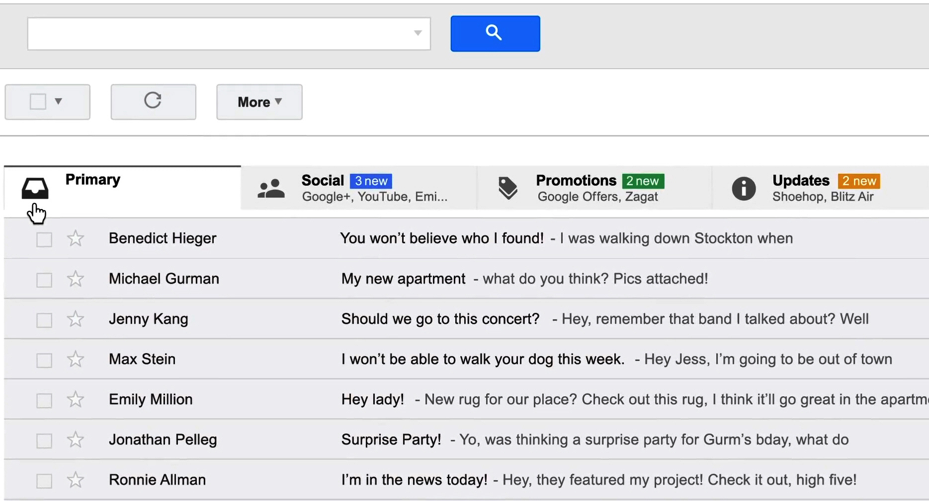
Google brings tabs to Gmail for web, iOS and Android

A move to Gmail frequently results in temporary disorientation. The labels feature takes getting used to, especially for those arriving from Outlook, which allows for the creation of folders. Now Google aims to clean things up a bit and help customers be better organized with the load of email received daily.
Itamar Gilad, Product Manager at Google, announces that "on the desktop, the new inbox groups your mail into categories which appear as different tabs. You simply choose which categories you want and voilà! Your inbox is organized in a way that lets you see what’s new at a glance and decide which emails you want to read when".
The new tabs will be completely customizable -- users can create them, as well as drag and drop messages between them. Customers can also set certain senders to always appear in a particular tab and star messages so that they will appear in the Primary tab as well.
With the new mobile Gmail, which arrives for Android and iOS devices, wireless customers will get the Primary mail tab when the app is opened, but will also be able to easily navigate to the other tabs.
If you like your Google email the way it is, then Classic View will switch off these new features and return you to the old days. The desktop, Android and iOS versions will become available within the next few weeks, but Google tells us that users can try it out sooner by keeping an eye on the gear menu and selecting Configure inbox when it appears in the Settings options.
