Windows 10 Technical Preview Build 9926 hands on -- making good on earlier promises
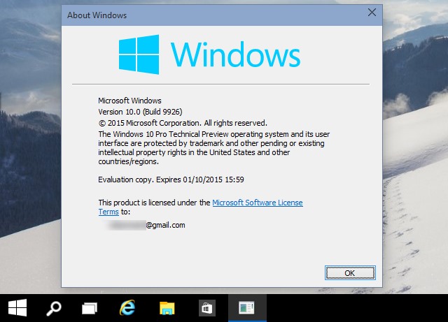
Windows 10 has been something of a tease so far. There have been hints that it could be a good operating system, protestations that it will be great, but a series of preview builds that have been a little uninspiring. With the release of build 9926, it appears that Microsoft is starting to deliver on its promises. From this release we can see that Windows 10 is actually starting to take shape.
Microsoft is clearly pleased with the progress that has been made because it has simplified the process of upgrading from Windows 7 and Windows 8 -- Windows Update can be used to install the Technical Preview. It might not quite be ready for prime time just yet, but I'm cautiously optimistic even though I've been far from impressed with previous builds. Oh, and before you ask, there's no sign of Spartan just yet. So… what's new and what's improved? Let's take a look.
While things have progressed a great deal over the numerous official and leaked builds, it's important to remember that this is still a preview. Despite what some people may say, this is beyond being an alpha version, but it's not really a beta. Does that make it something in between alpha and beta, or is it something else? A gamma build? Either way, 9926 is a step forward from 9888 -- the march towards 10000 continues apace, and there are real signs of things being pulled together.
For months, Microsoft has talked up Windows 10; build 9926 sees the operating system starting to walk the walk. Microsoft has had to tread a fine line between making sure that Windows 10 is different enough from Windows 7 and Windows 8 to convince users that an upgrade is warranted, but not changing things so much that people feel alienated. This is something that went wrong with Windows 8, and the 8.1 and Update upgrades took steps to fix the jarring move between desktop and modern. What we see now is the result of Microsoft listening to people and acting on it.
The beginning is usually the best place to start, and for many people, this means the Start menu. This has been a bone of contention for some time now. In a bid to please as many people as possible, we're given a Start menu that is a mixture of Windows Phone, the Start screen from Windows 8, and the Start menu that there have been demands for. The Start menu can be enlarged so that it occupies the entire screen.
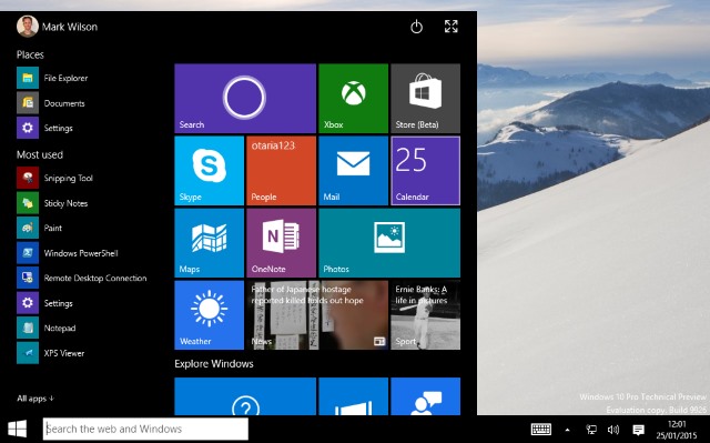
Windows 10's Start menu has evolved into something eminently usable
This is the version of Windows that's going to be running on EVERYTHING, if Microsoft gets its way. Phone, consoles, laptop, tablets and more. But convertible devices like Surface get particular attention. Continuum takes care of switching the interface to whatever mode is most appropriate to the mode your device is in. When docked or with a keyboard connected you get one mode. Switch to tablet mode and you get a more finger-friendly mode. A simple idea, but it's one that works. It's not clear how many people will make use of this feature, but for those who do have a convertible it is a real boon.
The action center is now home to genuinely useful notification, and this is an area of Windows 10 that is only going to become more useful as more apps tie into it. Sadly, it borrows a lot aesthetically from Windows Phone.
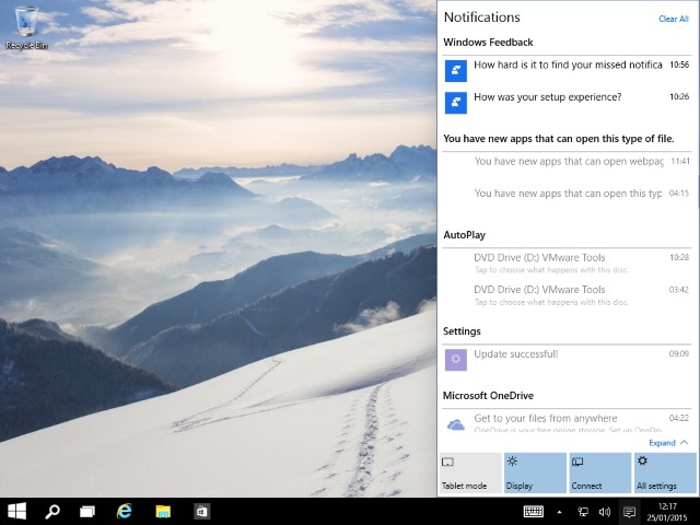
As they develop, Notifications will prove incredibly useful in Windows 10
This is still very much an operating system of two halves. It feels less divided, and while concessions have been made to those who hate modern apps -- they are now easily switched between full-screen and windowed mode and in many ways function just like an old-school desktop application -- the two worlds have not quite merged. Jumping between modern and desktop is far less jarring, the edges have been blurred more, but for anyone who hates the modern side of things, opinions are unlikely to change.
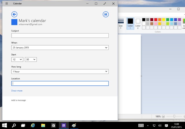
Lines have been further blurred between desktop and modern apps
There is more than a hint of OS X to Windows 10, particularly with the flat, largely borderless look to Windows. There is also what appears to be an attempt to copy the look of iOS's flat icons, but there's work to be done on the color scheme -- the folder icons are just hideous and garish.
Jeez, those are some damn ugly icons! Sort it out!
Cortana is possibly the biggest addition to build 9926. Sadly, I'm in the UK and the feature has not been enabled in my region -- nor have I been able to find a workaround that, er, works. In theory, I'm still to be sold on the value of Cortana. That said, it seems to be something that Windows Phone users have become enamored with and many people are looking forward to it on the desktop. It's possible I'm in a minority, and I'm willing (and happy) to be proved wrong in my cynicism. I just need to get it up and running first!
There are some odd little quirks here and there. In Windows 10, windows can, for the most part, be resized as you see fit, but there are instances where this is not the case. Take the Settings window for instance. At the moment, there are just nine icons in the window. Even though there is blank space beneath the last icon it is not possible to reduce the vertical height of the window -- a minor issue, but an irritating one nonetheless.
There are some things to learn, or remember. The Charms bar is gone. Hit Windows + C -- as I continually do -- and nothing happens. Settings have to be accessed through the Start menu.
There are also a couple of hidden surprises such as a redesigned system tray clock and calendar. This is not enabled by default, but if you fire up the Registry Editor and create a new DWORD (32-bit) value called UseWin32TrayClockExperience at HKEY_LOCAL_MACHINE\Software\Microsoft\ Windows\CurrentVersion\ImmersiveShell you can try out something with a slightly sexier look than the dull tool it replaces.
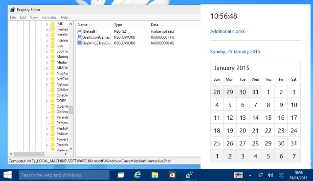
Hidden redesigned calendar? Don't mind if I do!
If the process of upgrading Windows 7 and Windows 8 to the Technical Preview through Windows Update is anything to go by, it's safe to assume that things should go just as smoothly for those holding off for the final product -- we've already been told that it will be possible to upgrade from the Technical Preview to the RTM release as well.
Talking of Windows Update, this particular Control Panel applet is no more. Of course, it has not been removed completely, but it has been moved to Settings where it can be found under Update & recovery.
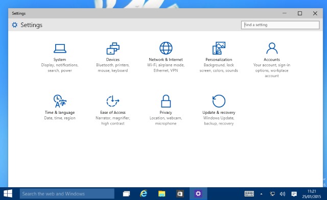
Lost Windows Update? Just look to Settings in Windows 10
While you're tinkering with the registry, you might also like to know that there's also a hidden logon screen that you may like to use instead of the default one. Navigate to HKEY_LOCAL_MACHINE\ SOFTWARE\Microsoft\Windows\CurrentVersion\ Authentication\LogonUI\TestHooks and change the value of Threshold to 1. If you change your mind further down the line, just change the value back to 0.
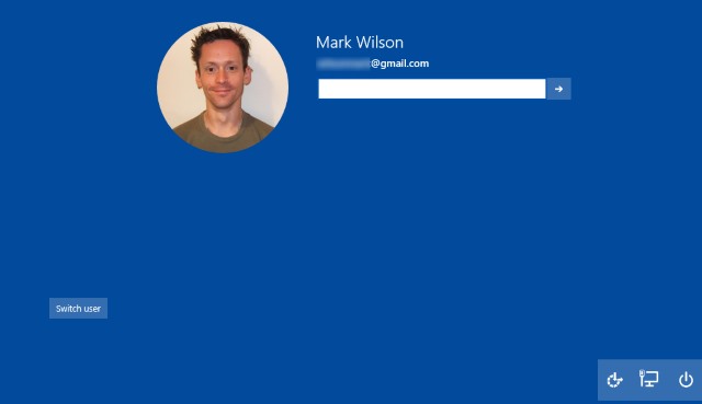
Unlock Windows 10's hidden logon screen to uncover more of Microsoft's love of circles
I've still got some playing around to do, but I'm starting to like Windows 10 more and more. There's still plenty of time for Microsoft to add the final spit and polish, and if done correctly, we could finally lay Windows 8 to rest and move on as if nothing happened. I still find the resemblance that many areas bear to Windows Phone to be a little disconcerting, but maybe it's something I'll get used to -- again, this could be a case of being in a minority that hate the look of Settings.
One thing I have been impressed by is the speed and stability of this build. It's hugely pleasing -- although hardware manufacturers will no doubt disagree -- that Windows 10 will run on the same hardware as Windows 7, and it's something (coupled with the fact that the upgrade will be free) that all but guarantees Windows 10 will be a massive success. I've warmed to 10 a great deal, and I can almost see myself loving it further down the line... thanks, in part, to the fact that the search button can be disabled!
So... over to you now. Does build 9926 cut the mustard? Has it swayed your upgrade decision one way or the other? What else do you feel still needs to be added, removed or refined?
