Linux Mint reveals upcoming logo and website changes

Linux Mint is one of the most polished and beautiful operating systems. As more and more people reject Windows 10, Mint becomes a very attractive alternative. Looks aside, it is a stable and reliable Linux distribution too -- it provides an overall excellent user experience.
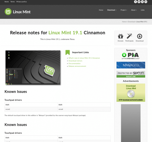
Unfortunately, the great looks of the Linux Mint operating system do not carry over to its website. What I’m trying to say is, the Linux Mint website is ugly and outdated. In the grand scheme of things that doesn’t matter much, but it could be a turnoff to new users.
Thankfully, the Mint Team is not only planning a website redesign, but a refreshed logo too. Rather than redesign the site themselves, however, the team has decided to buy a pre-made design.
"We’re working on a new design for our main website. When the current design (and logo) were originally designed they carried a strong identity and we grew quite attached to them. For a while now we were hoping to get a new unique design which would look brand new but still carry that very same feel, and that was very hard to achieve. In the meantime, we stayed with something that was stuck in the past and that just doesn’t work well nowadays. We’ve heard many people ask why our website looks so old, and I think it’s time we do something about that," says Clement Lefebvre, Linux Mint leader.
ALSO READ: Ubuntu-based Linux Mint 19.1 ‘Tessa’ finally available with Cinnamon, MATE, or Xfce
Lefebvre further says, "The main landing page has a different layout, with no sidebar, less text and more prominent elements to introduce what Linux Mint is and present its main features. We’re currently focusing our efforts on the header bar and the sponsors section. The header bar should receive a background or a texture which will make it more minty and give the website more identity. Its navigation menu will also be centered and placed below the title to allow for a larger logo."
Speaking of the new logo, Clem provides the following problems with the current logo.
- It doesn’t scale down well. When small (for instance for a favicon, or an application menu logo), its design is too complex to be rendered properly in a limited number of pixels.
- It looks off-center because of its non-symmetrical border, with empty space on the left and none on the right.
As you can see from the screenshot above, the new website design is hardly revolutionary. Quite frankly, I would say it rather boring with far too much white space. And maybe that is fine -- it doesn’t really need to be the most beautiful site on the web. Still, if you are going to do something, why not do it the best way possible?
The new logo is also a bit of a stumble, in my humble opinion. I mean, I suppose it’s fine, but it looks a bit like a weird thee-fingered fist. It’s functional and passable, but I think the Linux Mint developers are capable of much more. In other words, my criticism should be taken as a compliment.
My opinion is hardly the only one that matters, however. I would love to hear from you, dear BetaNews readers, as to your thoughts on the upcoming Linux Mint website and logo changes. Are they good, bad, or simply average and uninspired? Please sound off in the comments below.
Image credit: Dean Drobot/Shutterstock