iPhone 11 Pro: The ugliest iPhone ever!
They say that good things come in threes. Three of a kind. Three’s Company (RIP, John Ritter). Three-eyed ravens. There’s even a literary Rule of Three that spans the breadth of human influence and communication. Basically, we humans are hardwired to like things that come as a "pair-plus-one."
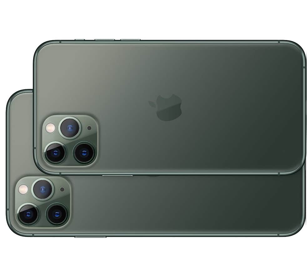
However, there are also plenty of bad things that come in threes. Three-eyed monsters. Three-legged invaders from Mars. The "third wheel" friend on what was supposed to be a hot date. So, it comes as somewhat of a surprise that Apple decided to put THREE separate cameras on the back of the new iPhone 11 Pro. Because, from an aesthetic and first impressions standpoint, this is one "fugly" beast!
Let’s start with the location. By cramming all those cameras into the upper left (or right, depending on your orientation) corner, Apple has created a look that feels visually off-center. It could sort of get away with this when there was just one camera -- or even two (in a vertical stack). But with three of them smooshed into an expanded "camera box" in the corner it unbalances the whole aesthetic.
Then there’s the camera lenses themselves. "Bug eyed" is the first thing that comes to mind when I look at the iPhone 11 Pro’s shooter. There’s just something unsettlingly "wide" about their apertures that makes me feel like a startled, three-eyed animal is gawking at me from within. Think of a bizarre Pandorian flora/fauna creation from the minds of James Cameron and the crew behind the move Avatar. I fear it’s going to jump out and bite me at any moment.
Of course, in true form over function style, Apple has also reduced the "grabability" of the device by dedicating a heretofore unseen amount of real estate to the camera’s "hump." I get it that cameras take up space, and that three cameras take up more space than two. But the combination of the size of the cluster and its edge/corner location virtually guarantees a lot of fingerprint smudging of the lenses and sensors. Why it didn’t center the whole mess, and thus free up the edges for more secure gripping, is beyond me.
Sadly, what Apple has wrought with the iPhone 11 Pro is likely to become the new standard for smartphone designs. We saw it with the infamous notch, and I’m sure the intellectual property Xerox machines are already running at full speed in Taipei and Seoul (and China proper -- at least once Huawei figures out how to install a hidden backdoor inside the third lens mechanism).
Frankly, it wouldn’t be so bad if these cameras finally did more than take super-duper-amazing photos. I mean, where is my practical, useful implementation of Augmented Reality? Where is my Star Trek-like Tricorder functionality? I want my phone to do more with all that amazing sensor hardware than just ensuring that every splotch and age mark on my half-century old face shows up clearly in a selfie taken in a dimly lit bar at 2AM.
All of this "more camera for camera’s sake" stuff is getting boring. And it’s making phones uglier and more unwieldy, to boot. When will it all stop?