YouTube has a new interface -- here's how to disable it if you hate the new look

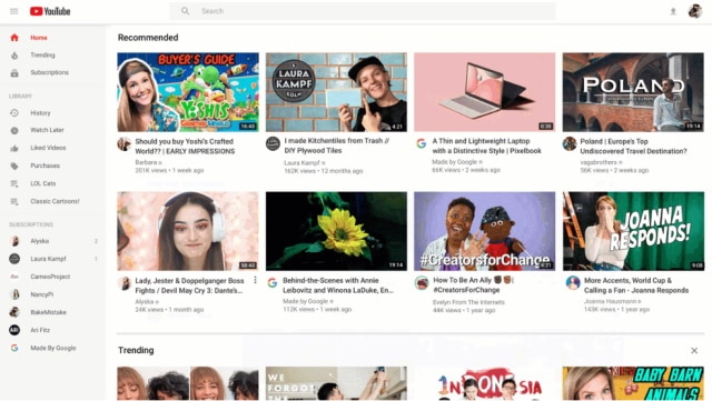
Google has updated YouTube with a new-look interface on tablets and the desktop. Thumbnails are bigger and easier to see, some superfluous links have been removed, and there are changes to the way the video queue works.
But, of course, not everyone likes change. If you're not a fan of the new interface, there are steps you can take to stick with the old look.
See also:
- Google introduces more privacy controls for Maps, YouTube and Assistant
- YouTube TV now on Amazon Fire TV
- YouTube changes its verification process after a huge backlash against planned update
Google says that it has made thumbnails larger and clearer to convey more information about videos at a glance. Video previews are now in higher quality and some "content shelves" have been removed to help tidy things up a bit.
It's now easier to add videos to your viewing queue on the desktop, and Google now lets you remove channel suggestions so you are not constantly recommended content you're not interested in.
Google also says that there is more to look forward to:
Earlier this year, we added a new feature to the YouTube Android app that lets you select your favorite topics and customize your Home feed with related videos. We'll be releasing it on desktop and tablets soon!
If you don't like the new look, there are a handful of options available to you.
Chrome users can install the appropriately named Restore Classic for YouTube extension, while Firefox users can turn to the Disable Polymer on YouTube add-on.
Alternatively -- for now, at least -- you use this link to visit the old version of YouTube to avoid the Polymer-based interface.
