Google Play gets redesigned logo to commemorate its 10th birthday
Do you want to feel old? Google Play launched in 2012! In other words, Google's digital store has now existed for a decade. Google Play has become a centralized digital store for both software and media, including mobile apps, games, books, television shows, and movies.
Is Google Play a good store, though? That is debatable. While it is has plenty of quality offerings, it is polluted with low-quality apps and games too. Even worse, some of the software downloads are designed by nefarious developers looking to trick and defraud unsuspecting users. Yes, Google Play actually contains some malware. Sadly, Google's digital store just isn't as safe as Apple's superior App Store.
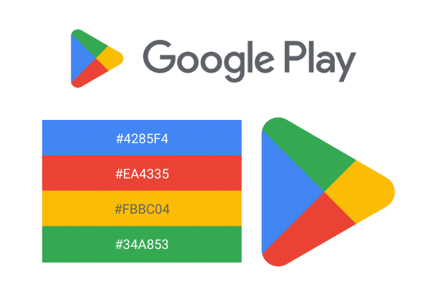
While Google Play isn't perfect, it is still the best option for Android users. To celebrate the store's 10th birthday, the search giant has decided to redesign the Google Play logo to align it more closely with the design of its other apps, such as Gmail and Photos. You can see the new logo at the top of this page, while the old one can be seen below. As you can see, it is quite similar, but with more rounded corners and new color shades.
Google shares the following statement regarding Play's 10th birthday and redesigned logo/icon.
A decade later, more than 2.5 billion people in over 190 countries use Google Play every month to discover apps, games and digital content. And more than 2 million developers work with us to build their businesses and reach people around the globe. To round out this decade, we’re introducing a new logo that better reflects the magic of Google and matches the branding shared by many of our helpful products -- Search, Assistant, Photos, Gmail and more.

Do you like the redesigned Google Play logo? Do you find the change to be too subtle? Please tell me your thoughts in the comment below.