
Apple’s Liquid Glass Control Center Gets a Much-Needed Fix in iOS 26 Beta 2
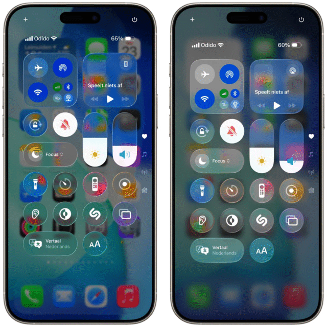
Apple’s design refresh for iOS 26 has been making a big excitement since its reveal, but not all the users’ reactions were positive, especially when it came to the new Liquid Glass Control Center. Some early testers quickly found themselves squinting at their screens, struggling to read essential things and sliders through a nearly transparent sheet.
Thankfully, it seems Apple was listening: the newly released second developer beta brings a key update that resolves this issue easily.
For those who missed the initial rollout, iOS 26 introduced the Liquid Glass aesthetic across the system, pushing Apple’s longstanding love of translucent interfaces to its limit. Nowhere was this more noticeable or more frustrating than in the Control Center.
With its quick-access buttons for Wi-Fi, Bluetooth, brightness, and audio controls, Control Center is one of iOS’s most-used panels. Unfortunately, in the first developer beta, the glassiness was so intense that background content bled through vaguely, turning a simple glance into a game of visual hide-and-seek.
With Beta 2, that’s changed. The frosted effect is still there after all, it’s central to the new design language, but it’s now significantly more opaque.
Here are the key improvements in iOS 26 Beta 2:
- Better readability: The Control Center’s glass effect is less transparent, blocking out distracting background details.
- Cleaner visuals: Icons and text stand out more clearly, making it easier to find and tap the right controls.
- Subtle tweaks: Some color bleeding remains, but it’s far less noticeable and no longer disrupts usability.
- More polish expected: Apple will likely continue refining this look in future betas ahead of the final release.
If we do a quick before-and-after comparison, it will show just how dramatic the improvement is. In Beta 1, wallpaper colors and app windows peeked through the Control Center tiles, messing up the view and making certain icons blend into the background. In Beta 2, that visual noise is dialed back, providing a better balance between style and usability.
That said, the new update isn’t perfect yet. Some early testers have noted that while the increased opacity helps a lot, color bleeding can still occur around certain buttons, particularly if your wallpaper is vivid or high contrast. It’s not a dealbreaker, but it’s the kind of polish that Apple will likely continue to refine before iOS 26 ships to the public this fall.
Apple’s developer and public betas now effectively double as large-scale user testing grounds, allowing the company to identify pain points in real-world use and tweak features based on direct feedback. It’s a win-win for both sides; users feel heard.
-
Beyond the improved Control Center, iOS 26 Beta 2 includes a handful of other small but noteworthy tweaks. For one, there’s a new ringtone that’s already getting fans among early adopters.
Intrigued by these updates? You can test-drive iOS 26 by yourself: Apple has confirmed its plans to open up the beta program to the general public next month, giving adventurous iPhone owners an early peek at what’s coming, without needing a developer account.
Of course, running beta software always carries some risk. Bugs, performance hiccups, and unexpected app crashes are par for the course, so it’s wise to install the beta on a secondary device or at least make a thorough backup beforehand.
In the meantime, it’s encouraging to see Apple iterate so quickly on user feedback. Beta 2 proves the company is committed to getting it right. If Apple keeps listening to users' feedback, there’s a good chance iOS 26 will feel less like a style experiment and more like a true evolution of the platform billions of people rely on every day.