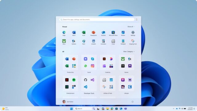
Microsoft brings new Start menu experience to Windows 11 Insiders

Having already given Windows Insiders signed up to the Dev and Beta channels a new Windows 11 Start menu experience, Microsoft is doing the same for those on Canary builds.
The new look sees the Start menu being made scrollable for easier access to shortcuts, but there are various other changes too. With the new Start menu landing in the Canary channel, it could be that we are due to see even more changes being introduced as Microsoft experiments. But the new Start menu is not all that the company has added here.
With the release of Windows 11 Insider Preview Build 27965 to the Canary Channel, Microsoft is also introducing its command line text editor, called Edit. This unusual addition is an open source project, and Microsoft says that it has been designed to enable people to quickly edit a file while in the Terminal app by typing edit followed by the file name.
Helpful information is available in the Edit documentation as well as on GitHub.
But it is the Start menu changes that will be of interest to most people. Microsoft says: “We’re making it easier for you to launch your apps with our updated, scrollable Start menu. With “All” now on the top-level, apps are easily accessible without having to navigate to a secondary page. In addition, we’re introducing two new views to browse and launch your installed apps in the “All” section: category and grid view.”
The new viewing option have been designed with personalization in mind:
The new default Category view automatically groups your apps by category for quick access to your most used categories and apps. So, if your most used apps are Outlook and Solitaire, you can expect those apps to bubble up to the top in their respective categories. Categories are formed when there are at least 3 apps in each respective category. Otherwise, they will remain in the “Other” category.
Grid view is ordered alphabetically like List view but allows for better scanning of all your installed apps with more horizontal real estate. With new view options to choose from in the “All” section, we’ll remember your last used view so you can reliably launch your apps with the view you prefer most.
For anyone with a large screen who has been frustrated by the inefficient use of space by the Start menu, there is good news. Microsoft has made changes that mean the size of the Start menu adjusts according to the size of the screen being used.
In what will seem like common sense to many people, a large screen will result in a large Start menu, and a smaller display will mean that you see a small Start menu with fewer visible items.
Microsoft explains:
We’re making better use of your screen real estate by adapting the size of the Start menu based on your screen size. Have a larger-screen device? You can expect to see a larger Start menu, by default, so you can see more of your apps and files. On larger devices, users can expect to see 8 columns of pinned apps, 6 recommendations, and 4 columns of categories in the Start menu. On smaller devices, you’ll see 6 columns of pinned apps, 4 recommendations, and 3 columns of categories.
Other changes include being able to adjust the way in which the Pinned section of the Start menu operates. For Windows Insider on the Canary Channel, there is also an update to cross-device integration with Phone Link which means you can easily expand and collapse mobile device content using the new mobile device button next to the Search box.