Sorry Nokia Lumia 930, I tried to love you, but we're just not meant to be [Review]

While I'm primarily an Android user, I'll dip my toes in the water of iOS and Windows Phone from time to time -- you have to check out what's going on elsewhere after all. A while back I tried to switch to the Nokia Lumia 928, but found Windows Phone too restrictive. But I'm open-minded... I'll give things a second crack of the whip. So now it's time for me to take look at the Lumia 930.
I am impressed with the look and feel of the handset. It's a very solid device that feels robust enough to be used as a tool for breaking and entering should the need arise. It feels like a high-end phone, it oozes quality. But it has Windows Phone 8.1 installed, and that's a massive problem.
It's no secret that Windows Phone has a huge amount of catching up to do; Android handsets and iPhone are way ahead of the pack. It's easy to say that usage figures don’t matter, but they do -- Microsoft doesn't just make these handsets for fun. Sales are important and they're just not really happening at the moment. Talk all you want about success in certain markets, but there's no getting away from the fact that globally -- which is what really matters -- Windows Phone fares terribly.
The "Fun" Phone
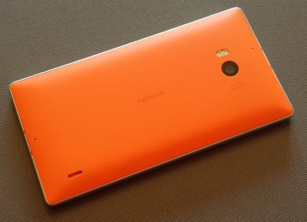
But this isn't supposed to be a diatribe against Windows Phone; we're talking specifically about the Lumia 930. As I mentioned in my first impressions, this is a heavy phone. It is also very angular and can feel uncomfortable in the hand, especially if used for prolonged periods of texting or messaging. While the look of the phone has been brightened up by the "fun" (radioactive) orange case, it's a shame that something new wasn't done with the styling.

AAAARRRRRGGGGHHH!!!!
In terms of specs, there's little to be disappointed by. The 5-inch 1080p display, a quad-core Snapdragon 800, 2GB of RAM, and 32GB storage are all very reasonable, but the lack of a removable battery is an unfortunate oversight, as is the absence of an expansion card slot. 32GB of space may seem fairly generous, but it's certainly not going to last forever. There might be a push to move everything to the cloud, but there is still a great need to store lots of things locally.
Style Over Substance
The 20MP camera is quite, quite superb, but we've come to expect this of Lumia devices. They are known for their great cameras, but this is a smartphone, not just a camera. I've already mentioned that apart from the coloring and addition of an aluminum surround, this phone is largely indistinguishable from other Lumia phones. What is meant to make this one stand out from the start is the inclusion of Windows Phone 8.1. This is an operating system that has been around four years in the making, so there has been plenty of time to get it right -- but it still falls short. Perhaps not as far short as previous versions, but it's still a disappointment.
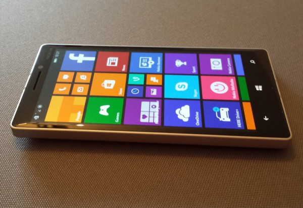
It looks as fabulous as could be expected on the seriously impressive screen -- ClearBlack is a nice touch that improves colors and saves battery -- but it is a let-down nonetheless. Some of the key additions to Windows Phone 8.1 -- the Action Center, customizable home screen icons, better Live Tiles and so on -- feel like too little, too late. Like its predecessors, this seems like a phone with training wheels on it. It gets the job done, but it's often an awkward and clumsy route to get there. Just look to Settings where you'll find nearly 40 subcategories to choose from; this is just silly.

Up to 8.1... and it's still terrible
Despite the clamor that has been made about Windows Phone 8.1, there are really very few changes. Sure, there have been a few nips and tucks here and there, but prepare yourself to be decidedly underwhelmed.
Glimmers of Hope
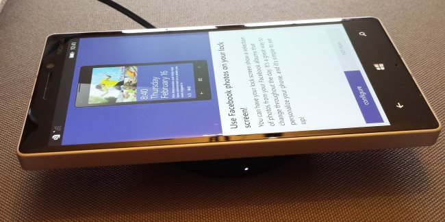
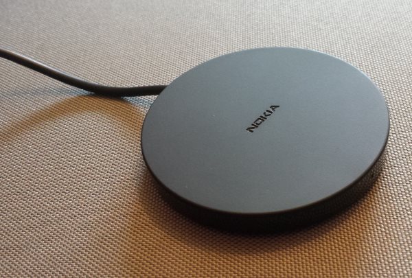
The wireless charger is a neat touch (even if the charging plate is rather chunky), but it's not enough to save the device for me. The weight that initially gives the phone its quality feel soon becomes too much, and the uncomfortable shape coupled with the unpleasantness of Windows Phone 8.1 make this phone impossible for me to love. Ergonomics disappoint, and while the dedicated camera button might seem like a good idea, it actually gets in the way and feels unnecessary -- there's a very good reason so few other phones have this feature.

It's unfortunate when the charger is one of the highlights of a phone.
When it comes to mobile operating systems, Google is still leading the way. The changes made in Windows Phone 8.1 so closely mimic Android -- and yet still manage to miss the mark -- and indicate that even Microsoft is almost ready to admit that. The company has already shown with Skype and Xbox One that it is happy to listen to it customers and make changes and additions that are needed. Let's hope that the same is true for Windows Phone or it and the Lumia range are doomed to remain in third place.
Until Windows Phone develops further, become more user friendly, and include far, far more customization options I'm going to take quite some convincing that it is a serious OS. You'll probably be impressed by the battery life. You'll easily get a day's usage out of it, and maybe even more. This can be put down to the fact that the phone is just not enjoyable to use. You'll pick it up to use it when you need to, but you're unlikely to just play about with it -- thanks, at least in part, to the untweakability of Windows Phone 8.1.
I'll give the Lumia 930 this: it's pretty much bomb-proof. But in my mind it is really a decent, robust, small digital camera that just happens to have some smartphone functionality.