How can form analytics help businesses increase conversions?

A form is one of the most important elements on many websites because it is where conversions happen, leads are created, and relationships begin.
According to MarketingCharts, Lead Gen forms have an average conversion rate of just 17 percent. As dismal as these numbers are, the good news lies in the immense opportunity left by the 83 percent of visitors who do not convert on forms -- and the data-driven solution to help win over more of them.
Making your website forms more user-friendly will catapult them from hindering conversions to enabling users to get friendly. When users provide their personal details, they display trust, interest, and intent.
For this reason, forms are crucial, and making the process frictionless and painless is guaranteed to increase conversions.
Pains aren’t just for personas
In creating buyer personas, we focus heavily on pain points -- those hardships buyers face that make their jobs or their lives frustrating. We know that if we can convince our target audience that our solution will resolve their pains, they will happily oblige.
But sometimes, instead of solving pains, we inadvertently create pains for our users. Typically, this happens on forms.
Interested users arrive at our forms and something there pains them -- too many fields, information that is too personal, or an intrusive experience.
By removing the pain from our forms, we can return to solving our buyers’ pains with our solutions.
What is needed to increase form conversions?
When companies need to increase conversions from the forms on their sites, they first need to understand two things:
- WHAT the user is experiencing on the form
- WHY the experience is flawed
Only with full visibility into WHAT is happening and complete understanding of WHY it is happening can companies take action to correct their forms and increase conversions.
Knowing they need to understand the WHAT and the WHY leaves many wondering… HOW?
Form analytics to the rescue
Internal QA testing and external multivariate testing, along with expert analysis are all great for finding and squashing bugs in the workflow and function of a form. It is a great first step for novices, but nowhere near enough for expert data-driven marketers.
By adding form analytics, you are privy to information about the forms as they are experienced by real users (those who convert and those who do not). With form analytics, you will be able to truly understand the pain points of your users when you:
- Record (and later replay) what users do on the form
- Understand what happened on the form (for example, what consistently fails and where bottlenecks may be)
- Determine how much time it takes users to complete the form (or at what point the form is abandoned)
- See any code errors on the backend
By gaining this insight into the frustrations experienced by users, you will acquire the knowledge you need to declutter, debug, and demystify the form completion process.
A real form analytics example
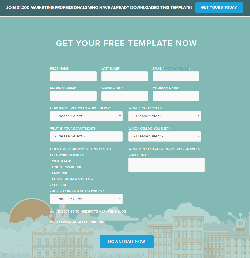
Let’s take this HubSpot form for example. If the team over at HubSpot noticed a low conversion rate on this form for downloading a free template, they could use form analytics to understand why this is happening:

Studying the form analytics of the page may lead the HubSpot team to realize that the question, "What is your biggest marketing or sales challenge?" is hard for users to answer and leading visitors to abandon the form.
Such a bottleneck can be dealt with in several ways. They may opt to remove the question and see if they track more conversions. They may consider providing multiple choice options to guide users toward popular answers. They may reword the question to make it less intimidating by saying "What is one of your marketing challenges?" They may just add a notation that the questions is "(Optional)".
Whichever direction they may choose, by continuing to reference the form analytics, they will understand:
- Why the form isn't converting
- Which questions are difficult to understand and need to be clarified
- If a user is reluctant to answer any particular question (phone, company name, etc.)
- Why customers aren't completing their purchases / Why visitors aren't signing up
- If the form is broken on particular devices or browsers.
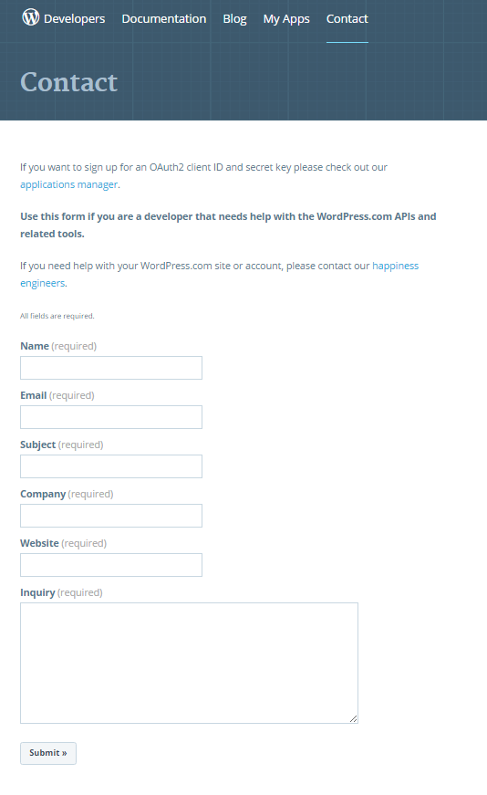
Consider this contact form on the WordPress Developers site. Contact forms typically convert at 34 percent. Using that as a benchmark, do you think this form does better than average?
{HINT: it is a trick question.}

Without access to form analytics, there is no way to know if users experience pain and frustration with this form.
A UX expert may lay out the form more concisely so it fits above the fold, or replace the menacing "(required)" label from each field with an asterisk.
Once they have the understanding of what users are experiencing on the form and, more importantly, why they are experiencing it, they can take actions to resolve the issues and continue to monitor as conversions rise.
Forms by definition
A form, by definition, is "a mold, frame, or block in or on which something is shaped". In the case of company websites, forms are often the building blocks on which conversion funnels are shaped. If your funnel is top heavy and you are witnessing too many incomplete form submissions, form analytics can help you understand what is happening on your form, why it is happening, and how to fix it.
This is how form analytics increases conversions: it gives you the visibility you need to understand your user’s pains…and solve them.
Photo Credit: vinnstock/Shutterstock
Yael Tolub is the VP of Marketing at Clicktale, leading the company’s worldwide marketing initiatives and driving awareness and adoption at global fortune 500 companies. Yael has a global perspective of marketing, having lived and worked on three different continents (and counting!). Prior to Clicktale, Yael held product and strategy roles in various companies, including MediaMind (today called Sizmek). Yael holds a LLB from Hebrew University, and an MBA from MIT Sloan School of Management.