Microsoft's new Office Web Apps: More mobile, but not mobile enough

For just about three years, we've had Microsoft's browser-based suite of free Office tools alongside the desktop Office software. In that time, we've composed and edited loads of Word documents, created Powerpoint presentations, and manipulated Excel spreadsheets. But when these types of Web apps debuted, there were three great islands: the standalone desktop software, the Web-based service, and the mobile application. Each was meant to be used in a different context, and each was equipped with different capabilities to suit those contexts.
For Microsoft in 2010, the PC was still the reigning king, so the Office Web apps were meant to get Office documents off the hard drive and out where they could be easily shared and passed between PCs.
But today, the mobile device is clearly the new king. And at the dawn of Windows 8, Surface, and Office 2013, we are seeing the Office Web applications add new features and gradually shift their focus to the connected mobile device.

"The initial version of the Office Web Apps allowed users to view an Office document on nearly any phone with a browser. However the experience was very basic. With this latest release, we now provide a high-quality reading experience that take advantage of today's modern smartphones, including Android and iOS," Mike Morton, the group program manager for Office Web Apps said on Friday.
"The Web Apps are now available on a broader set of devices, browsers and sites," Microsoft Office Group Manager John Jendrezak recently said. "They work great on the latest browsers, including new 'touch-friendly' UI controls. Our mobile interface has been redesigned to take advantage of today's smartphone capabilities."
Unfortunately, we have looked at Microsoft's crop of Office Web App previews on a number of non-Windows devices, and these quotes appear to be gross overstatements of the Web apps' actual mobile capabilities thus far.

The new Web apps have a ribbon interface that looks identical to Office 2013, with improved space between tabs, and a new font sans serif to improve legibility on smaller screens, they utilize HTML5 for broad compatibility, but that is about it for interface design.

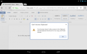
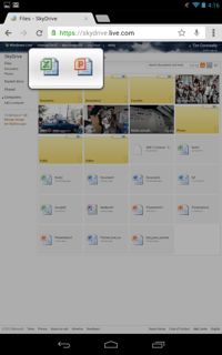
"Touch friendly" is a bit of an inaccurate description for the Office Web App design (see embedded image above, where I tapped one of the app icons on the Google Nexus 7, and it had to zoom in so I could pick the proper one) but the applications can still be comfortably used on a touchscreen device. "Working Great," is also a bit of an inaccuracy, as the Web apps crashed and failed on the iPad 2, Kindle Fire, and Google Nexus 7. The whole SkyDrive interface itself worked across all devices, though.

In this space, Google Drive is Microsoft's primary competitor, and Google's Web App interface for mobile devices is nothing short of horrible itself. Google document editing and formatting can only really be done in the Google Drive mobile app, the mobile browser-based editor is essentially a space filler. Google's acquisition of Quickoffice may change that, but currently, Microsoft's Office Web apps are far superior to Google's.
Tomorrow (Tuesday, July 23), Microsoft is hosting a Webinar specifically about the Office web app experience on mobile, highlighting the SkyDrive and OneNote experience on "other mobile devices." In other words, the experience on all the mobile devices that are kicking Windows Phone's head in.
