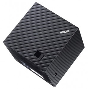
Attention set-top box makers: Stop trying to differentiate by shape!
 Some trends are really bad. Take set-top box designs, which are headed in the wrong direction. Entertainment devices used to have traditional box shapes. Some were longer or deeper or taller, but they all stacked on a shelf. They fit neat and tidy in your media center. Those days are gone.
Where did this madness all begin -- insanity that sweeps though the Consumer Electronics Show this week? Boxee is as good a place to start as any. The original Boxee Box had a "unique" shape -- I am being kind. However, version two, not surprisingly, went with a more traditional shape in an effort to raise sales and fit better within the living rooms of customers. Lesson learned.
CES is chock full of manufacturers who have unlearned this lesson. Consider the Asus Qube, a just-announced Google TV box. Oh, it is not bad, but, well, it is a cube.
On another note, have you seen that strange looking Slingbox? Great technology, but it better be on top or have a shelf of its own because heaven-forbid you need to put something on top of it. Remember the Phillips HMP2000 from last year? No? Guess why? The Nexus Q? That didn't even makee it to market.
While smartphones are getting bigger, set-top boxes are smaller. That is fine. I understand. I can easily stack both an Apple TV and a Netgear NeoTV Prime on top of one another and even put them both on top of my Blu-Ray player or A/V receiver. But there is no good reason why I should need to draw up a plan to figure out how to arrange Qube, HMP200 or Nexus Q!
