Ubuntu Touch -- interesting concept that needs work [preview]
 The concept of Canonical taking a stab at the mobile market eludes me. Unless we want to split hairs, which I know will happen, Android already is the Linux ambassador across the globe, so why would the world need Ubuntu Touch? Furthermore, any new player starts out with a clean slate, which means many consumers will be skeptical at purchasing devices running the new operating system and therefore developer interest does not surpass a low threshold.
The PC market is not what it used to be a couple of years ago when people rushed out to buy new computers, rather than tablets or smartphones first. In some ways Canonical right now is Microsoft before Windows Phone and Windows 8 -- an important player further heading into obscurity down the road unless the boat steers in the right direction. Ubuntu Touch is supposed to give the world a breath of fresh air, the X factor that would sway enough people into switching from Android, iOS, Windows Phone or a feature phone, even.
Truth be told Canonical's preview for Ubuntu Touch is one of the most basic I have ever laid my eyes upon. Nothing really works in the sense that it only paints (literally I should say) the bigger picture without allowing users to run most of the preinstalled or listed apps. Basically Canonical delivers a cool new gadget that cannot be used for anything except a paperweight.
Normally when you buy a new mobile device, the operating system comes preinstalled. Most people don't want to install Android, iOS, Windows Phone or Windows 8 on their smartphone or tablet anyway. Canonical's product, however, cannot be added to the same list, at the moment, as there are no devices running Ubuntu Touch out-of-the-box; instead one has to download the operating system manually and install it on a Google Galaxy Nexus, Nexus 4, Nexus 7 or Nexus 10. Needless to say any of the four must sport an unlocked bootloader and, to make it easy, a custom recovery such as ClockworkMod or TWRP.
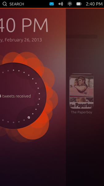
Fast forward to the boot process, Ubuntu Touch Developer Preview starts quite fast even on my aging Galaxy Nexus and, shortly after, it displays the lockscreen, which sports the usual suspects -- date and time, status bar with notifications, Wi-Fi and volume, battery indicator and the time. On top of the aforementioned items, Ubuntu Touch also adds search on the left side of the status bar and a round disc in the middle of the lockscreen, which right now only displays "14 tweets received". I can only speculate that in the final version users will be able to rotate the disc (like on an old telephone) and it will display other statuses.
There are no buttons to speak of whatsoever. For someone first using a smartphone running Ubuntu Touch, there is going to be a learning curve involved straight from unlocking the device. It's done by swiping left from the right edge of the screen -- it's one of the reasons why Canonical must have a pretty explanatory guide on how to use the interface. So it's unlocked, now what?
Well, Ubuntu Touch now displays the main homescreen, one of the five available, called Home. No surprises there. The other available ones are, from left to right, Music, People, Apps and Videos with Home bang on in the middle. Switching between them can be done by swiping horizontally. It has to be noted that Ubuntu Touch Developer Preview comes similar to a snapshot of the operating system after it was used, so everything is in a frozen state with contacts, apps, etc.
 The Homescreens
Let's take them one by one.
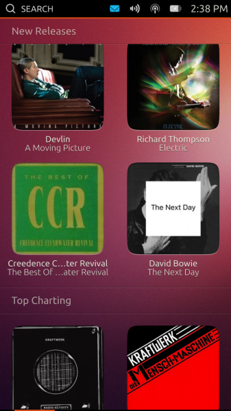
Music, as the name suggests, focuses on music content and, judging by the pictured items on the homescreen, acts as a store similar to iTunes, for instance. Right now it displays Featured, Recent, New Releases and Top Charting categories, all of which contain albums. Users can swipe left and right in the first one to view all the featured content, whereas in the following four Ubuntu Touch only lists four items per each category inside a grid. Needless to say tapping on any album in Music leads nowhere at the moment. There is, however, a basic animation when tapping on an item. It's just a preview, but I expected more out of it, to be honest.
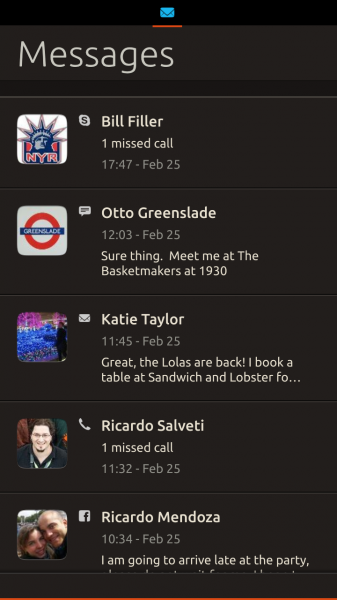
People is similar to the People hub in Windows Phone and currently displays Favorites, Recently in touch, New Contacts and the A-Z category, the last of which is a list of all the contacts. The names are pretty self-explanatory. Favorites, like the Featured category in Music, shows a horizontal list of contacts which can be navigated by swiping. Tapping on a contact displays the contact's picture and, if exists, last status on Facebook, home number, email address and home address. Other fields may also be available. Not all fields are active, but I managed to power up the Phone app after tapping on a contact's phone number.
Recently in touch shows recent interactions, although it is not yet clear on which social network without tapping on the listed item, which will power up the contact's info. Also, it is unclear as to whether the Recently in touch category displays a list of the most recent interactions between the user and his contacts or the latest social network status from most recently-interacted contacts. It's a nice concept, but I am not certain if it works all that well in real-life because so many of us have hundreds of contacts across various social networks and we do chat with many people each day so I can only imagine how lengthy the Recently in touch category will become. It might be just too much swiping involved without other tabs on top.
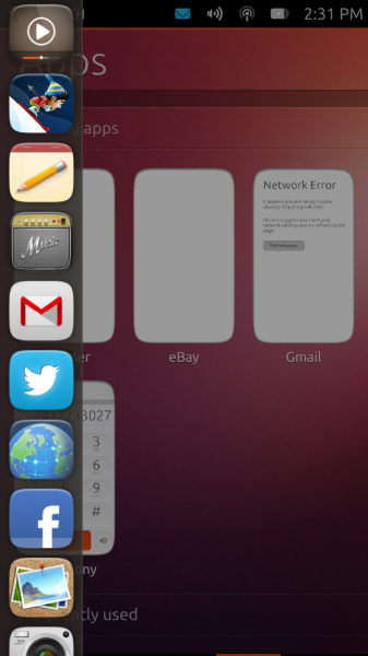
 Apps displays the Running Apps, Frequently used, Installed and Available for download categories. There are some interesting items listed, both as installed and available, including Amazon, eBay, Evernote, Pinterest, SoundCloud, Twitter, Wikipedia and YouTube. Obviously listed does not really imply available as well, so the situation might change over time before Ubuntu Touch is released.
Videos embodies the same philosophy as the other homescreens and displays Featured, Recent, New Releases and Popular Online categories. Featured displays a horizontal list with movie posters, while Recent and New Releases revert to a grid of movie posters. Users can tap on a title and either buy or rent the item from Amazon or Ubuntu One, respectively. Popular Online displays a grid of videos, likely only from YouTube.
Home is where people will revert to after navigating the operating system. The homescreen displays Frequent Apps, Favorite People, People Recently in Touch, Recent Music and Videos Popular Online. Basically Ubuntu Touch wants to provide users with the most important features that they use on the device straight from the default homescreen. If there are also plenty of cat videos in the last category Canonical will hit a home-run with Ubuntu Touch for most YouTube aficionados.
The Same Idea, Just Differently Implemented
The homescreens display a bunch of condensed information that we have grown accustomed to get from various apps individually. Truth be told, Canonical does not revolutionize operating systems, at least not right now. Ubuntu Touch merely gathers relevant pieces and joins them together in four major categories. It's a very neat way of dealing with information overload and having what matters nearby at a couple of swipes. This is just a glimpse of what's to come, indeed, but I can only wish that what's to come will be improved in a number of areas.
I like the concept of Ubuntu Touch, I really do, but I can't get past its looks. All app icons have rounded corners, which I can live with, but the edges appear to be rounded as well giving them a cartoonish feel. The colors are typical Ubuntu as well and, generally speaking, the overall design of the icons is dated or too kitsch. The background looks like it was ported straight from Ubuntu as well, which is to be expected, but it does not look all that great either and neither do the fonts. Canonical should really consider polishing up the interface.
 Then there is the status bar, which is a great concept but difficult to work with nicely on the go. I use my smartphone most of the time when I'm out of the house and then I find it difficult to nail the right swipe to see the battery or volume panel (accessible via status bar). Don't get me wrong, it's nice to have different panels for each icon in the status bar but not so great in real-life. I see this as a problem even when stationary for elderly people and people with big thumbs.
Big thumbs don't help either when typing on the keyboard, which more than often does not register a press unless slightly tapping on the key. I don't have a similar issue with Android, iOS or Windows Phone and I don't like to pinpoint such problems for mobile operating systems in 2013. Hopefully Canonical will fix this issue in upcoming, and more stable, builds of Ubuntu Touch.
Switching between apps is done by swiping left from the right edge of the screen. Ubuntu Touch switches between them in a certain order and does not currently display a list of running apps without going straight to the Apps homescreen. Another downside of the Developer Preview is that Ubuntu Touch does not deal well with multiple running apps, becoming overly sluggish. Normally the lag exists but it's made worse in the aforementioned scenario.
Powering up a menu inside the app is done by swiping up from the bottom edge of the screen. Depending on the app it may display a navigation bar (like in the Browser) or a keyboard or absolutely nothing at all because Ubuntu Touch freezes. But when you want to minimize the app, by swiping right from the left edge of the screen there's another menu, which weirdly enough shows up as well. I can assume that it can be customized to include only a certain number of apps that users want quick access to, but the Developer Preview build leaves that to our imagination at the moment.
Refreshing but Needs Work
Ubuntu Touch is an interesting concept that needs work. That's the bottom line. Navigating the interface works well through swiping and after using it for a couple of days I have no problem in the lack of on-screen buttons (because this is still a Nexus device that I'm running it on). But when compared to Android, iOS or Windows Phone, Ubuntu Touch lacks polish and, obviously, apps that make smartphones and tablets the mobile devices we know and love. That said...
I was skeptical and, likely, for all the wrong reasons. The Ubuntu Touch Developer Preview is enlightening as to how Canonical envisions yet another smartphone or tablet operating system. And, to be honest, I quite like that vision as it delivers something new and exciting which, unless you view a mobile device solely and solely as a simple tool that doesn't have a soul, is what we should get more and more. Needless to say there's an overdose of early adopter syndrome happening, and I love that feeling.
