My Two months with Moto 360 [Review]
A smartwatch by any other name is compromise. The question: How much are you willing to pay, if anything, for the privilege? No matter what any manufacturer promises, battery life will never be enough, particularly when daily recharging is the minimum requirement. If you use the wristwear as prescribed, no less is demanded, regardless of the device maker. None delivers daily use without sacrificing something.
Nearly all these mini-computers on the wrist aren't smart enough. You need a phone, too. Is two of one and half-dozen of the other worth the trouble? The answer depends much on your lifestyle. If you text and drive, and can't break the habit, a smartwatch could save your life or others. If your mobile handset feels like a ball and chain, adopting glance-and-go lifestyle can liberate you. But if your smartphone is practically surgically attached, for its frequent use, you shouldn't add another tech accessory. If your phone battery often runs out, because you forget to plug in, don't multiply your troubles. If you don't wear a watch now, and haven't for years, don't bother.
Smartwatch Fatigue
Stated differently: The wristwear isn't the smart choice for most people. You must weigh hassle against benefits. Using Moto 360 for more than 60 days, I tell you this: Hassles aggregate, leading to what I call smartwatch fatigue. My prediction: User abandonment percentages will be high, even after 3 months use.
For many people, even those excited enough to pay more for Apple Watch, usage fatigue will be inevitable, because benefits are constrained by fundamental flaws. Some context: In 2004, I developed four principles for good tech design, which I later expanded to eight. By that measure, successful products must:
1. Hide complexity
2. Emphasize simplicity
3. Make users feel happy
4. Build on what is familiar
5. Imbue human-like qualities
6. Do what it’s supposed to really well
7. Allow people to do something they wished they could do but couldn’t
8. When displacing something else, offer significantly better user experience
Smartwatches violate several of these principles, but No. 6 is the killjoy. Deficient battery capability undermines core benefits, and that's true of all the devices currently for sale—including Apple Watch. Once you start using the wristwear as it's meant to be, trouble follows. My Moto 360 is example. I typically get 18-24 hours from casual use. But yesterday, with notifications buzzing and voice text responses flying, the timepiece couldn't last from early morning charge to late afternoon depletion. Read any review of any smartwatch anywhere, and this scenario is typical.
Fatigue sets in when benefits aren't taken so that the user can preserve battery life or the device dies on the wrist before the day's done. You've been warned.
Understated
On April 24, Apple Watch officially is available; FedEx boxes arrive for those people lucky enough to preorder. Everyone else waits. The Sport and Edition models ordered today ship in June, while the standard stainless steel timepiece goes out in 4 to 6 weeks. Competitors seek to seize sales. Discounts are aggressive. Example: For about a week, Google Play sold Moto 360 for $165. But full price, $249.99, is back.
I never considered Apple Watch; during January, my iPhone 6 and MacBook Pro went to Craigslist Heaven and afterlife with new owners. I chose Moto 360 for two main reasons: Shape (round) and presumed compatibility benefits (with my Nexus 6).
I purchased the timepiece from Best Buy on Valentine's Day. The retailer price-matched the $50-off coupon Motorola offered on Groundhog Day. I choose the silver model, but the receipt checker at the exit wore the black watch, which looked great on his wrist. We chatted about his choice, and I exchanged mine without ever leaving the store.
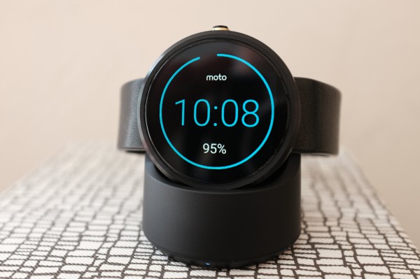
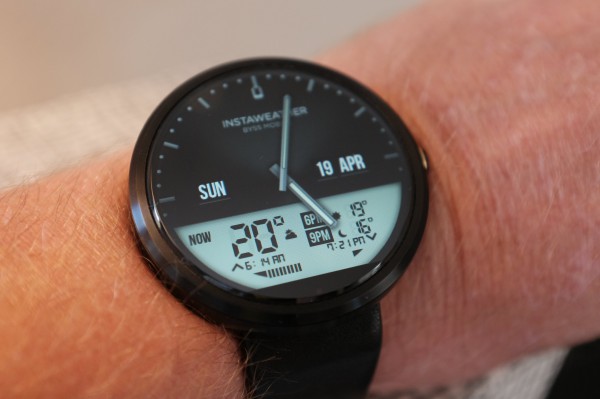
Moto 360 is handsome in an understated way; the design characteristic is a visual negative when Ambient Display Mode is turned off. The setting keeps the screen dark most of the, ah, time. Enabled, the device display dimly lights and looks more like a real watch. However, the battery drains even faster, which is reason to go dark. You can choose form or function but not both if battery life matters to you.
In an Android Wear update announced today, but not yet available for my watch, apps will stay on-screen longer. I can't yet say what the impact on battery life will be.
Moto 360 also features an ambient-light sensor, which shouldn't be confused with the Display Mode. Like most smartphones, but unlike most Android watches, the screen brightness changes depending on local conditions. The display is plenty bright and readable, even at 320 x 390 resolution and 205 pixel density.
Notify Me
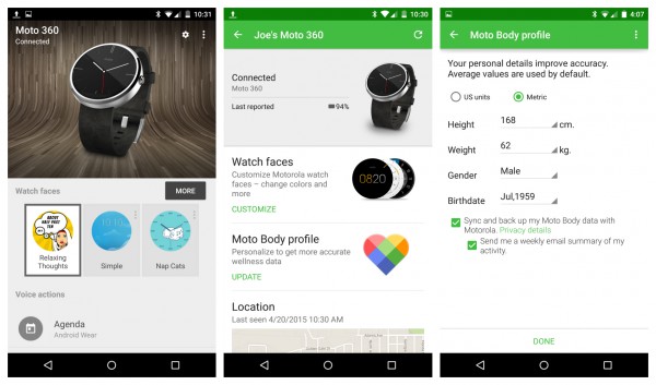
Setup is straightforward. Download the Android Wear app to your mobile and follow the prompts. You can pair one watch and smartphone together. Motorola Connect, which is a separate app for your phone, brings other benefits, like letting the user input basic height and weight data to establish a body profile. The health-monitoring features, like capturing pulse or steps walked, are for the overly obsessed; not me.
Once the devices connect, notifications appear on the timepiece, which is one of the major benefits. The more you receive, the greater the battery drain, however. If you don't want a service's notifications on the watch, turn them off on the phone. Facebook messages, Tweets, news alerts, Amazon account activity, and more will show up otherwise. You can glance, dismiss with a swipe, or dictate voice reply.
I use 2-factor authentication for most of my major online accounts, so services typically send one-use security codes via text message to my phone. Now they also come to Moto 360, eliminating the hassle of digging out the Nexus 6. The process saves time and is less disruptive to my writing workflow.
As an information companion to the smartphone, Moto 360 deserves praise. Notifications and active voice interaction are massively useful. I use my phone much less when wanting quick information. "OK Google" comes out of my mouth a couple dozen times a day, most often directed at the smartwatch.
Likes
My Android Wear watch offers many habit-changing benefits that aren't easily parted with. But they're also maddening when battery depletion diminishes, or even prevents, them. Shortlist:
1. I miss fewer phone calls or texts. At home, Nexus 6 often isn't on my person. If I am washing dishes in the kitchen, and the phone is in the bedroom, the watch let's me see what can't be heard: Ringing call or pinging message.
2. As someone who wouldn't otherwise text and drive, I now can see messages and dictate responses while in the car. Just flick my wrist to glance, swipe, and dictate.
3. The phone shows what song plays on Nexus 6, and I can pause, play, and skip. "OK Google" stops the music when I speak to the phone for other need. (You also can store and play music on the smartwatch. I don't; sold my Sony Bluetooth headphones last year.)
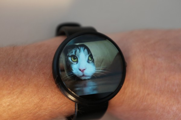
4. Voice interaction is fantastically enabling. For example, my best brain magic happens when walking. Now when inspiration arises, I can set a reminder or dictate a note with a couple commands. More: Check the weather, make an appointment, map a route, or view Google Now Cards, for starters. "OK, Google. Show me cat pictures". Yes, that, too.
5. Battery life is typically, but not always, long enough that I charge during the day, not at night—usually when removing to shower. Vendors recommending overnight charging are loony. When waking, I want to know the time or if there are important notifications; so should you. The smartwatch shouldn't be charging.
Dislikes
My two months with Moto 360 were largely positive, but Motorola, and perhaps Google with Android Wear, needs to smooth out many hiccups before a successor's release. Complaints:
1. The watch screen often doesn't light up when I flick my wrist with appropriate motion.
2. The display frequently lights up when not wanted, such as washing dishes or driving, wasting battery life.
3. Voice dictation lags, such as text-messaging replies. That can cause the wrong words to be sent when trying to re-dictate while walking or driving.
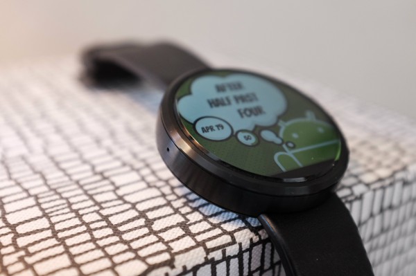
4. Watch faces are among the many benefits; customize to taste and day. But many of the most interesting ones more briskly run down the charge. As compromise, I use several of the lighter ones, such as Relaxing Thoughts.
5. If my arm rubs against the screen, the watch activates. So, if I cross my arms while standing or sitting, Google Now voice search might launch. This will stop music playing, for example. Or, if the playback screen opens, skip ahead or behind to another song.
Finally...
I strongly considered delaying this review, because of the Android Wear update that Google announced today. WiFi support diminishes phone dependence, and that's a capability Moto 360 can support.
Google also promises improved notification support and even better hands-free benefits. Circling back to smartphone fatigue, I expect it to be a greater problem for Apple Watch than Android Wear timepieces. Apple touts UI benefits that depend too much on the crown. The more you must use your hands, the less beneficial is the watch compared to a smartphone.
Both are contextual devices. The context that makes most sense for wristwear is little to no touch. Eyes and voice are the only senses that should matter. Google gets touchless interaction in ways Apple doesn't.
All that said, as long as a smartwatch is hampered from doing what it's supposed—mainly because of battery life—it's not the choice of the masses. But the benefits are life-changing, and they can frustrate for their muted potential. I wouldn't go back to a dumb watch. My cell phone is huge, and Moto 360 is more practical means of contextually consuming what matters in the moment. That is until the battery dies.
Photo Credits: Joe Wilcox

