Something you gotta know about iPhone X
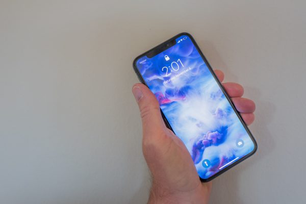
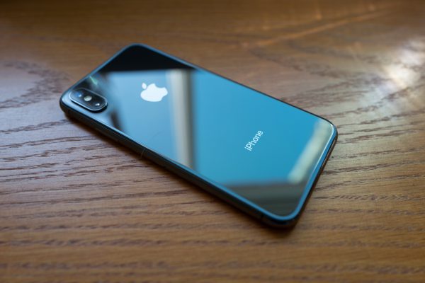
I consider myself lucky, although some commenters (you know who you are) will disagree, by successfully ordering from Verizon Wireless the iPhone X for delivery on launch day—November 3rd. A FedEx driver brought the anticipated package to my door yesterday afternoon. I hauled down to Apple Store to purchase AppleCare+ before my grubby paws caressed the steel rims (vroom) and generous glass (screen measures 5.8 inches diagonally).
Replacing iPhone 7 Plus, which features and benefits greatly satisfy, is a bit extravagant. But I wanted the X to review and for its smaller size but larger display—understanding caveats: Home button's removal changes fundamental interaction and means adapting habits (oh my aching muscle memory).
Thanks, Red
Apple officially opened preorders at 12:01 a.m. PDT on Oct. 27, 2017. I had the company store site open in a Safari tab and shop app on iPad Pro 10.5. I also logged into Verizon, where the option to purchase popped a minute (maybe more) early. I scrambled to punch through the process so as to get a X before the initial stock sold out and in hopes of receiving launch day delivery. I knew from my experience buying iPhone 6 that Verizon might not wait until the allotted time.
While the Apple Store in app and on the web wasn't yet taking orders, I had confirmation email at 12:04 a.m. for the 256GB space grey variant. I tweeted: "Ordering #iPhoneX from @verizon was so fast & easy, I keep thinking something must go wrong. I’ll breathe when payment posts to credit card". Company replied: "No worries. Easy is how it is. Let us know if you have any questions". Red didn't charge my credit card until the device shipped days later—and, with FedEx confirmation email received, I released that long-held breath of relief.
Family matters related to near-final cleaning of our old apartment kept me away from my newest tech treasure upon its arrival around 1:30 p.m. Two hours later, I arrived at Apple Store to buy extended protection and device repair warranty only to find that the cost is considerably higher for iPhone X. Cough, cough. A gag-me $199. Frak me! But the cost of not having AppleCare+ could be higher in the event a smartphone with glass front and back was dropped. I have used cell phones for 20 years and never had breakage. But never say never, eh?
(Sidebar: While shooting photos for this story, I placed iPhone X on my bicycle seat, thinking to create a classic photo. Instead, the device slid off and fell 3 feet to the wood floor. Face down! This would be the first time ever that I have dropped an iPhone. "Oh, no. Oh, no. Oh, no", I muttered picking up the device but daring not turn it over to see. Thirty seconds of angst later, suspense overwhelmed—and relief! The screen wasn't shattered, nor marred in any way. I carry my phones bareback, so there was no protective case. Talk about moments of relief.)
Simply Satisfying
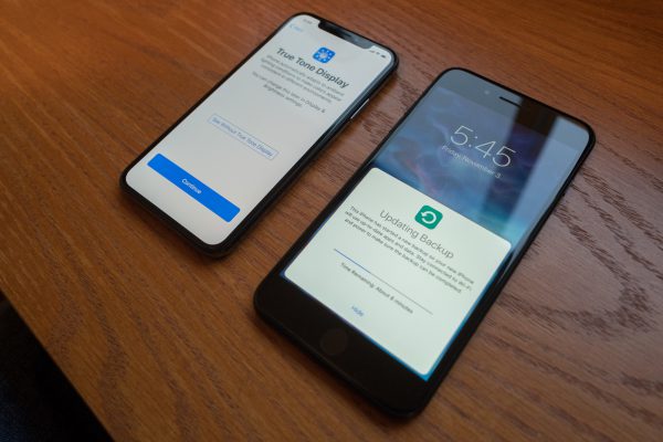
Setting up X is so easy, I had the privilege of doing it twice! Kudos to Apple for making the process uncomplicated—almost mind-reading! Setup asked if I wanted to restore from another iPhone (yep) and provided a slick sync-and-go process that would have been flawless had I not been running iOS 11.2 beta on the 7 Plus. That left me to do a partial setup, update to the same software, reset, and start over. My bad, not Apple's.
I have long harped about the importance of simple synch. For example, in my 12 year-old analysis "iPod Shuffle: Apple Understated", I explain about the design ethic behind the music player: "Apple uses its understated approach to strip away complexity, too, in virtually all its products...The synchronization process is highly understated, but in the right way that strips away complexity and so improves the user experience".
I could self-plagiarize and fill in iPhone X for iPod Shuffle and republish. I see in this smartphone the tight software-hardware integration that was the hallmark of Apple design during cofounder Steve Jobs' second coming glory days.
I would describe setting up the tenth anniversary iPhone as "remarkable" and "astonishing". Out-of-the-box experience means everything. Users should feel good about their toy. Positive emotional content bonds the buyer to his or her thing and (presumably) to the underlying brand. Apple understands the concept well, and seeing its resurgence after long absence is refreshing.
At Last!
Something else: Finally, the fruit logo company transcends the concepts that made the original iPhone and its successors innovative disrupters. Nokia invented the smartphone more than a decade before Apple released its own. Jobs and Company used various sensors to humanize the device and to make it more auto-responsive to you.
That underlying design ethic explains iPhone's growing popularity more than journalists', pundits', or tech competitors' obsession with the screen (or imitating it). Consider for how long Apple successfully sold smartphones with considerably smaller screens than competitors.
The company's Face ID is magical; fundamentally transforming. Suddenly, iPhone is remarkably responsive again. Lift the device and it unlocks. Then swipe up from where the lock screen was to go beyond notifications. Facial recognition also can auto-authenticate where password or Touch ID would be required on another device. Frak me, it's fast, seamless, and responsive.
Google barks about the artificial intelligence that will make its Assistant and search more responsive and personal. But Apple delivers intelligence now—that you can see, by how iPhone X takes the most visibly human part of you (the face) and uses it for your benefit. The execurion extends the synchronization concept from data to the UX (user experience).
What If
For all the hype about Apple innovation spanning several decades, I believe there is a strong case against Jobs' vision for the graphical user interface. Let's suppose there was no friendly GUI advanced by the original Mac and copy-catted by Microsoft for various versions of Windows. The natural evolution from command-line and text input—whether from dumb terminals or smart PCs—should have been voice.
The Star Trek universe of talking to a computing device, and it intelligently responding, could have been commonplace two decades ago. I believe that the GUI was a diversion from the path we are on in the late-2010s: touchless interaction.
Google gets this concept, and also Amazon. Apple leaped ahead with Siri, then couldn't keep up; the design ethic focused on preserving the finger/hand-input GUI. The tenth anniversary iPhone breaks away from the motif, by removing the Home button, making Siri serious replacement, and using facial recognition to make the device even more responsive.
Humph. In a strangely unexpected twist, Apple's Face ID transcends voice with speechless interaction. I use the word to describe process and surprise about it. Maybe the future of computing isn't voice after all. I can imagine a near-time when one glance tells the iPhone what you want, and the device responds—like there is some telepathic communication based on facial expression. Thinking about future applications, there is way more to Apple's approach to augmented reality than tech-industry know-it-alls understand. Hehe, face-forward.
Product with Purpose
In the past, I harped about Apple creating products without purpose and wondered if under CEO Tim Cook the company could ever achieve greatness. To get there, I argued that Apple would have to take bold risks and disrupt itself. In my early iPhone X examination, the company does both. Risk is in part the lofty pricing, following recent release of iPhone 8 and 8 Plus. Related is disruption, by taking away things users and developers are accustomed to (like the Home button) and compelling them to develop new habits (or software, in the case of devs).
The new smartphone also steps down in a way that is too necessary: Size. For years I have griped about these thangs getting to be too big. Jobs shook up the music player market with diminutive iPod nano in autumn 2005. The stick-of-gum-size media device replaced the company's Mini at the height of its popularity. The move was risky and bold.
I feel similarly about the risk and boldness behind the X and also diminished size while making the screen bigger. The smartphone is 143.6 x 70.9 x 7.7 mm (5.65 x 2.79 x 3 inches) and weighs 174 grams (6.14 ounces). That's but a little larger than 138.4 x 67.3 x 7.3 mm (5.45 x 2.65 x .29 inches), which screen is considerably smaller (4.7 inches vs 5.8 inches) and lower resolution (1334 by 750 at 321 pixels per inch vs 2436 by 1125 at 458 ppi).
If Apple can make future iPhones even more responsive with limited, active interaction, why shouldn't size be smaller still?
Principles of Design
A decade ago, I developed Principles of Good Design, for which there are now eight. Successful products must:
1. Hide complexity
2. Emphasize simplicity
3. Make users feel happy
4. Build on what is familiar
5. Imbue human-like qualities
6. Do what it’s supposed to really well
7. Allow people to do something they wished they could do but couldn’t
8. When displacing something else, offer significantly better user experience
The original iPhone easily fulfilled all eight principles, and, unless something dramatic occurs during my testing, I must say same abour the X. The last point of the eight is weakest-fulfilled but still met if the thing being replaced is the large smartphone and bringing its core benefits (and additional ones) into smaller, sleeker form factor.
Wrapping up, my first impression is nothing less than "WOW!" But there is much testing ahead, and we'll see how I feel about iPhone X after a month of use.
Photo Credits: Joe Wilcox


