Google Drive gets a major redesign to match the look of the new Gmail
Following on from the redesign of Gmail, Google has start to roll out a new interface to Google Drive. The new user interface can be found on the web version of the cloud storage service, but it's likely that mobile apps will follow suit.
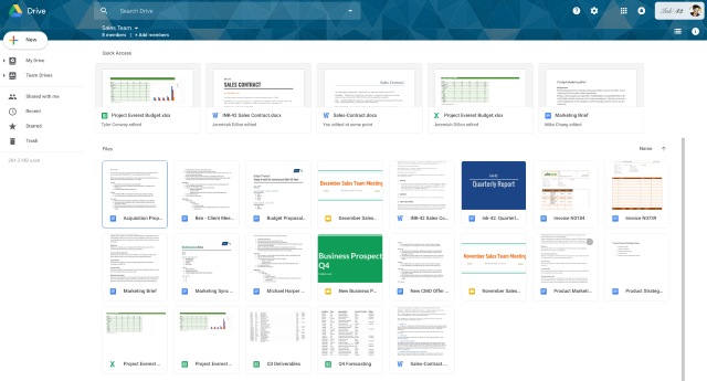
Google hasn't made much of a fuss about this redesign, but keeping things in line with other G Suite products makes a lot of sense. The redesign sees the arrival of an updated material look.
See also:
- Gmail's new 'Smart Compose' feature writes replies for you
- Google rolls out massive Gmail redesign -- here's what's new and how to access it
- Upcoming Gmail redesign will also herald the arrival of self-destructing emails
The company points out that this is just a series of aesthetic changes -- there are no new features. Over on the G Suite blog, Google says: "We're making some updates to the look and feel of Google Drive on the web. There's no change in functionality, but some icons and buttons have moved, and there's a range of visual tweaks to align with Google's latest material design principles. We built that this new interface to create a responsive and efficient experience for Drive users, and to feel cohesive with other G Suite products, such as the recently redesigned Gmail."
Google shares details about the specific changes that Google Drive users can expect to see:
- The logo in the top left has been changed to the Google Drive logo.
- If you've added a custom company logo, it is now in the top right.
- The Settings icon has been moved in line with the search bar.
- The Help Center icon has been moved in line with the search bar.
- The page background is now white, not gray.
- The "New" button has been updated.
- The font used for headers has been changed.
The roll out is underway now, but you may have to wait a day or two for it to hit your account.