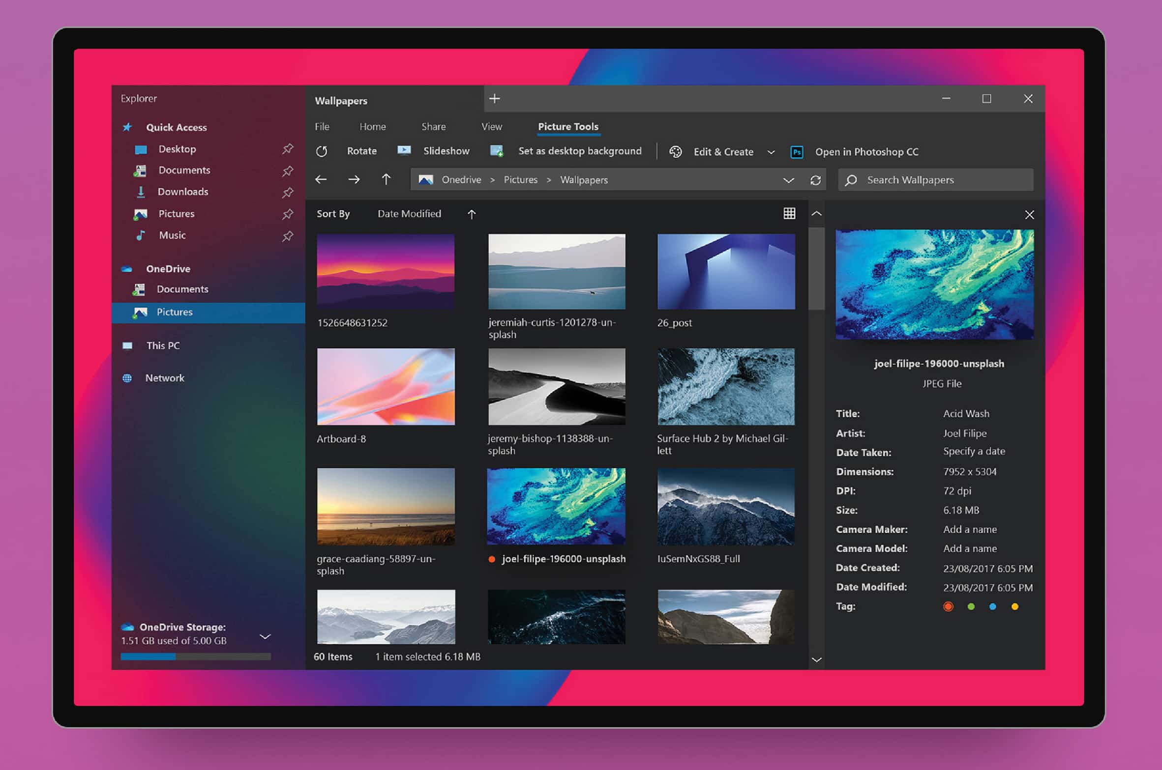
This is the redesigned File Explorer that Windows 10 should have

Windows 10 is a decent operating system, but it’s not exactly attractive. Microsoft is attempting to spice things up a little with its Fluent Design language, but it’s never going to deliver the "Wow" factor.
File Explorer is one of the blander elements of Windows 10, but a brand new concept shows us what it could look like.
SEE ALSO:
- This redesigned Windows 10 Start menu is a big improvement
- Forget buggy Windows 10, Windows 11 is the operating system we want
- Windows 7 -- 2018 Edition is the Microsoft operating system you've been waiting for
- Would you swap Windows 10 for Windows 95 -- 2018 Edition?
- Windows XP 2018 Edition is the operating system Microsoft should be making
From Cage Ata, who recently brought us his re-imagined Start menu, comes this modern twist on File Manager.
He explains: "Leaving the past behind and adopting a new design language is not always easy. With each feature update, Microsoft has inched closer and closer to harmonizing Windows 10’s UI while putting other areas on the back burner. File Explorer has not had a drastic change for quite some time. With the implementation of Fluent Design making its way across the OS, this more modern design leaves File Explorer looking rather dated."
Cage also says: "It’s time for this design to go the way of Clippy. Users want a fast, reliable and familiar setup that is uncompromising and beautiful, fluent yet not overbearing. It should be a new canvas built upon a familiar setup. An Explorer that any end user can use with an ease that doesn’t ostracize power users. Supporting new form factors and touch enabled devices is just as important as a mouse and keyboard. From flexible screens to pocketable devices, File Explorer’s input should adapt to the device being used."
You can view his work in the image below. Let me know in the comments below what you think of it.

