This redesigned Windows 10 Start menu is a big improvement
The next big feature update for Windows 10 will offer tweaked visuals, but most people probably won’t notice the difference. It’s all about evolution rather than revolution with Microsoft these days.
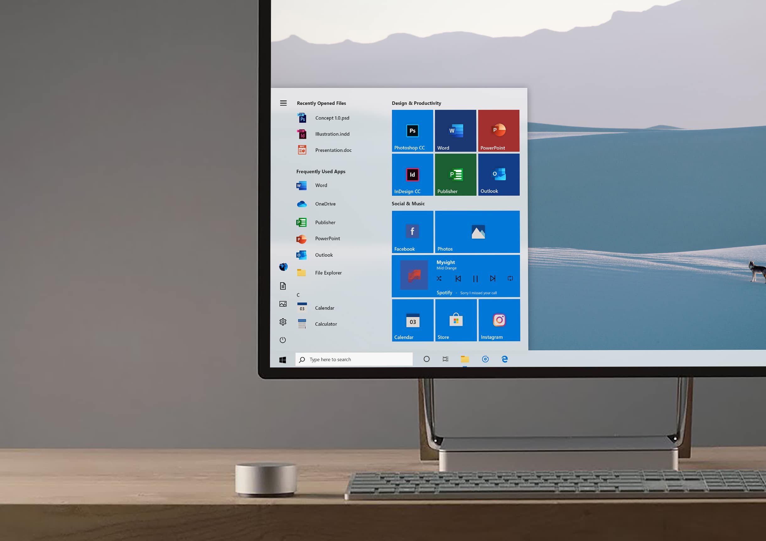
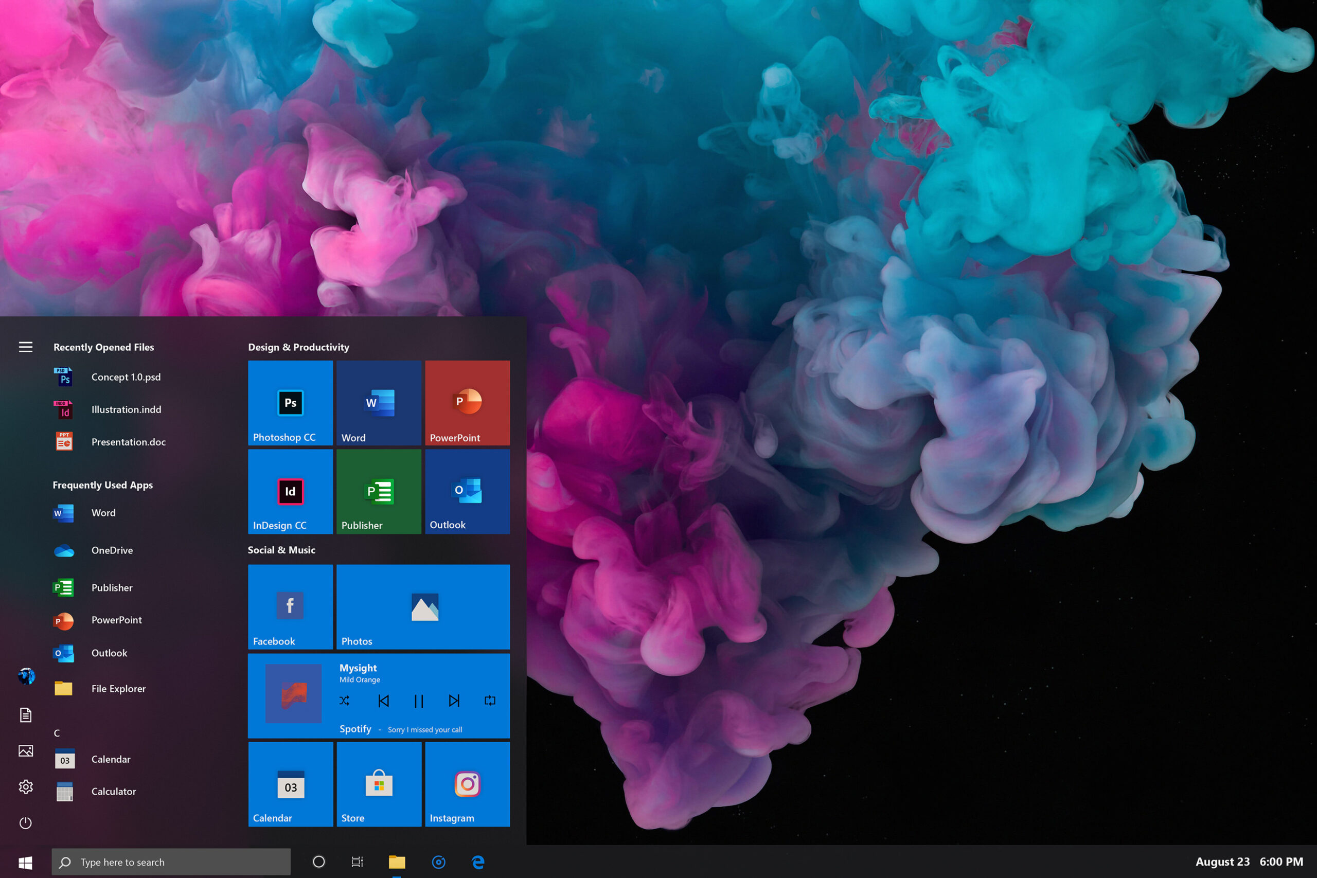
If you are hoping for a more modern Start menu then you’re going to have to look beyond Redmond for that, and a brand new concept shows us just what the tiled menu could look like.
SEE ALSO:
- Forget buggy Windows 10, Windows 11 is the operating system we want
- Windows 7 -- 2018 Edition is the Microsoft operating system you've been waiting for
- Would you swap Windows 10 for Windows 95 -- 2018 Edition?
- Windows XP 2018 Edition is the operating system Microsoft should be making
Like the recent concept videos from Avdan (Windows 10 -- 1990s Edition, Windows 11 and more), Cage Ata’s re-imagined Start menu offers a more modern twist on the current design.
The creator explains: "This year Microsoft is set to bring a redesign to many of the native Windows 10 app icons. Before this transition, I wanted to create a mock-up of what the new system set would look like. I sourced direct inspiration from the Office 2019 promotional video along with a few new ideas and fan favorites".
Improvements go beyond the new icons though, with subtle shadows and a bolder font choice. There’s also Light and Dark modes on offer.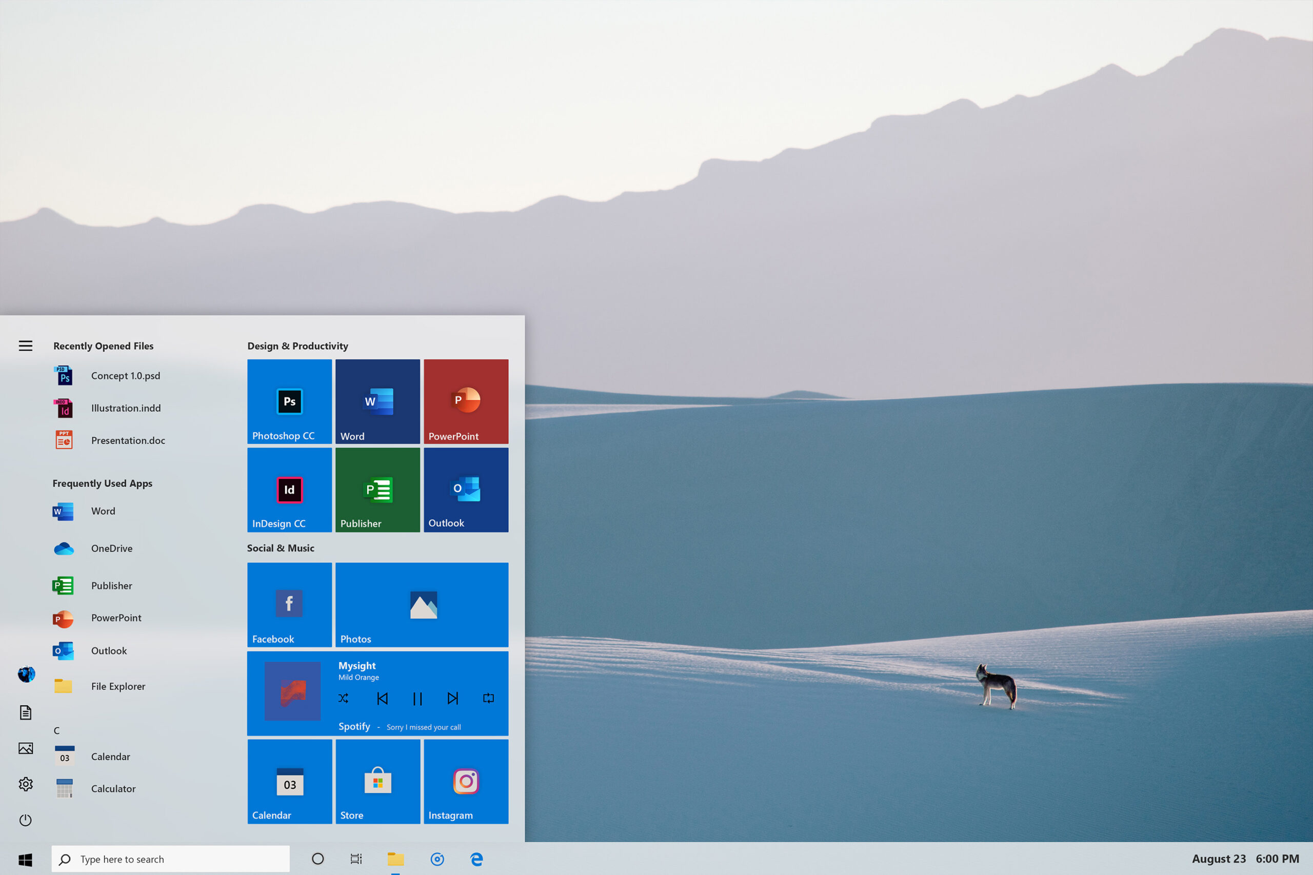
You can see more of the concept here. What do you think of it?