Hey Google! This is the modern YouTube we need

YouTube has never had the best layout. Despite going through numerous design changes over the years it’s always looked a bit of a muddle, and unearthing great content to watch has never been as easy as it should be.
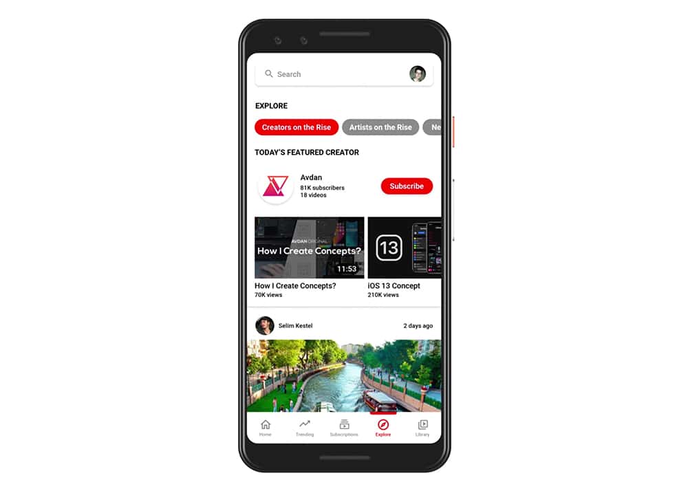
What Google’s video site has needed for quite some time now is a fresh take to bring it more in line with its newer rivals, like Instagram and TikTok. Something like this.
Serial concept creator Avdan has produced new designs for iOS 13, Windows 11, and Windows 7, to name but a few, and now he turns his sights to YouTube.
SEE ALSO:
- Feast your eyes on how Apple's iOS 13 should look
- Forget buggy Windows 10, Windows 11 is the operating system we want
- Windows 7 -- 2018 Edition is the Microsoft operating system you've been waiting for
- Forget Windows 10, it's Windows Vista -- 2018 Edition we want!
- Windows XP 2018 Edition is the operating system Microsoft should be making
- Would you swap Windows 10 for Windows 95 -- 2018 Edition?
His updated design -- which also serves (unsurprisingly) as something of an advert for Avdan’s own channel -- brings the "you" back to YouTube and also restores the old "Broadcast yourself" tagline. It offers smart ways to browse creators, and discover YouTubers you haven’t heard of previously via a new Explore tab.
There’s an all-new Trending tab too, which lets you view just what you want to see.
Avdan also imagines the comment section supporting images, videos and GIFs, but that’s definitely not a wise move. As one of the commenters of his video observes: "You just know that every comment section would have swastikas, a shock image and that one guy promoting his channel in there when he has like 4 subs".
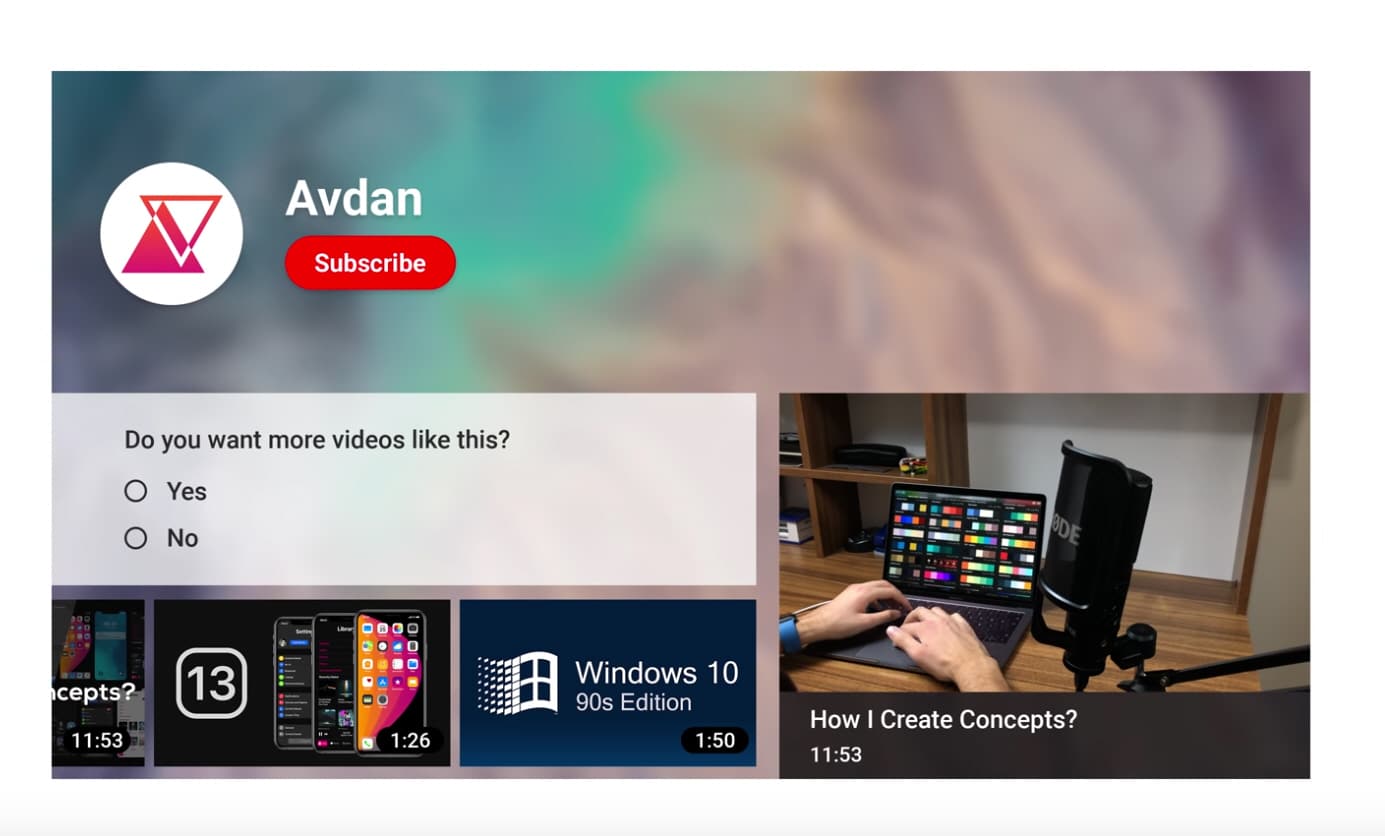
The concept additionally shows off nice Dark and Really Dark themes, and new end screens, like the one below.
The addition of a Watch Later playlist on the Home tab is definitely something we’d like to see Google adapt.
You can watch Avdan’s new YouTube concept below.
Share your thoughts on it in the comments.
