Hey Apple, this is how iOS 14 should look
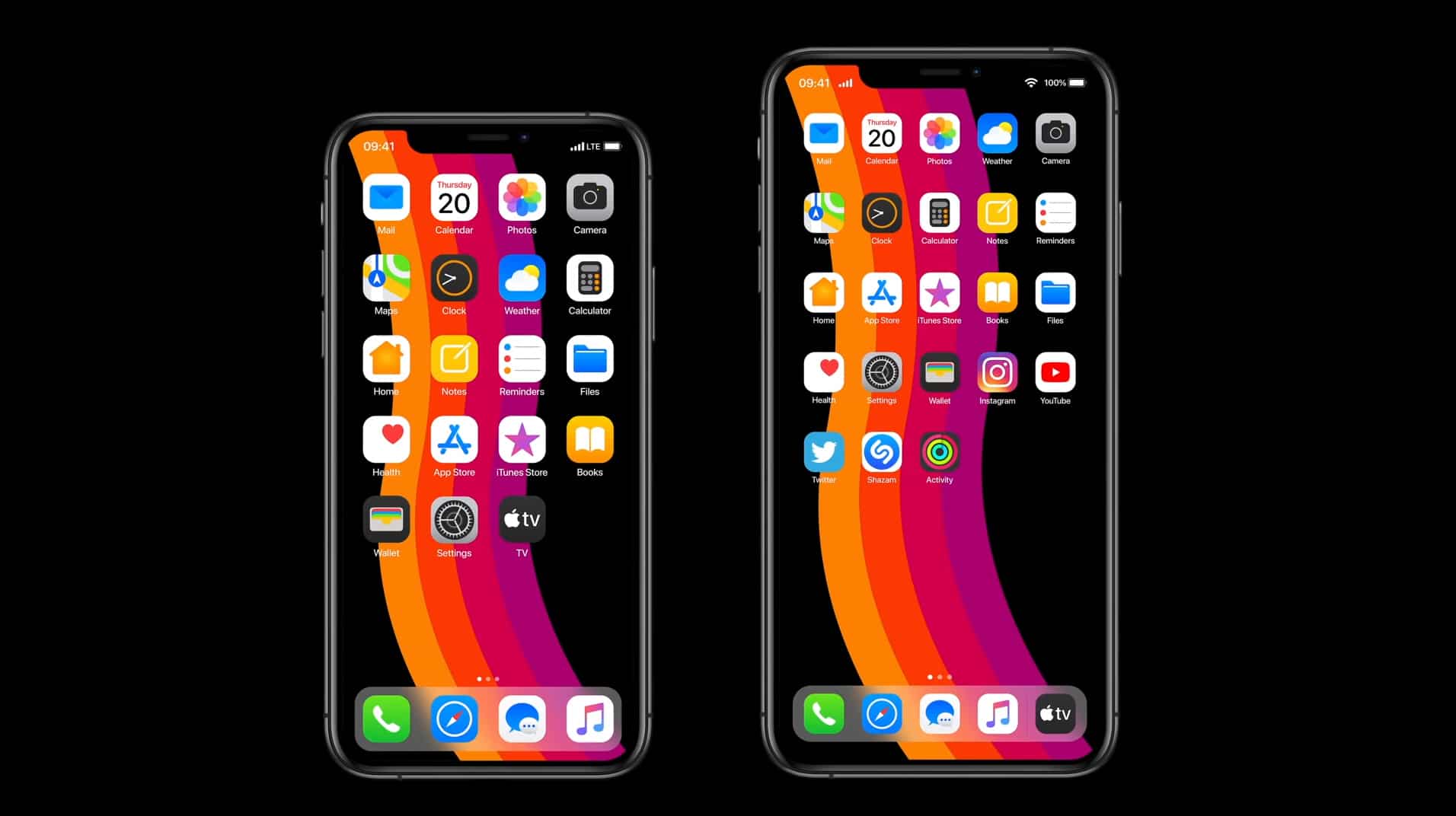
Last June, as its WWDC in San Jose, California, Apple took the wraps off iOS 13, revealing many of the new features we were expecting see, as well as plenty of new additions we weren't. The standouts included a system-wide dark mode, better multitasking, advanced Photo and Camera features, the ability to securely sign into apps using Sign In with Apple, and an all-new Maps experience.
It will be a few months yet until we see what Apple has planned for iOS 14, but if you want a glimpse what the OS should look like we’ve got this stunning video to wow you. It takes everything we like about iOS 13, but improves on it significantly.
This concept video comes from YouTuber Kamer Kaan Avdan, who has previously created similar videos for updated versions of Windows 11, Apple’s Windows 10 (no that’s not a typo!), macOS Ventura, and Windows XP.
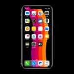
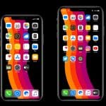
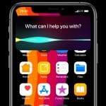
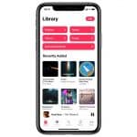
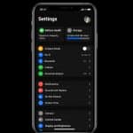
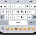
In his vision of iOS 14, Avdan gives us a redesigned the home screen with new icons and a tighter grid layout. He’s added seamless interactions, the ability to set your own default apps, and an improved Settings app with the option to pin favorite actions to the top. His updated keyboard includes an emoji bar, and he’s redesigned Apple Music for good measure too.
Watch the video below and tell us what you think of his iOS 14 concept.
Do you prefer it to iOS 13?
