
Microsoft is giving its icons a sleek and smooth makeover
Microsoft has officially announced a subtle revamp of its Microsoft 365 icons. Taking something of a cue from Google, the redesign is subtle and sees a switch towards using gradients and flowing colors.
The update is the first for Office icons since 2018, and this latest change is a gentle revisiting and dialling up of the changes that were introduced then. This is not a rebrand or a major change, but a pleasing evolution.
Google makes its new gradient G logo company-wide
It is a little while since Google first started to use an updated version of its colorful G logo. The design revamp saw the company moving away from the four colored blocks of color towards something with more flow.
The graduated look of the G was introduced with little in the way of fanfare, and quite what Google had planned was not clear. Now, having seemingly tested the waters by trying out the new look in a limited number of places, the company is ready to use it more extensively.
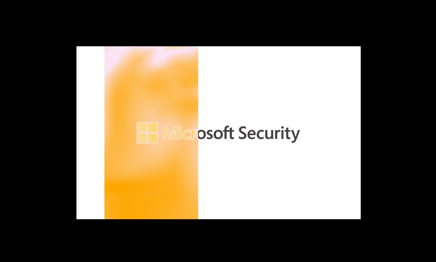
Microsoft Security gets a style upgrade that goes beyond the surface to embrace the human
Padlocks, chains, keys, shields: these are all stereotypical images used to represent security. They are also the themes -- tropes, if you will -- that have been avoided in an eye-catching and vibrant rebranding for Microsoft Security.
A team at Koto -- a creative studio also behind design projects for Amazon, Riot Games, FitBit, WhatsApp, and more -- is responsible for a bold new brand identity that sidesteps the obvious. Instead, the new look that is bold yet human, clear and confident.
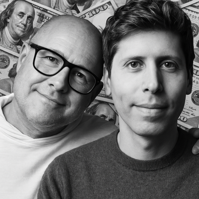
OpenAI spends billions to buy Jony Ive's io as Sam Altman bets big on design-led future
OpenAI is officially buying Jony Ive’s hardware startup, io, for more than $6 billion. Yes, you read that right. The folks behind ChatGPT are now writing checks to bring legendary design talent and a brand-new product lab into their orbit.
Sam Altman and Jony Ive have apparently been quietly plotting this partnership for years, according to their announcement. What started as casual brainstorming and a bit of creative daydreaming apparently turned into “tangible designs” that both parties think could change the way we interact with computers.
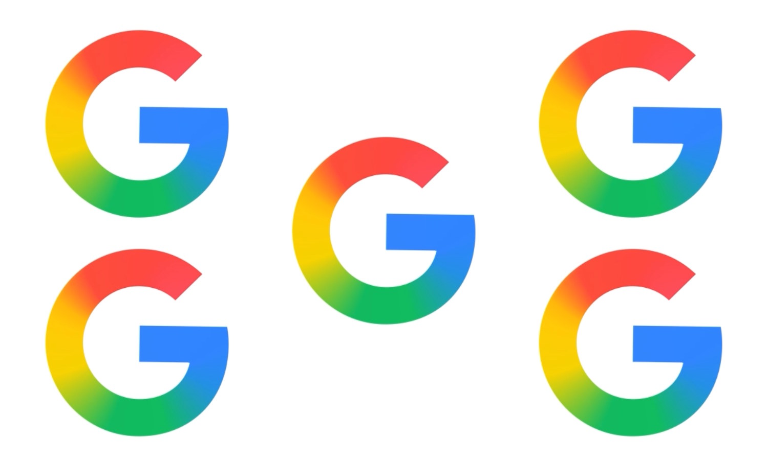
Paint the whole world with a rainbow: Google rolls out new icon design
The Google logo is iconic -- as, indeed, are its icons. Every so often, though, there is an update, a refresh… normally to great fanfare.
But this time around things are a little different. Google has very quietly rolled out a new icon for its search app and has made no fuss about it at all. All of the familiar design aspects are present, but now there is a rainbow gradient.
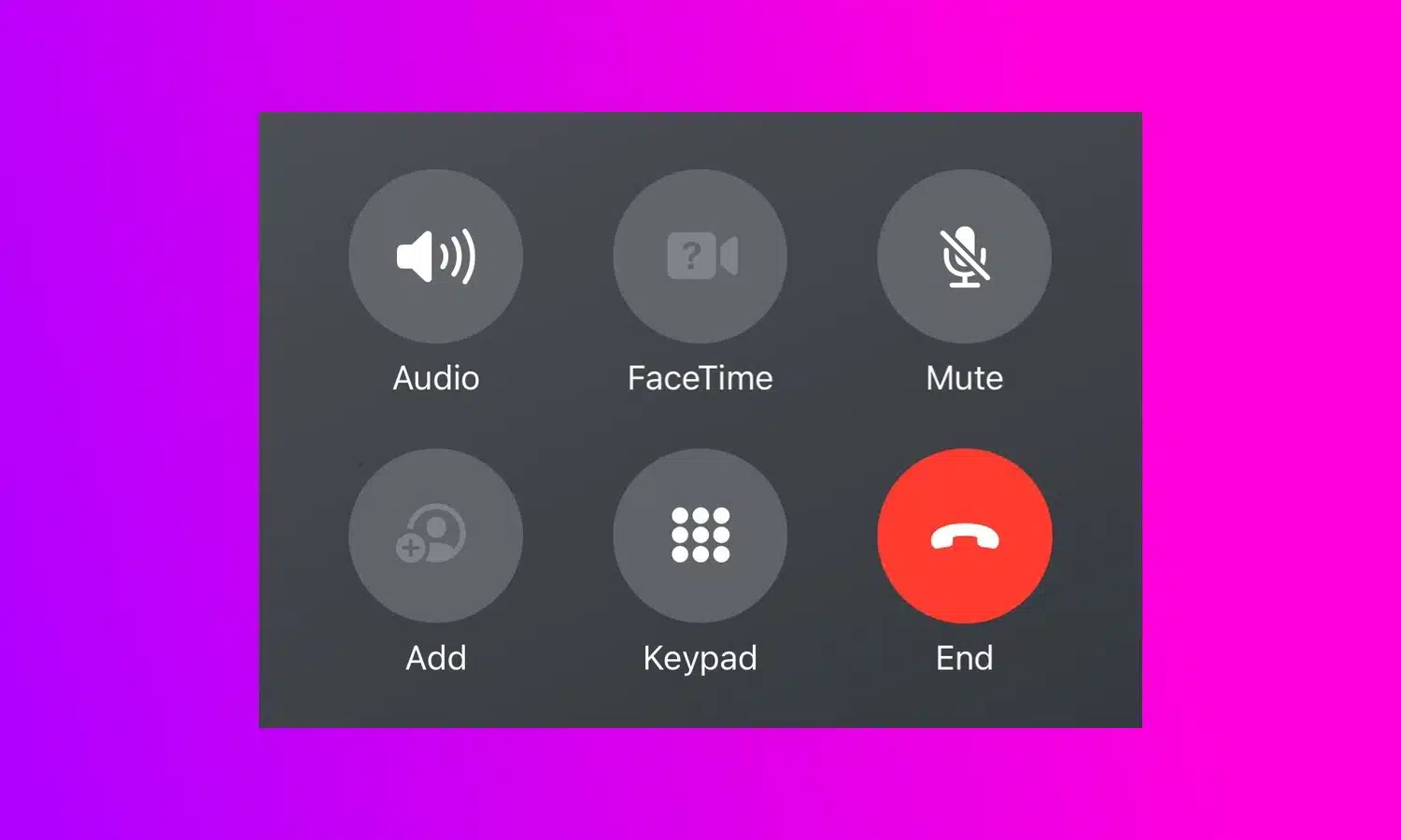
People are mad at Apple for a crazy change to the End Call button in iOS 17
Change is often divisive, and with a UI tweak in iOS 17 Apple is certainly dividing opinion. In the latest beta version of the iPhone operating system, the company has made the decision to move the End Call button.
Shifting the button from the center of the screen -- where it has resided for many, many years -- is causing confusion and wails of discontent from beta testers. Having becomes use to the button being in a central position for well over a decade, users are complaining that the new location is a problem for muscle memory.
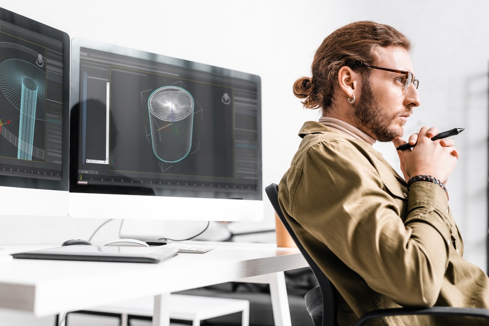
How next-generation remote desktops are giving power users more flexibility [Q&A]
Driven by the pandemic, remote work has been normalized in many offices. But while it works for many tasks it's not so useful for power users.
Think architects, 3D developers, game developers and designers who rely on high-powered computing to get their jobs done. They can't easily take a $50,000 workstation home to do their work.
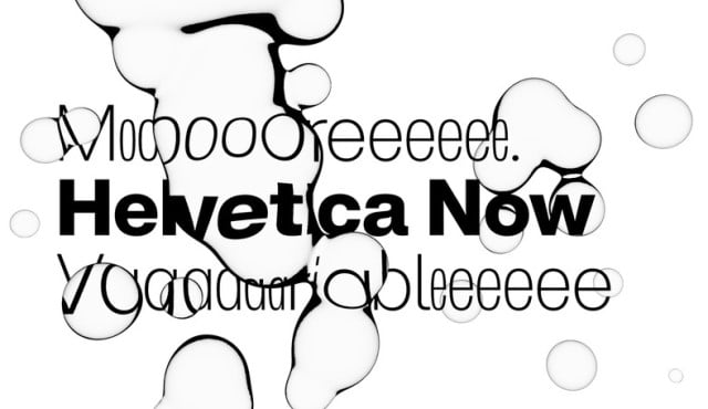
Helvetica Now Variable could be the most flexible font in the world -- over a million styles to choose from
In the design world, Helvetica reigns supreme. The font can be seen everywhere from brand logos and advertising to signage and print, its ubiquity stemming from its incredible versatility.
2019 saw an update to the font in the form of Helvetica Now, and it has been updated once again to create Helvetica Now Variable, the most versatile take on the classic font. Designers can fully express themselves typographically thanks to the fact that the latest iteration offers more than a million new Helvetica styles in one font file.
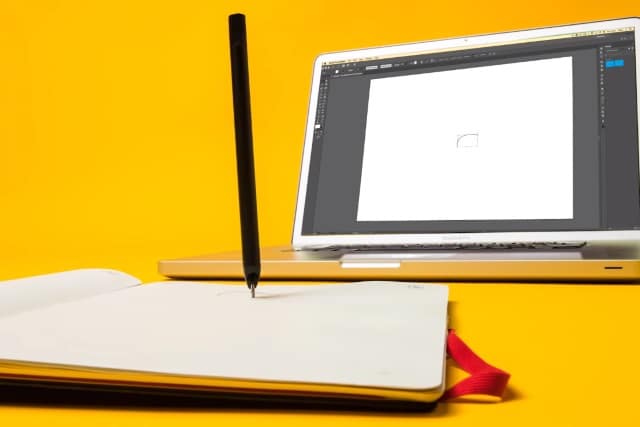
Moleskine teams up with Adobe to create a smart notebook: the Moleskine Paper Tablet Creative Cloud Connected edition
Moleskine is a name to be reckoned with. Its paper notebooks have been used by writers, poets and artists for years, and it's a brand that has a dedicated following.
Now, having previously worked with Adobe to blur the boundaries between digital and analog writing and drawing, Moleskine has once again joined forced with the Photoshop-maker. The outcome of this latest partnership is the Moleskine Paper Tablet Creative Cloud Connected edition, a smart notebook that works with Adobe Illustrator in conjunction with the Moleskine Pen+ Ellipse optical pen.
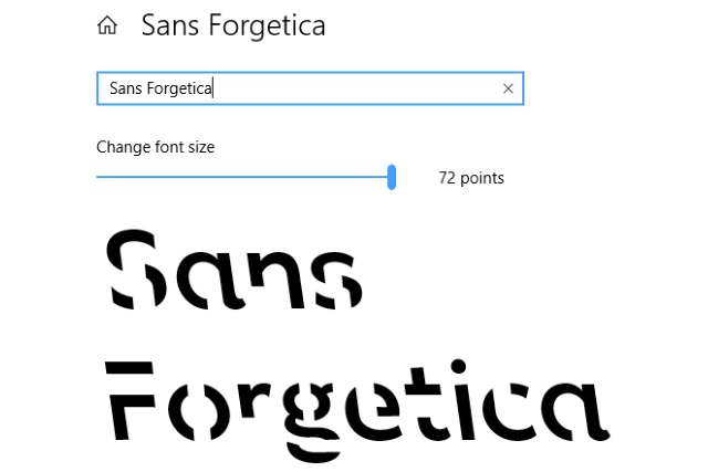
Sans Forgetica: the font that could help you remember
Researchers from Australia's RMIT University have created a font which they say could help you to retain more data.
Sans Forgetica is the result of work involving typographic design specialists and psychologists, and it has been designed specifically to make it easier to remember written information. The font has purposefully been made slightly difficult to read, using a reverse slant and gaps in letters to exploit the "desirable difficulty" as a memory aid.
Shutterstock's creative trends report: The design direction and aesthetics of 2018
Every year, Shutterstock customers across the world make billions of searches for images, footage, and music. Our data and creative teams analyze this search and download information to discover the biggest year-over-year increases. The information gathered, plus expert knowledge from our content, design, video, and music teams, forms the creative trends series which identifies and predicts the trends for the upcoming year.
This year, we selected a "trend to watch," a style we predicted would explode onto the design scene in more ways than one: Holographic Foil. The holographic trend has notes of the ‘80s, a dash of sci-fi, and a hint of nostalgia. Up 435 percent in searches, holographic’s chameleon palette of shimmering colors has been a trend to watch, even finding its way to the catwalk at Paris Fashion Week; Iridescent designs were showcased by Maison Margiela models walking down the runway in prismatic looks accompanied with iridescent lips.