What 1984 Macintosh marketing reveals about iPad
The strangest of role reversals is occurring right now as Apple prepares to release iPad on Saturday. In 1984, Apple needed the media and publishers to promote Macintosh. Twenty-six years later, the media and publishers need -- or seem to think they do -- Apple and iPad. How strange is that?
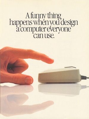
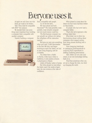
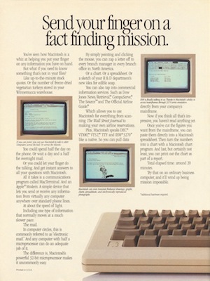
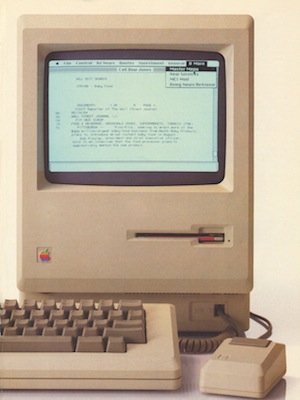
Apple's "1984" Super Bowl commercial is legendary advertising. The commercial aired just once on TV, although it lives online in its original form and in many spoofs. But Apple's Macintosh promotion didn't stop there. For example, Apple purchased all the ad space -- 39 pages -- in the Newsweek 1984 election issue. The Graphical User Interface Gallery has scanned and preserved all 39 pages of ads.
Apple needed the big media splash to launch Macintosh. How strange that with their fortunes waning, it's big media coming to Apple, hoping that iPad can revive failing print business models. New York Times has an iPad app and Condé Nast reportedly plans to offer six magazines -- Vanity Fair and Wired among them -- on Apple's tablet.
According to March 24 Wall Street Journal story "Magazines Use the iPad as Their New Barker": "Time magazine has signed up Unilever, Toyota Motor, Fidelity Investments and at least three others for marketing agreements priced at about $200,000 apiece for a single ad spot in each of the first eight issues of the magazine's iPad edition, according to people familiar with the matter."
The Journal, which will offer an iPad app for a $17.99 monthly subscription, also is signing up advertisers -- six of which have agreed to a $400,000 four-month ad package. "Magazine publishers see the device as crucial to their future as they scour for new ways to make money, with print advertising still under threat," write WSJ reporters Shira Ovide and Suzanne Vranica.


Strange Destinies
While their destinies may once again intertwine, Apple and the media and publishers pursue different paths. Apple is attempting something new, while publishers are doing the same `ol thing. Macintosh was a revolutionary product in its day, as the company hopes iPad will be. Before some smoke-pouring-from-the-ears Betanews commenter can write it, I'll acknowledge that the slate computer isn't a new concept, which also can be claimed of the Macintosh in 1984. But, like Macintosh, with iPad Apple is greatly trying to improve the user interface and user experience (UX).
By comparison, publishers are really trying to apply the print motif they know to a digital medium. The print layout motif hasn't paid off so well on the Web, but clearly -- based on prototypes demoed or leaked -- old media and publishers hope to take the familiar and marginally improve it for iPad.
It's the only sense I can make of so many publishers committing so much to an untried, unreleased, uncertain product. They know print page layouts, which they can replicate and even improve on a device like iPad. Apple's slate fits publishers' comfort zone, which would be the wrong reason for supporting iPad.


In late-January Advertising Age post "Is the IPad Publishing's Savior? Pro and Con," Hill Holliday's Ilya Vedrashko expressed:
This sums up about how I feel about the argument that iPad will single-handedly save traditional periodicals. It's not enough for the publishers to be thrown a life raft; they will also have to figure out how to last for days without water and how to avoid getting eaten by the sharks (or by each other, for that matter).
What makes publishers so sure they can do better offering the same motif and means of selling and qualifying ad space? At least on the Web, publishers have tools for analyzing ad reach and effectiveness.
Apple stays the Marketing Course
I've chided the media and publishers for not adapting -- for trying to largely keep but marginally improve the old page-layout motif. Strangely, Apple deserves praise for staying the course somewhere else: Marketing. Macintosh and iPad marketing share a similar aspirational quality. Aspirational marketing defines iPad as much as it did Macintosh 26 years ago. Some comparisons:
1) Macintosh: "Despite all the amazing technology and engineering genius we've put into Macintosh, the most impressive thing just might be what you can get out of it: Magic."
iPad: "A magical and revolutionary product at an unbelievable price."
2) Macintosh: "A funny thing happens when you design a computer everyone can use. Everyone uses it."
iPad: "It's going to change the way we do the things we do everyday."
3) Macintosh: "If you can point, you can use Macintosh, too."
iPad: "I don't have to change myself to fit the product. It fits me."
On second thought, maybe Apple hasn't changed approach that much. Based on original Macintosh and iPad advertising, several UX themes are observable: Magic, simplicity, finger-usage and creativity. If the media and publishers can incorporate some of these concepts into their content apps, perhaps there is hope for them yet. Perhaps.
[Magazine Ad Scanning Credits: Graphical User Interface Gallery]
