Tumblr for Android smokes iOS version
 The official Tumblr app was a late-comer to Android, and, sigh, hasn't kept pace in the years since. That's all changed. Today's update simply puts the iOS version to shame. Surely this lead can't last.
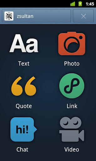
Tumblr for Android has a spiffy new user interface, which look and feel -- including post-type icons -- is more like the social network. The revamped UI is the real deal; well close to it. The app is speedier, and that includes photo browsing as well as loading blogs and posting to them. By comparison, Tumblr for iOS looks ugly and lacking. Access to Tumblr Radar from the Android app rocks. Still there are omissions that favor Tumblr for iOS, such as audio uploads. I'm surprised this feature isn't available on the Android app (Wasn't it once?).
"Its very rare for me to say that an app is sexy", jozefd14 comments on the Google Play product page. "This is truly an awesome update. Hopefully iPhone/iPod Touch update will look like this. Its very nice to the eyes". The Android user has HTC myTouch 4G.
Brett, who uses Droid Bionic: "A really good update for the app. Things are better, and I can actually open the photos on ny dashboard to get a better look. I just wish I could go through all of my 'liked' posts, because it seems I'm limited to a certain amount. I see the three periods at the end, so does it mean I have to stop there?"
Lee, who uses HTC Thunderbolt, offers more mixed reaction: "Love the new UI. Really well done. This app was just terrible before, definitely usable now! Problem: logs me out a lot and says its unable to reach the network. Really annoying!"
I must admit to rarely using Tumblr for Android, having likewise found previous versions deficient. But the update is promising.
Earlier today, I explained that for this week I'm putting away the RSS reader and using social media to ferret out the news. Thanks to software developer Aaron Burrell, whose post alerted me to Tumblr for Android -- something that likely wouldn't have popped up in Google Reader.