Suddenly, Facebook looks more like Google+, only better

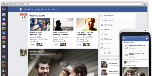
Today, the world's largest social network announced a sweeping overhaul to major UI motif News Feed. Photos are bolder -- as are advertisements -- and white space more generous. But the big change is uniformity, as Facebook offers a fairly consistent visual experience across devices. That's a claim Google can't make.
Still, Facebook looks lots more like Google+ -- or will once changes roll out to everyone. That's a good thing. Clutter creep long defines the Facebook user experience, something its rival avoids. Well, so far. But the larger social network isn't copying Google+ so much as acting out of necessity. All that clutter in the browser overwhelms smaller device screens, particularly smartphones. To get similar UI across devices, something had to go -- and come, too.
Four for One
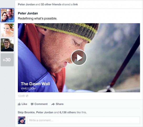
Puffier photos will matter more on smartphone or tablet and in ways more meaningful, engaging friends, family and coworkers on the go. Presentation of other content, such as events, maps and news, is bolder, too. Emphasis on what matters most, what engages users, is smart focus, and where Facebook tried and failed before -- well, if clutter measures misery.
To give up clutter, Facebook increases complexity, which isn't necessarily a bad thing. There are four new News Feeds:
- All Friends is self-explanatory -- everything friends share
- Following serves up news from Liked pages and followed Friends
- Music is part of Facebook's push to become what MySpace once was to artists
- Photos feeds pics from Liked pages and, obviously, those that Friends will share
More News Feeds increases complexity, while also breaking up the flow of information. Google+ is more flexible by letting users create Circles of people that matter to them. Facebook takes tighter control for many reasons. Among them:
- Familiarity. People are used to News Feed. Something like Google+ Circles would be too radical for many users.
- Platform. Presumably, the social network would need to make radical back-end changes to offer an even more-flexible News Feed.
- Advertising. Facebook ads tend to be highly contextual based on user activity. The different categories, but Music and Photos particularly, are easily curated for marketing purposes.
One for All
Uniformity, and less clutter with it, is the big thing here -- and not just to the 1-billion-plus users. Facebook wants to increase advertising revenues. Less clutter distracts from ads and uniformity makes placing and selling them much easier across platforms. Facebook doesn't want to sell ads that appear just in desktop browsers, particularly as mobiles' use grow.
Late last month, Facebook ended weeks of rumors by formally announcing acquiring Atlas Solutions from Microsoft. The social network plans to bolster ad management services for desktop and mobile, but the latter is an increasing priority -- and for good reason.
During fourth quarter, Facebook reported 680 million mobile monthly active users, exceeding those on the desktop for the first time. That's stunning 57-percent year-over-year increase, by the way. Mobile ad revenue rose to 23 percent of all advertising, up from 14 percent in third quarter.
The eyeballs Facebook wants to reach most increasingly look to mobile devices. From the perspective of where users want to be and where the ads need to be to reach them, uniform motif across devices is the right approach. Some investors agree. In late-day trading, Facebook shares are up more than 4 percent to $28.64.

Many Stories
Something else: During today's announcement, CEO Mark Zuckerberg referred to the revamped Facebook as a "personalized newspaper", with the users and their friends essentially the publishers. What would a newspaper be without advertising? The social network will provide plenty.
Interestingly, Google, which depends on advertising for the bulk of revenue, does nothing really to monetize its social network. Google+ isn't anywhere as uniform across devices, nor are uncurated Circles as effective storytelling. Facebook's redesign is all about telling stories -- the people that matter most to you.
The two social networks now both use strong card-like motifs -- Google+ even more so after design tweaks introduced yesterday. But based on Facebook demos, I see a much more contextual experience that's visually more appealing -- and accessible. Whether or not the storytelling is compelling depends on many factors -- and how the News Feeds work in practice, rather than just demo, is high among them. At first blush, I'm impressed.
Facebook plans on rolling out the changes over many weeks. You can sign up for the waitlist here.
