Outlook on the web gets a new look, name, and tools to improve efficiency

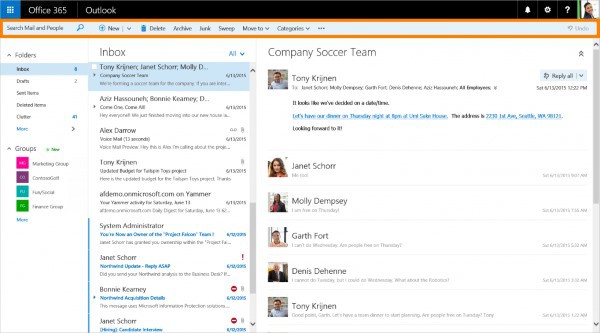
Microsoft today announces a number of changes to the online version of Outlook. One of the biggest updates sees the rollout of a new, cleaner interface which Microsoft says helps to improve efficiency. In addition to aesthetic alterations, there are also a number of new tools that make it easier to manage an inbox.
There is also something of a rebranding taking place. The Outlook Web App (OWA) is no more; say hello to Outlook on the web. The new name is a minor change, however. The big news today are the visual and productivity updates.
A new 'action bar' is visible in the Mail, Calendar, People and Task sections of Outlook on the web, providing easy access to common commands no matter where you are. A UI revamp makes content easier to read, and makes it quicker and easier to get around. Outlook is primarily about email, so it should come as no surprise that there have been a large number of changes to the inbox side of things. A new pinning option makes it possible to keep important messages at the top of your inbox, while Sweep makes it simple to collect together messages from particular senders.
Improvements have been made to the mobile version of Outlook on the web, and the calendar also benefits from a number of tweaks and changes. Many of the changes that have been made are a results of feedback from users and today Microsoft also announced a new way to provide feedback. Outlook UserVoice now includes an Outlook on the web forum, and this can be accessed by clicking the gear icon and selecting Feedback.
While the update rollout starts today, it will first come to users with Office 365 plans that include Exchange Online and have opted into the First Release program. Everyone else can expect to see the update from the first week of September.
