Adobe launches its latest test of Buzzword online WP
The viability of AIR as an application platform is only becoming more clear with today's revamp of Buzzword, Adobe's online word processor, now part of Acrobat.com. BetaNews spent some more time with Buzzword this morning and afternoon.
Buzzword does not feel like an online app. Typically, when one thinks of running applications in his Web browser, a decade of experience has already taught him to expect to type his data into postage stamp-sized controls, click on Submit, and wait a few hours. Buzzword flies in the face of that expectation by delivering a snappy, well-presented, original front end that doesn't take a month to learn.
That said, it's still somewhat experimental. In the way you might expect a mobile hospital or a remote television studio to not have all the bells and whistles of the stationary version, Buzzword still feels oddly like the "home game," still more of a proof-of-concept of the underlying AIR platform than a stand-alone application upon which one would stake the success of an important project.
The parts that should work readily, without a second thought, seem to present the hardest obstacles for Buzzword -- for instance, the simple process of clearing the existing document and launching a new one.

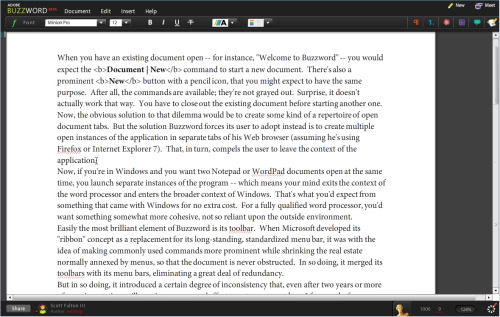
When you have an existing document open -- for instance, "Welcome to Buzzword" -- you would expect the Document | New command to start a new document. There's also a prominent New button with a pencil icon, that you might expect to have the same purpose. After all, the commands are available; they're not grayed out. Surprise, it doesn't actually work that way. You have to close out the existing document before starting another one. Now, the obvious solution to that dilemma would be to create some kind of a repertoire of open document tabs. But the solution Buzzword forces its user to adopt instead is to create multiple open instances of the application in separate tabs of his Web browser (assuming he's using Firefox or Internet Explorer 7). That, in turn, compels the user to leave the context of the application.
Now, if you're in Windows and you want two Notepad or WordPad documents open at the same time, you launch separate instances of the program -- which means your mind exits the context of the word processor and enters the broader context of Windows. That's what you'd expect from something that came with Windows for no extra cost. For a fully qualified word processor, you'd want something somewhat more cohesive, not so reliant upon the outside environment.
Easily the most brilliant element of Buzzword is its toolbar. When Microsoft developed its "ribbon" concept as a replacement for its long-standing, standardized menu bar, it was with the idea of making commonly used commands more prominent while shrinking the real estate normally annexed by menus, so that the document is never obstructed. In so doing, it merged its toolbars with its menu bars, eliminating a great deal of redundancy.
But in so doing, it introduced a certain degree of inconsistency that, even after two years or more of experimentation, still requires a concerted effort to get accustomed to. I frequently, for instance, lose track of where to find the button that pulls up information on document templates.
Buzzword's alternative is simpler and more compelling than Microsoft's. It uses ordinary toolbar functions, but divides those functions into a handful of categories. Each category has its own icon whose color-coding actually does help the mind to separate it logically from the others, even though the colors chosen were probably arbitrary (green for "font," red for "paragraph," for instance).
Passing over a button flips it out slightly for a moment, like paging through the cards in a hand of poker, revealing each button's one-word category. Clicking on a button swiftly slides the whole toolbar into view, and the sliding effect is not only slick but effective for folks with impaired vision and who need to see visual evidence of change taking place. Simply replacing one toolbar with another in a single snap could go unnoticed.
Granted, Microsoft Word has a much longer laundry list of things it has to do -- like organize templates, preview active pages on different paper and card stocks, merge with mailing lists, manage macros, and a number of other very necessary features for professional writers -- or people who write in the act of being professional -- that Buzzword clearly lacks. But had Buzzword been in existence four years ago, there's no question in my mind that the engineers at Microsoft might have thought harder about their ribbon implementation and gotten some better ideas.
Next: Some things lost, other things found...