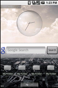
Android gets skinned, finally
 Android has been commercially available for a little more than four months, and the completed application store for just over two weeks, and now we're beginning to see desktop theme changes that address a fundamental Android feature: the look of its widgets.
If there's one complaint about Android that you might have heard more often than any other, it's about the clock widget. The most frequently used screenshots of the mobile operating system show the big analog clock face hovering over the still blue waters in the wallpaper. It's a mundane representation of what is actually one of the most tweakable mobile home screens.
Over the weekend, Better Android Apps released Open Home - Lite in the Android Market, which supports themes and finally provides alternatives to the standard analog clockface. The Google quick search widget, folder icons, and dock tab all receive overhauls as well.
Other apps in the Android Market, such as aHome and dxTop, support new widgets and skinning, but as some market commenters noted, neither of those retain the Android "feel."
Better Android Apps has ported themes made by users on the xda-developers.com forum, and and says it will open source the skins app "in the next couple of days" so that third parties can quickly and easily make Open Home skins.
Another feature of Open Home -- which is of somewhat questionable utility -- is the seven-panel home screen. Traditionally, the Android home screen is made up of three panels (left, center, right) where the user can put app shortcuts and widgets. Open Home breaks this into seven numbered screens which do the same thing...just more so. Once installed, Open Home does not default on. When a user presses the "home" key, he must select the standard home screen or the Open Home screen.