Google Nexus 10 first-impressions review

A month has passed since I started using Nexus 10, Google's first 10.1-inch tablet, which Samsung manufactures. iPad is reason for the delay writing this review. I bought the first three generation models and sold each within two months. The appeal didn't last, in part because of the user interface's long-term limited utility. So Nexus 10 faced resistance before I opened the box and for another, compelling reason: I was (and still am) hugely satisfied with sibling Nexus 7, which form factor and feel in the hand hugely appeal. After a month of testing, just to make sure, I don't plan on selling the larger tablet; its immediate fate won't be that of iPad 1, 2 or 3.
I definitely recommend Nexus 10 to anyone considering a tablet this year in the $400-$500 range. Nexus 7 ($200-$300) is a better option for the budget conscious -- or even Kindle Fire HD ($300-$600). I don't recommend iPad 4 or mini. They cost too much ($329-$829) for the benefits, and iOS has fallen behind Google and Microsoft operating systems. My experience with Surface RT is limited, but the tablet makes a great first impression such that it's worth considering -- and easily over Apple's larger tablet.
Better PC?
Still, Nexus 10 doesn't satisfy enough, because I like the smaller Google tablet so much more. If ASUS and Google produced a 7-incher with higher screen resolution and more generous memory, I could easily part with the larger tablet. For me, Nexus 10's compelling feature is the screen resolution, 2560 x 1600, which exceeds iPad 4. Then there is the performance, which is exceptional. That leads to a broader benefit, I only recently explored: PC replacement.
I tend to use a tablet about as much, some days more, than my computer, which is the $249 ARM Chromebook. Situation would be similar if my main machine ran either OS X or Windows. Unquestionably, in the weeks after acquiring Nexus 10, my tablet usage dramatically increased -- and it already was up with the smaller Google device. By comparison, iPad interest waned within weeks. I now do most content consumption or social interaction on Nexus 10 and some content creation, too. For example, I much prefer Google+ on a tablet to the service running in a PC browser. YouTube experience is superior as well.
The ARM Cortex A-15 architecture is the same as my $249 Chromebook, but the tablet is waaaay more responsive. Nexus 7 is quad-core, but the larger model's ARM A15 screams such that the 7-incher feels slow by comparison. I'm not as satisfied as before using Nexus 10. Phenomenal performance coupled with the breadth of apps and Android 4.2's surprising utility make the tablet a more enjoyable productivity tool than a PC, which without touchscreen lacks the sheer intimacy the Android device provides.
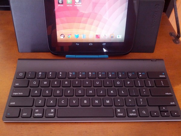
I had planned during this initial review to temporarily replace Chromebook with the Android. But the Logitech Keyboard for Android 3.0 Plus I purchased behaved badly and only today I discovered "for iPad" underneath, which might explain the problems. With another keyboard, I will make the switch and report on that experience in the future.
Son of XOOM
Google Play started selling Nexus 10 on November 13. and I ordered right away and luckily, too. Soon after, the store stopped taking orders, having exhausted initial supply. Two models are available: 16GB ($399); 32GB ($499). I purchased the costlier one, which arrived on the 16th -- Friday instead of the scheduled Monday. Thank you, Google.
Specs: 10.055-inch display, 2560 x 1600 resolution, 300 pixels per inch; 1.7GHz Exynos 5 (Cortex A-15) dual-core processor; Mali T604 graphics chip; 2GB of RAM; 16GB or 32GB storage (depending on model); 5MP back- and 1.9MP front-facing cameras; accelerometer; ambient-light sensor; barometer; compass; GPS; gyroscope; microphone; NFC; WiFi N; micro HDMI; Bluetooth; 9000 mAH battery; Android 4.2. Measures 263.9 x 177.6 x 8.9 mm and weighs 630 grams.

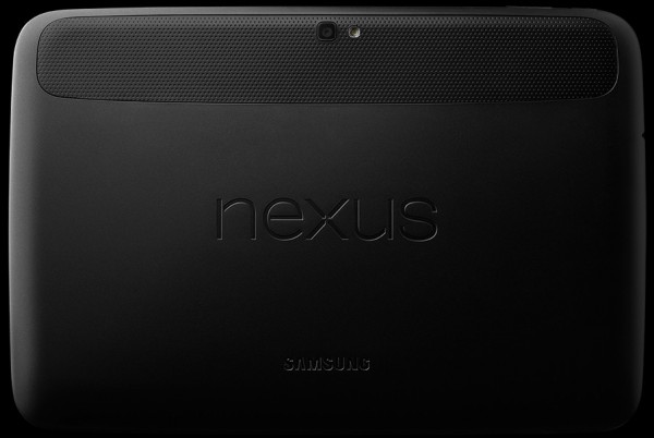
Nexus 10 definitely is black, which other than Motorola XOOM stands apart from most major-brand tablets this large. The all-black finish seemed drab at first but quickly grew on me. Not all blacks are the same, and I like this one, although I wouldn't call the device handsome. Android 4.2 really pops against the black finish, which is excellent frame for most digital content. There's the wisdom of all-black over flashy design: Emphasizing content, which is what the tablet is for.
The Android feels good in the hand. There is lots of friction and pleasant touch, unlike iPad's cold -- and somewhat slippery -- metal. Speaking of cold, the tablet doesn't get overly hot, even when videoing or gaming.
Nexus 10 is recognizably Samsung, particularly the front-facing speakers also found on Galaxy Tab 2 10.1. But the corners are considerably more rounded, reminiscent of XOOM. If XOOM and Samsung Galaxy Tab had progeny, Nexus 10 would be it. Think of Nexus 10 as XOOM thinner than iPad 4 with front-facing speakers.
Their overall sound doesn't wow me. I expected more. They're better than being in the rear, but experience is much better with headphones; I use Grado Labs RS1.
Eye-Popping Display
Initially, I found the tablet to be too big -- that coming from Nexus 7, which size really appeals to me. I type much faster on the 7-incher, because it's easier to hold with one or two hands. Nexus 10 is bulky, which can be said of other slates in this size class, including iPad 4. But after a month's use -- and experiencing the benefits of the amazing screen -- I'm more accustomed to the difference, but not settled.
Amazing isn't strong enough word to describe the super high-resolution display. Colors are crisp and viewing angles are superb. There is no distortion, even watching video, from any angle -- that's a distinguishing characteristic. The screen is really bright, even at half-brightness, almost too much for my tastes.

Nexus 10's display sets it apart from every other Android tablet, even ASUS' impressive Pad line, and the 16:10 aspect ratio smokes iPad's 4:3. You can watch movies on Apple's tablet, but they're more enjoyable on Google's.
The two cameras are competent enough for a device this size and price, but I didn't much use either for this initial test.
Battery life is excellent, such I can't tell you how much. Subjectively, I haven't experienced charge running down too fast doing anything. Days usage is my overall experience. I rarely benchmark, which is one measure, because the numbers often are meaningless for real-world usage. For example, I get much better battery life from Galaxy Nexus or Nexus 4 than some benchmarks suggest, while based on posts in my social network other people get much less.
Charging the battery is a whole other matter. Plugged into the electrical wall socket, my Nexus 10 takes average 6 hours to recharge from about 3 percent. Six hours! That's simply too long. If you run down the battery like I do, recharge while you sleep.
Your Canvas
The Google-branded tablet isn't just fast, it's smooth. Transitions among apps and functions flow. Sometimes at night, I'll use Nexus 10 to play music videos on Google TV, while actively juggling three or four other apps, typically Chrome, Feedly, Gmail, Google+ and Now. Smooth operation is consistent, even with many open Chrome tabs.
That said, Nexus 10 started misbehaving soon after updating to Android 4.2.1. The tablet occasionally freezes and reboots. Frequency varies from once a day. The experience jars, because during the four-and-a-half months I used Nexus 7 as my full-time tablet, it crashed not once. The lockups frustrate and, based on posts in my social network, aren't unique. Other users also say problems started with the newest update.
Otherwise, Android 4.2 just sings. Get it an audition on the X Factor, will you? Apple's iOS 6 simply can't compete. The user interface is more static, really acting as placeholder for apps. By comparison, Jelly Bean is a canvas the user paints with widgets, apps and more. Android is highly customizable and provides live action via widgets, which also can be placed on the swipe screen. I won't review the OS here but will simply say Android 4.2 fits the hardware hand to glove. The experience feels end to end, like you would expect from Apple, which develops iPad hardware, services and software. Google's tablet gives similar impression, even though Samsung makes the gear.

Nexus 10 runs stock Android. There are no offending skins. Google leaves customization to you rather than letting a hardware manufacturer impose its own. Google dispatches Android updates right away over the air. No months or even weeks of waiting on device manufacturers.
Where Nexus comes up short compared to iPad 4: the reading experience isn't as immersive, particularly magazine apps, many of which are richer and more interactive. That said, the overall Nexus 10 experience is more immersive, with widgets and other Android 4.2 goodies being major reasons. Since I started using the tablet, Google updated most major apps. Notable: Currents, Google+ and YouTube, which are considerably more immersive on Nexus 10 than when my review started. However, new versions of these same apps dropped for iOS, too, and I haven't used them and so can't gauge their immersive qualities.
Perhaps I should qualify something. In my experience using tablets, starting with iPad, immersion is a distinguishing characteristic -- that and intimacy from touch. A good tablet draws you in and closes the world out. Nexus 10 is the first Android tablet I've used that matches or exceeds iPad intimacy and immersive qualities. They're more function of apps, cloud services and operating system than hardware.
Wrapping up, I don't love Nexus 10 but I like it enough to recommend over any other tablet in the size and price range. That said, anyone heavily invested in iOS apps should consider iPad. Those folks wanting to replace a PC with Android tablet should consider the ASUS Pad line, for which there is optional, attachable keyboard. For the rest of you, Nexus 10 is the gift you give yourself.
Photo Credits: Joe Wilcox; Google (second)
