Microsoft gives a behind the scenes look at Office for iPad development

Microsoft has talked a big game on becoming a devices and services company, but it was not until Office for iPad launched two months ago that the software giant's change of tune yielded something concrete for consumers, and its own customers, on rival platforms. It is the most important productivity suite to arrive on iPads in 2014 and, perhaps, the most important one since Apple's slate launched in 2010.
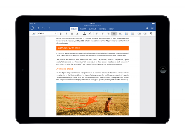
Microsoft has been praised for designing Office for iPad with touchscreen use in mind, making Excel, PowerPoint and Word powerful and easy to use on the small iPad displays, even without a keyboard as most Office users are accustomed to. It is clear this is not a quick porting job, and that the development process involved much more work. The Office team has a new blog post which reveals how Office for iPad was created.
Office for iPad group program manager and design manager Han-Yi Shaw says the software was designed based on "several key mobile scenarios", among which are the ability to take notes, collaborate and create content from scratch. This meant the process required "designing for iPad" rather than "porting to iPad", the latter of which would, arguably, have resulted in a lesser experience.
The idea behind Office for iPad was to deliver a similar experience Office users have been getting on PCs while optimizing the interface for tablet use. "So when it came to defining our user experience goals, it was important to us that users could just pick up our product and get started right away", says Shaw.
Office for iPad could not just give users access to advanced features in the way its PC counterpart does, as it would have overwhelmed and confused them. So traditional features like the ribbon had to undergo design changes. If you want to learn more about the process, hit the link in the second paragraph.
