Redesigned Windows 10 with blur effects looks incredible!
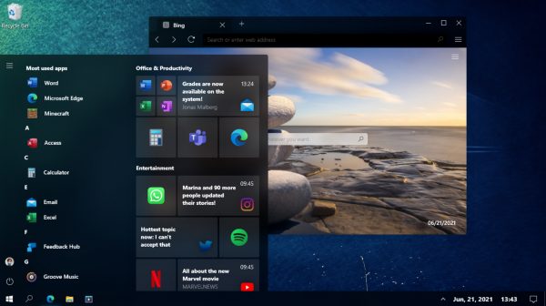
Windows 10 is a decent operating system, but it isn’t what you’d call exciting to look at. The recent Start menu update, with a translucent background, and new Fluent Design icons, is definitely a step in the right direction, but it doesn’t go far enough.
If there’s one thing that Windows 10 really needs, it’s a visual overhaul, and making good use of Microsoft’s Fluent Design system, with blur effects, transforms a slightly bland looking operating system into something amazing.
SEE ALSO:
- Forget buggy Windows 10, Windows 7 2020 Edition is the Microsoft operating system we need!
- Windows 7 returns with the stunning 2020 Edition
- Forget Windows 10, Windows 20 is the Microsoft operating system we need!
- Windows 10 -- 1990s edition is the retro operating system we want
Posted on reddit, this new Windows 10 concept shows how the operating system could look, and judging from the positive feedback it has received already, it’s clear we’re not alone in wishing Microsoft would do something similar.
Some people do point out that it makes Windows 10 look more like macOS, but that’s not necessarily a bad thing.

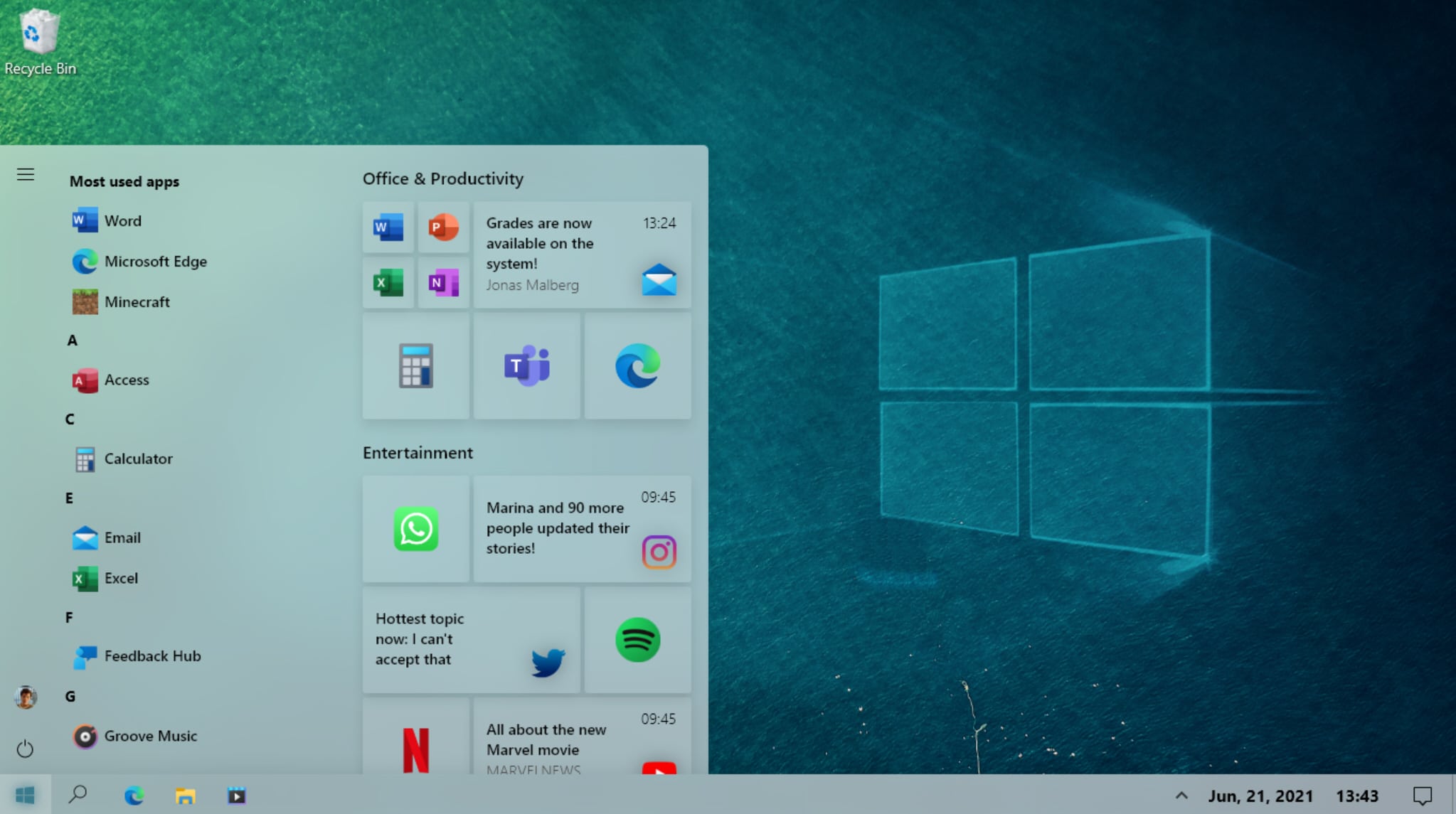
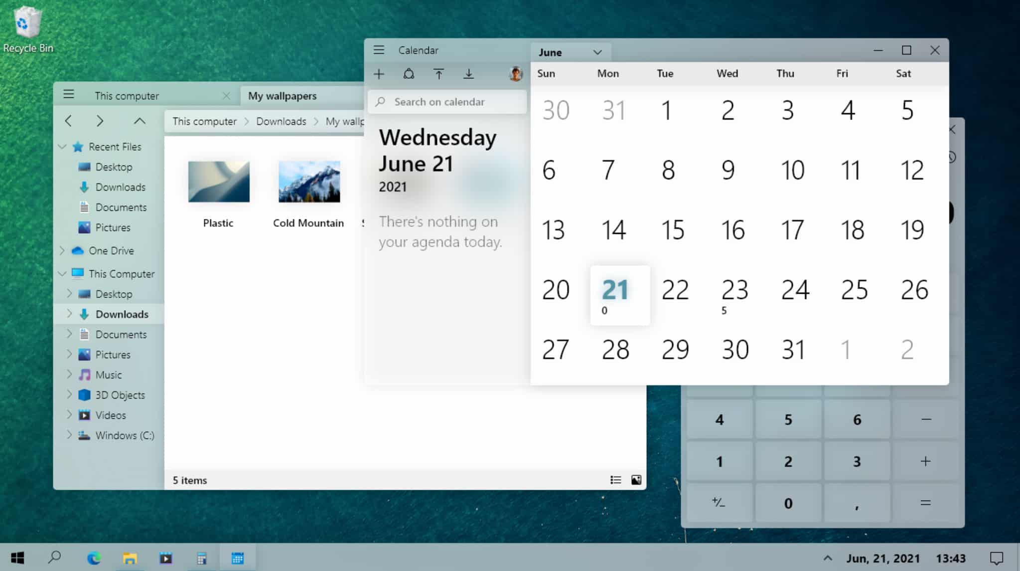

The consistent approach to design is definitely something we’d like to see Microsoft spend some time on.
Let us know what you think of it in the comments below.