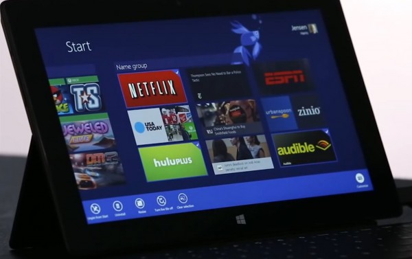
Can Windows 8.1 turn you into a Modern UI fan?

Ever since Windows 8 arrived I have struggled to fully embrace the Modern UI. The new user interface offers a polarizing experience -- it impresses me on a touchscreen but fails to get my attention on a run-of-the-mill display like my laptop features. For this reason, my forays into the new realm are mostly limited to reading and replying to emails, chatting with friends on Facebook and using Twitter. The Desktop continues to be my safe heaven, relying on it to carry out my daily routine.
Don't get me wrong, the Modern UI is not bad but it feels much more natural to use on a tablet -- touching tiles gives way to an intimate and enjoyable experience. But buying a new device which offers a touchscreen is not a particularly sound method of kindling a long-lasting relationship with the Modern UI. With the decline of the PC market, Microsoft is aware of this as it looks to revamp the new user interface in Windows 8.1 with new features aimed at "stealing" users away from the Desktop.
The improvements unveiled for the revamped Modern UI are not groundbreaking, but rather evolutionary compared to the current version found in Windows 8. After all, the foundation provided by the latter is solid enough as to allow Microsoft to further iterate the work space.
One of the the main issues with the Modern UI in Windows 8 is the crude multitasking -- users can only view a maximum of two opened apps at the same time. One takes roughly three quarters of the screen while the other occupies the rest. This results in a crippled experience for demanding users which are used to configuring their work space as they so desire on the Desktop side.
According to Soluto, Windows 8 users only launch Modern UI apps 1.52 times per day. The situation improves on tablets, where folks open Modern UI apps 2.71 times per day. The report is rather shocking, with numbers that do not favor the new user interface.
The Modern UI in Windows 8.1 will not revolutionize multitasking but rather strike a better balance between the current iteration and the Desktop. Users will be able to view multiple opened apps (the number depends on the size and the resolution of the display) and have better control over the window size -- for instance, apps will be able to equally share the screen.
This is one feature that Microsoft should have introduced from the get-go in Windows 8. As I write this story, I run two equally-sized Google Chrome windows side by side on the Desktop. The benefits are obvious -- they can display an equal amount of information, like a full web page on each, without having to resize either like on the current Modern UI.
The interface from Windows 8 also gives users little control over the computer. Heading into the PC Settings menu expecting to find advanced options is like going to the market to buy fruits and coming home with expired vegetables instead.
Microsoft promises that the PC Settings menu in Windows 8.1 will finally mirror the Control Panel from the Desktop side, porting "all" settings normally available in the latter. This provides major benefits for both computer and tablet users -- folks will be able to configure Windows Update or alter power plan options from within the Modern UI without having to transition to the Desktop for any advanced configuration.
Microsoft also announced that its Modern UI apps will be much improved in Windows 8.1 and that the new user interface will provide more customization options than it currently does in Windows 8. But what the software giant can't fix in Windows 8.1 is the glaring app selection.
The Store may provide more than 50,000 apps but a significant part is either comprised of cheap knock-offs or is unappealing to those who already have experienced Apple's App Store or Google's Play. By comparison, the Windows Store feels like a major step back (significantly worse even than the Windows Phone Store) -- no Facebook, Flipboard, WhatsApp Messenger or YouTube (just a few examples without even mentioning popular Google-branded apps).
So can Windows 8.1 make you love and embrace the Modern UI? That seems to boil down to whether the app selection is satisfactory enough or not. But, at least thankfully it will boil down to this instead of having to trade usability for looks.
