Amazon Kindle Fire HDX 8.9 is just right [Review]

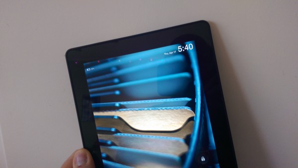
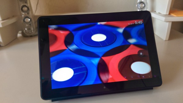
If Goldilocks visited the bears' home and tried tablets instead of porridge and beds, Google Nexus 7 would be too small. Samsung Galaxy Tab Pro 12.1 would be too big. But Amazon Kindle Fire HDX 8.9 would be just right. This tweener tab is optimal size, packs bright breathtaking display, and is easily used for many hours with minimal eye, hand, or arm strain. While screen size and design concepts are little changed from the previous model, the HDX is thinner, lighter, higher-resolution, and well-matched to a bizarre-looking but beneficial case cover.
Kindle Fire HDX 8.9 is a nearly perfect Android tablet -- that is for anyone buying into the Amazon lifestyle. If I were asked to recommend any tab, the HDX would be one, and iPad Air the other. Both share similar usability benefits and tightly-integrated content and commerce stores, supporting services, and appealing apps. In late November, I put both tablets on my list of favorite products for 2013.
Perfection Defined
That said, Kindle Fire HDX 8.9 isn't the perfect all-around Android tablet. Amazon customizes Android and operates a separate app store. Google apps vital to the broader Android ecosystem aren't easily available (and for average consumers not at all). Like Apple, Amazon curates a vertically-integrated set of apps, content, and services.
For an all-around Android tablet, I recommend the Sony Xperia Tablet Z and aging Google Nexus 10. The Sony is as thin and light as the Apple, is water- and dust-resistant, and offers valuable content consumption extras without overwhelming Android's purity. The Google packs high-resolution (2560 x 1600), tight-pixel density (300 ppi) comparable to the Amazon and Apple tabs and presents the best of Big G and the Green Robot. All four are lifestyle purchases. You buy more than just hardware and app platform.
Kindle Fire HDX 8.9 is designed to mainly work within the Amazon content/retail sphere and little outside it. Amazon runs its own stores -- everything from apps to movies -- while shunning Google Play. Meanwhile, Kindle Fire supports the custom Silk browser rather than the stock Android one or Chrome.
Still, the Amazon lifestyle isn't as exclusive now as when Kindle Fire HD 8.9 shipped in November 2012. Then, services like Google+ were barely usable in Amazon's browser, which redirected the URL for Google Play to Amazon App Store. Fire OS is a more cooperative Android citizen today than 18 months ago, making the HDX a better all-around Android tablet.
I say that in part because of how much more usable Silk is now. The browser was previously such a hardship I couldn't recommend Kindle Fire HD in 2013. Silk is finally fast, fluid, and flexible. More significantly, most Google web apps run just fine. This capability is crucial for anyone wanting the benefits Amazon offers while still accessing cloud services like Google+, Google, or Google Maps.
Size Matters
Amazon's HDX is available in 7-inch and 8.9-inch screen sizes. In his review, colleague Alan Buckingham says the smaller tab packs "better features" and is a "huge design improvement" over the HD model. I agree. The tablets are functionally and visually indistinguishable save for size. But that 1.9-inches extra, as measured diagonally, makes a huge usability difference.

The larger Kindle Fire fits into a size niche smack between 7-inch and 10.1-inch tabs, which is why I call it a tweener. By display, closest competitor is the appealing Samsung Galaxy Tab Pro 8.4, which screen size is in the name. I have handled but not tested the device, which size and screen appeal but overall conception doesn't fit into the curated digital lifestyle that Amazon, Apple, or even Google presents. The Samsung's screen resolution is the same as the Amazon's (2560 x 1600) and pixel density slighter greater (359 ppi).
Kindle Fire HDX 8.9 considerably exceeds iPad Air and iPad mini by measure of resolution or pixels per inch. The difference shows -- well, for discerning eyes. HD video looks (and sounds) fabulous on the Amazon tab compared to either Apple, which are no slouches. Viewing angles are excellent on all three tabs.
But there is something more -- an attribute often overlooked in device reviews: Balance. Tablets are meant to be held for long periods of time. Physical size matters but so does weight and its distribution. iPad 3 and 4 both have terrible balance. They're bulky and quickly exhaust the arm. By comparison, iPad Air, Kindle Fire HDX 8.9, and Xperia Tablet Z all have terrific balance, bolstered by thinness and lightness.
The Amazon and Apple are closest in physical and screen sizes (8.9 and 9.7 inches). I would like to someday test the Samsung, which from brief handling feels good. By comparison, iPad mini doesn't compete as a "just right" tweener. The tablet is too wide in portrait mode, which throws off the balance and comfort when reading, say, ebooks for long periods.
Kindle Fire HDX 8.9 specs: 8.9-inch display, 2560 x 1600 resolution, 339 pixels per inch; 2.2GHz Qualcomm Snapdragon quad-core processor; 2GB RAM; 16GB, 32GB or 64GB storage (depending on model); 8-megapixel rear- and HD front-facing cameras; WiFi; LTE (some models); Bluetooth; 12-hour battery; Fire OS 3.x. Measures 231 X 158 X 7.8 mm and weighs 374 grams (WiFi) or 384 grams (LTE). Prices range from $379 (16GB WiFi with ads) to $554 (64GB LTE, no ads).
iPad Air specs: 9.7-inch display, 2048 x 1536 resolution, 264 ppi; 64-bit A7 chip with M7 motion coprocessor; 1GB of RAM; 16GB, 32GB, 64GB, or 128GB storage (depending on model); 5MP rear- and 1.2MP front-facing cameras; WiFi; LTE (some models); Bluetooth; 10-hour battery; iOS 7.x. Measures 240 x 169.5 x 7.5 mm and weighs 469 grams (WiFi) or 478 grams (LTE). Prices range from $499 (16GB WiFi) to $929 (128GB LTE).
Curated Lifestyle

Amazon's tablet is nowhere as pretty as Apple's. The all-black finish is unassuming, but that's okay. Content pops, like on Nexus 10. Which ultimately matters more -- the tab's appearance or the content you consume on it? Volume and power buttons are on the back, a design change from previous models. I find the location to be a little bothersome. The finish provides great friction in the hands, which diminishes likelihood of accidental fall from slipping through your fingers.
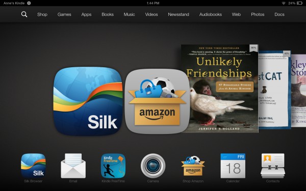
Fire OS 3.x evolves from its predecessor in the best of ways. The bottom dock is handy and tight integration with Amazon services is among the best benefits. Choose your delight: apps, games, Goodreads, Kindle, music, Prime Video, and much more. No one -- not even Apple -- offers such tightly-presented, curated content options. If you love Amazon, the HDX 8.9 will satisfy. Features like Kindle FreeTime or textbook rentals are primed for families.
Size matters. The tweener offers all the benefits of smaller or larger tabs in a form that feels just right to handle for long periods of time. I typically see battery life close to 24 hours for reading, which includes web browsing. Stand-by time is exceptional -- the best I've seen for any tablet. Put the Kindle Fire aside for a month and you can expect there to still be charge left.
Size, comfort, and battery life are ideal for books, magazines, and newspapers. Amazon and Apple offer the best choices and reading experiences for the latter two. There, the fruit-logo company deserves bigger hat tip. Content consumption is more immersive on iPad, for which there are still some exclusive titles. For example, I read Nature magazine, which costs $35 per year on iPad -- big savings over the $199 print subscription; Amazon doesn't offer the magazine (nor does Google Play).
 Origami Case
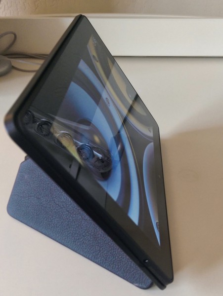
The strangest thing about Kindle Fire HDX 8.9 is the major accessory: Origami Case, which colleague Brian Fagioli reviewed in November. My first reaction: "Ugh", ah, "ugly". But beyond first impressions, the case is hugely functional and really protects the tablet. I see three major benefits:
- Keeps out the dust and protects the screen.
- Folds over several ways to provide portrait or landscape stand.
- Holds the tablet by magnets, so the user can easily remove it for more comfortable reading.
The Origami Case demonstrates the merits of functional design over something that is pretty first and useful second. Good for Amazon.
Wrapping up, there is much to like about Kindle Fire HDX 8.9. It's the easy choice for anyone primarily living the Amazon lifestyle. Silk lets you use web apps for services many people might want on a tablet, like Google Maps; make-do won't do enough for most people, however, when they want apps Amazon doesn't offer.
Bottom line: I couldn't recommend the HD 8.9 because of app and browser shortcomings and so chose not to review the tablet last year. The HDX changes everything. The tweener gives you the best of Amazon and enough of everyplace else.
Photo Credits: Joe Wilcox