Windows 10 Build 10061 -- buggy, but a huge leap in the right direction

I’ve been playing around with the latest build of Windows 10 Technical Preview that was released yesterday, and I have to say I'm liking what I'm seeing so far.
I have been critical of previous Windows 10 releases, opining that the OS wasn’t going to be what I was hoping for, and calling the previous build, 10049, dull, boring and bland. Fortunately, with Build 10061 Microsoft addresses a lot of my concerns and you can now see the operating system’s true potential. Here’s what I like about the new build.
The Start menu
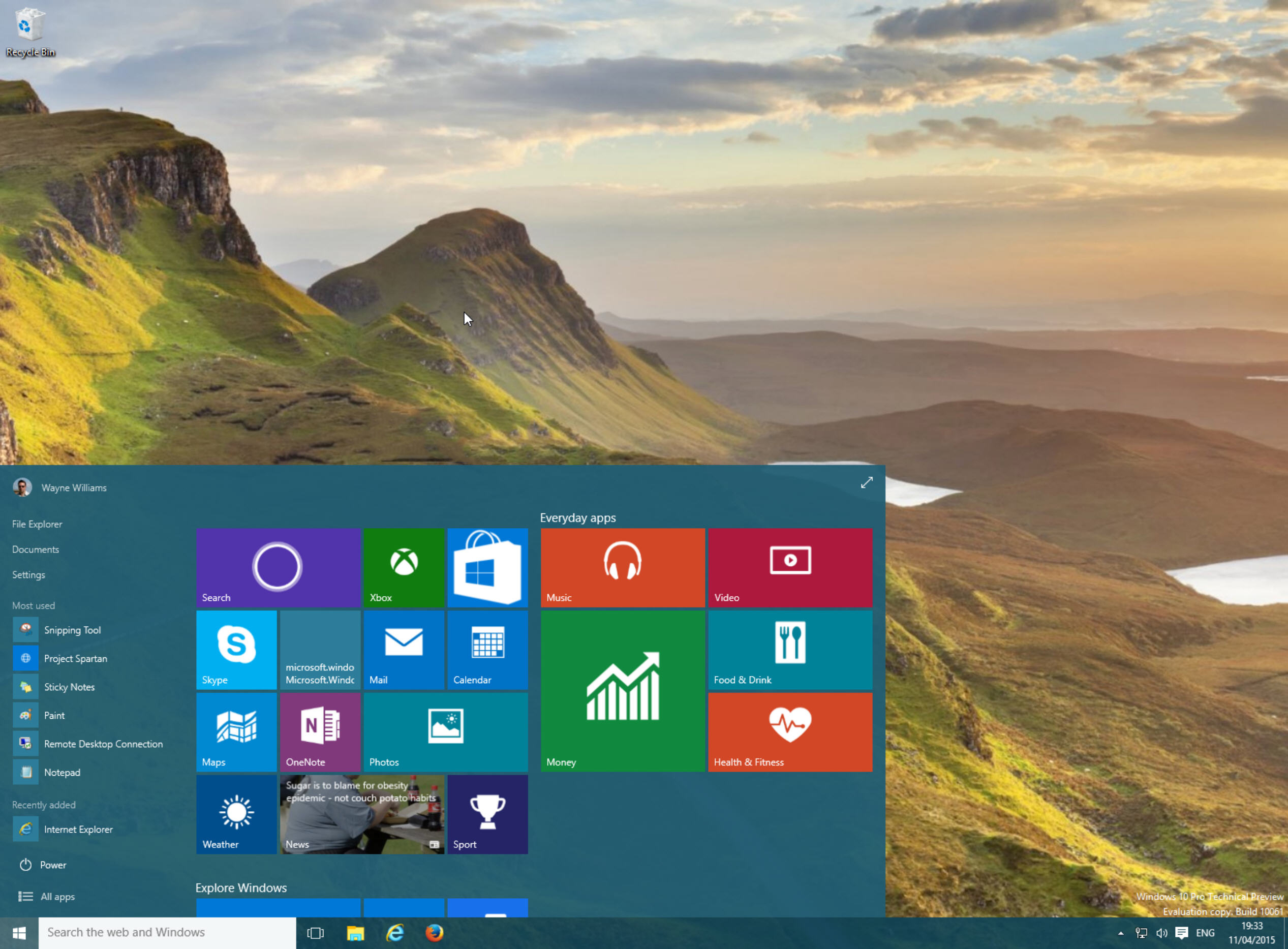
It is finally resizable once more. As well as being able to toggle between Start menu and Start screen modes, as you could in the last few releases, you can now properly resize the menu by clicking and dragging on an edge. Pull on the upper edge and the menu will stretch upwards. It doesn’t quite reach to the top, so you can can’t have it like a sidebar, but it works well.
Pull it out to the side and the tiled panels automatically arrange themselves to fit. The menu’s transparency effect makes it all look very classy. You can toggle transparency off if you're not a fan, and customize the menu’s color scheme to suit your tastes.
It’s a marked improvement all round, although I’ve experienced some weird bugs whereby the Start menu sometimes won’t appear when you click the Start button. Signing out and back in again seems to fix the issue.
Dark Theme
The light theme, which looked awful and boring in the last build, has been replaced by the dark theme which looks much, much classier. You’ll be able to switch between light and dark themes in the finished build but you can’t do so at the moment. Some of the apps included in this build (including Settings) still use the light theme, which looks odd, but Microsoft's "housekeeping" should fix that soon.
The Icons
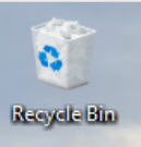
 The childlike recycle bin has been replaced with a square, familiar, and much better icon. It’s the sort of icon you could happily leave on your desktop now and not try and cover up with small windows, unlike the previous bin. You honestly have to wonder if Microsoft made some of the changes in earlier builds just to upset users. Make the OS look so bad that when it fixes the problems everyone’s much happier. But the company couldn’t be that devious, right?
New Apps
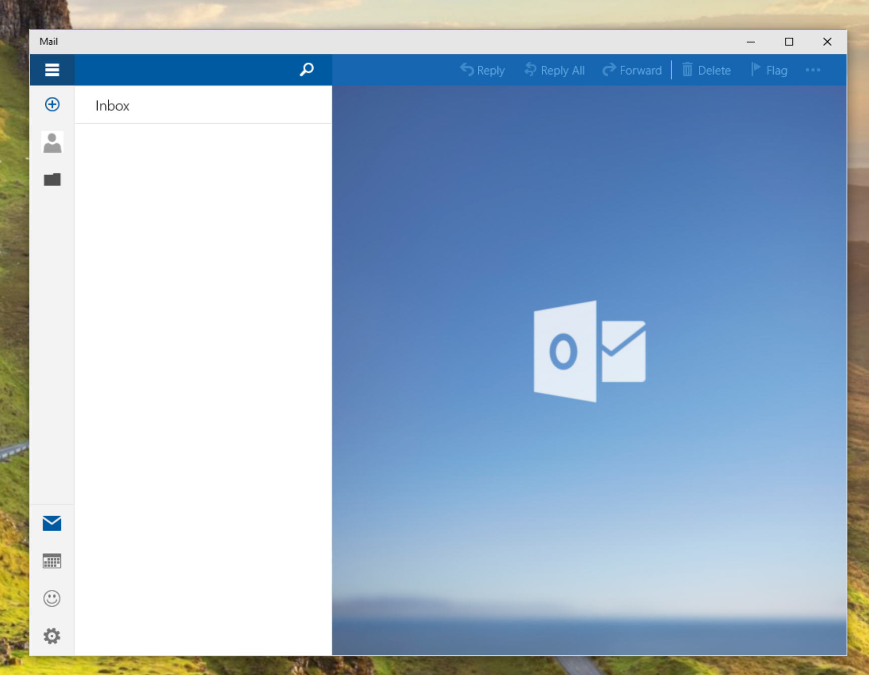
There are new Mail and Calendar apps in the latest build, both of which have a new UI that matches the new universal Office apps. The layout changes as you resize the apps, and they look great. There’s also a new People app which looks like it might be good, but as it only stays visible for a few seconds before crashing it’s hard to say for certain.

Task View
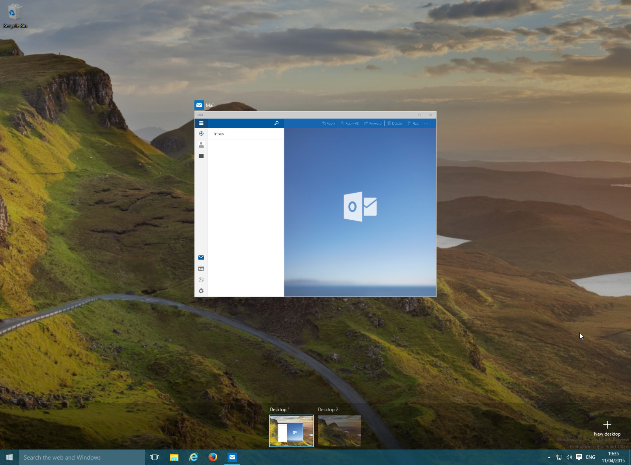
Virtual desktops is a feature I’m looking forward to in Windows 10, even though I have three screens attached to my main PC. It will be handy for keeping things organized, and it will be really useful on my laptop. The new build allows for unlimited workspaces, and also makes some cosmetic improvements. You can customize its behavior in Settings -- choose whether the taskbar should show windows that are open in all desktops, or just the one you’re currently in and using.

There are of course other changes in the new build, including improvements to Tablet mode, but those are the standouts for me. I’m really liking the new version, and it does give me hope for the finished release, although given the vast amount of quite nasty bugs in this build (expected in a Fast ring release), it seems incredibly unlikely Microsoft will have got everything tidied up and ready for that rumored July launch.
What’s your view on the new build?