7 Android apps that have successfully adapted Material Design
Material Design -- the new(ish) design language introduced by Google in Android Lollipop, and inspired by 'paper and ink' -- aims to provide a unified experience irrespective of device fragmentation.
This was very much needed for a mobile first world, where the market for small screen devices (read wearables) is growing at a rapid pace.
The tenets of this unique design language can be summed up as:
- A single environment for all actions
- The creation of hierarchy, meaning, and focus
- An immersive user experience
This design philosophy has been successfully adapted to the T by many developers, who got the gist of the underlying principles and implemented the same in their apps’ features and functionalities.
Here are some of the apps which have made the transition to the 'flatter' design brilliantly.
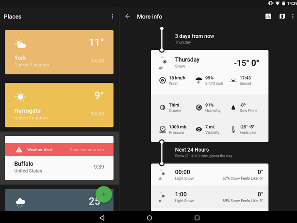
Weather Timeline provides a summary of the next hour’s weather, the next 48 hours, and even the next week’s forecast in an easy-to-understand timeline. It also provides the current weather alerts for location(s) chosen and gives the option to move back and forth through time to check the weather.
The weather conditions are highlighted in vibrant colors with contrast in the text color against large fields in a card based layout. Additionally, the rich color palette of the app is something to watch out for and so are the animated icons, which depict the weather conditions, temperature, and current time.
The app also includes excellent implementation for Android Wear. It provides useful information on the screen such as push notifications of weather alerts and charts of temperature and weather conditions.
All of these features make the app intuitive and user-friendly, which are among the basic fundamentals of Material Design.
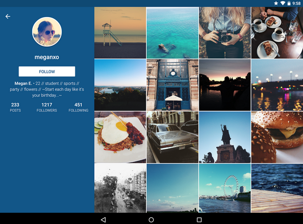
Imagine is an Instagram client infused with Material Design. The app retains most of the features and functionalities of Instagram and at the same time, introduces some new additions.
From the Material Design perspective, the third-party Instagram client has a minimalist interface with a grid based layout for photos/videos. This gives more clarity to the interface and adds to its lightweight or minimalist look and feel.
A slide out menu provides users with easy access to profile, activity, likes etc. Amazing animations are also an integral part of the app’s interface along with consistent and simple icons.
Google provides an elaborate outline for iconography in its Material Design guidelines. The system icons of the app adhere to the outline. They symbolize common actions such as "new photo", "new video", "take photo", and "take video" etc. Also, they are geometric in shape, simple and have a modern feel, which in turn makes them consistent and readable even when the screen size is small.
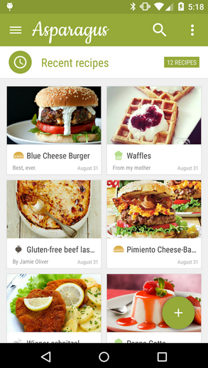
Google recommends one floating button per screen and no more as a part of its Material Design principles. This is to increase the prominence of the button -- which represents the most common action on the screen. The action can be anything -- marking as favorite, adding a new photo, video or any other element, sharing, creating, navigating and so on. Apart from guiding users, this floating button also adds to visual continuity (in this case, a mini version is used in the design).
This feature is prominent in Asparagus -- My Cookbook, which is a digital cookbook and recipe app that has many interesting features that include, but are not limited to, recipe sharing, unique ingredient calculator, and customizable recipe folders.
The app’s interface embraces simplicity, is minimalist to a fault and offers a seamless experience to the end-users. This is how it implements the principles of Material Design. A color palette with bold colors and grid-based layout also hint at the use of Google’s latest design standard.
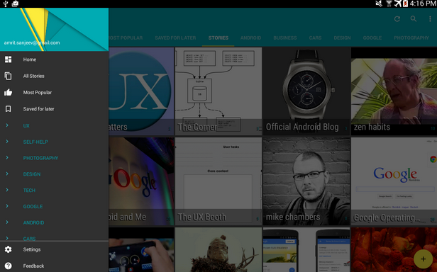
When discussing yardsticks of Material Design, one has to mention Paperboy: A Feedly Newsreader. There are more than 25 million feeds to select from and the app does what it needs to "make reading enjoyable" for users.
To begin with, the app enters a "semi-immersive" mode with its beautiful, concise typography that aims to make readability better. Another interesting feature is a floating menu button, which provides options that include opening the article in browser, marking the articles you want to read later, a tool to read text aloud (text to speech) and something that perhaps everyone wants in a reader app -- offline reading. The app also makes good use of colors to distinguish between read and unread news.
All these features help users’ focus their attention and this is one of the main aims of Material Design.
Google Flagship Apps With Material Design Implementation
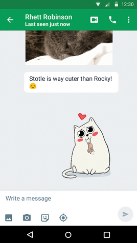
Hangouts gained a major design overhaul with Material Design. Complete with a floating button to compose messages, a simplified user interface, special system icons, new dialer UI and improved video calling facility, the app is all set to compete with the likes of Facebook Messenger and other apps in the same category.
For example, users can now share stickers with their friends, add as many as 100 friends in a conversation, and even share their location, making it a comprehensive Messaging app.
But what really steals the show is the intuitiveness of the app and smoother transitions between tasks, which account for a more fluid experience for users.
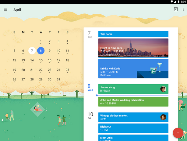
Just like Hangouts, Google Calendar is another app from the search giant, where Material Design has been put to practice quite visibly. Bold colors, immersive imagery, crafted simplicity, stimulating animations and fluid design are some of the major highlights of this app that are in sync with Material Design norms.
With the latest design aesthetics, the app offers Schedule View that helps users check their schedule at a glance, complete with images and maps.
Also, users get the option to easily switch views of their calendar, transitioning smoothly between getting a single day’s view or the gist of multiple days on the screen. Material Design makes this option better than ever.
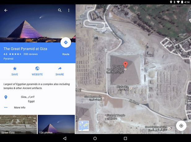
Google Maps is no "old wine in a new bottle" but rather, it is "old wine in a beautiful new bottle". A case in point is the astonishing clarity of the maps and the images.
Users get to see immersive imagery come to play with the high quality Street View, as well as indoor images for places of interest, famous landmarks, restaurants, museums located at any corner of the world, and get a better idea about the same without even visiting the places in person. The app is more beautiful than ever and brings to the table better functionalities.
For instance, when users tap on any place’s info sheet at the bottom of their screen, they will be able to see an info layer on the top. This will enable them to view photos, reviews and many other details of a place. These kind of interactive features get better with Material Design implementation, which also provides smoother transition to the users.
To Conclude
Google’s Material Design has definitely introduced some great design aesthetics. Although it will be some time before all apps make this switch to a new, flatter design, the change is well underway as is evident from these apps.
What is your take on Google’s new design style? Share your insights with us.
Jaykishan Panchal is a content marketer at MoveoApps, an android app development company. He enjoys writing about Technology, marketing & industry trends. He is tech enthusiast and love to explore new stuff. You can follow him on Twitter @jaypanchal8.