Try the public preview of new sign-in experience for Azure AD and Microsoft accounts

Microsoft has redesigned the sign-in process (or "experience" as the company refers to it) for both Azure AD and Microsoft accounts.
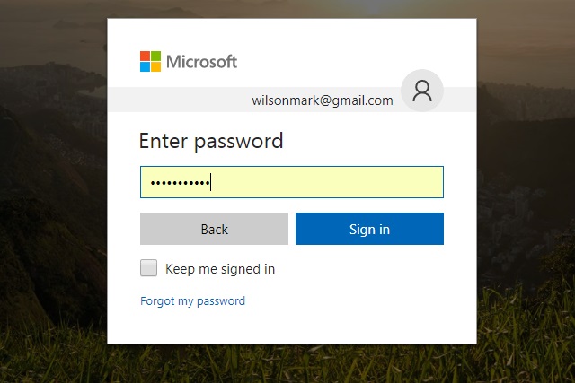
The interfaces for the sign-in screens for both types of account have been updated so they are the same, and there's now a Google-style two-page sign-in procedure. The updated design is available as a public preview and the change has come about through telemetry data collected by Microsoft.
The new experience can be found on desktop and mobile websites, and companies can add their branding to sign-in screens for a customized look. The two-page design (username/email address on the first screen, and then password entry on a second), Microsoft says, allows for a higher success rate for signing in:
The new design prompts you to enter your username on the first screen followed by a credential (typically a password) on a second screen. We've done a lot of testing of this design and our telemetry shows that people are able to sign in with a notably higher success rate using this approach. It also sets us up to be able to easily introduce new forms of authentication like phone sign-in and certificate-based authentication.
The new-look for Microsoft accounts has been rolling out for a few weeks now, with Azure AD being added to the mix. To prevent too much disruption Microsoft is making it opt-in:
We know that this will be a disruptive change for some of you, but we believe that this sets us up for an exciting future of innovation in the sign-in space. To give you time to prepare for the change, we’ll leave the new experience as an opt-in public preview for the next few weeks. We plan to switch over to the new UI by default during the last week of September.
You can test out the new look here.