Google+ makeover is much more than a pretty face

Just as Facebook forces users to adopt a more cluttered, confusing appearance, Google+ simplifies and provides social networkers more control over the layout. Much as I've tried to use Facebook more, because that's where my family hangs out, Google+ is inescapable. It's a gravity well too strong to resist. For 170 million, the number of users Google revealed today, Plus perhaps is irresistible, too. That's a lot of people for a service less than a year old.
Google+ is more than a social network. It is the future of Google. Like it or not, the company has embarked on a strategy around social search, and Plus is a pillar. Competing against Facebook clearly is one of Google's goals. But there also is realistic appraisal that social is the web's future -- and why shouldn't it be with gregarious humans? Additionally, Google+ is the sun around which the company's other products will revolve -- even search -- defining a digital lifestyle empowering connections, communications and commerce.
The New Social
I strongly encourage anyone trying to understand this concept to closely read Vic Gundotra's blog post about Google+ changes. The vice president of engineering writes:
We're more excited than ever to build a seamless social experience, all across Google. A critical piece of this social layer is a design that grows alongside our aspirations. So today we’re introducing a more functional and flexible version of Google+. We think you’ll find it easier to use and nicer to look at, but most importantly, it accelerates our efforts to create a simpler, more beautiful Google.
This isn't marketing gobbledygook. Gundotra's theme is consistent with past statements and Google's actions building out Plus. Stand-outs: "grows alongside our aspirations" and "create a simpler, more beautiful Google". He doesn't write about creating a more beautiful Google+, but Google. The whole shebang. Page and company are reinventing Google. Make no mistake about their "aspirations".
Plus Your World
Services like +1, Search Plus Your World and, of course, Google+ are part of this transformation in progress. Two weeks ago in post "Google, there's no good 'without doing evil'", I reviewed the colossal amount of cross-product and service integration taking place over the last year. Search anchors the integration effort, but its role changes as social creeps into everything Google does, with G+ and Search Plus Your World as key pillars.
In that post, I asked readers: "Does all this newfangled integration -- Android, Chrome, Google+, +1, search and other services benefit you?" I'll answer yes before anyone else, particularly how search now lets me tap into social when looking for something or answers to questions.
I'm not alone. "I love the integration of Google products", John Thomas comments. "Things just keep getting better. I worry about Google's dominance, but that dominance has come through providing amazingly useful services for a great price -- free. I'm happy to share my browsing history with Google. It's very useful to me to find places I've been and it helps Google fund their amazing services".
"The integration benefits me a lot", Ismail Hammoud agrees.
Renovation Row
I started writing this post early morning, then had to shelve it to report the Justice Department's lawsuit against Apple and five publishers. When Gundotra announced Google+ changes, I didn't have them. Now I do, and they impress.
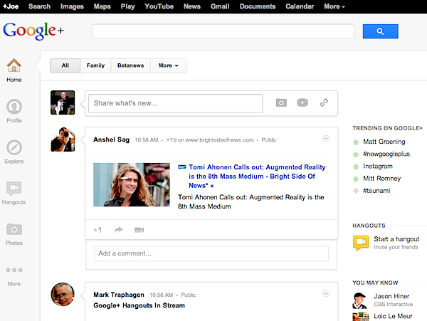
There isn't as much generous white space as before, but Google+ still is largely uncluttered. Facebook looks like a horder's house, by comparison. Google moved the top menu bar -- Navigation Ribbon -- to the left, which isn't my preferred location. But I can live with it. My eye tends to gravitate up, but when reading posts in the flow there's sense to having the menu bar with them. Nicety: The apps on the Navigation Ribbon can be dragged to the order you prefer. There are pop-up options behind some of the menu bar apps, too.
Gundotra highlights other changes:
Once you’ve upgraded to Google+, it’s easy to share with your circles from just about anywhere. We’re dreaming bigger, though. We're aiming for an experience that fuses utility with beauty—one that inspires you to connect with others, and cherish the conversations that unfold. Today’s update is an important step in this direction, including:
- Full bleed photos and videos that'll make you really proud to post
- A stream of conversation 'cards' that make it easier to scan and join discussions
- An activity drawer that highlights the community around your content

Better Place to Be?
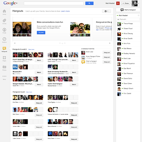
From my perspective, the most startling and important changes are two: Trending topics and revamped Hangouts page. There are now trending topics visibly placed on your main G+ page and even more under the "Explore" button, where Google finally succumbs to clutter creep -- lots of it. Hangouts is busier still, but, whoa, what a place now to discover new folks to video chat with. Trash the TV, baby, and light up the webcam.
The two areas share common theme: Increasing interaction around interests or people that matter most to you.
Circling back to where I started, Google's reinvention is all about cross-product integration with search and social as core. Gundotra writes:
By focusing on you, the people you care about, and the stuff you’re into, we’re going to continue upgrading all the features you already know and love -- from Search and Maps to Gmail and YouTube. With today’s foundational changes we can move even faster -- toward a simpler, more beautiful Google.
Sorry, Vic, but I'm struggling with my nerd stereotypes. Can a geek hangout really be beautiful or are you just putting lipstick on a pig?