Google+ for Android catches up with iPhone
 Well, perhaps I should qualify that with "almost", depending on what matters more to you as a user. On Thursday, 15 days after releasing a major Google+ update for iPhone, the Android version arrived. Timing is interesting. According to NPD, considerably more Android users access Google+ from the browser than the app -- 16 percent to 10 percent overall reach, in March, respectively. My question for you quick downloaders, will that be true for you, or is the app now preferred? It's no idle question, because the web experience is now so vastly different from the app.
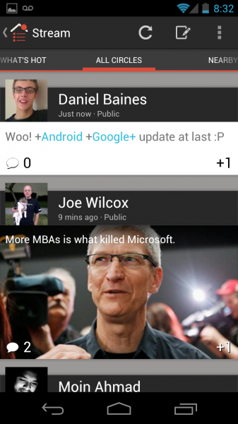
Like its counterpart, Google+ for Android offers bleeding-edge photos. Pretty much everything about Google+ bleeds the edge of the screen. The effect is immersive. You just want to scroll and scroll -- and you will since so much less content fills the screen now. But the Android version has better visual flow than its iOS counterpart. Stated differently: It's snappier, more alive. "We're building for a mobile future", Google senior veep Vic Gundotra says. That's apparent from just how different the app is from the web experience -- and how immersive.
Immersion is Everything
Immersion is critical in an app of this kind:
1. Engagement. Social networking is all about relationships, meaningfully making connections with others. Google+ distinguishes from Facebook in several key areas, with common interest being one of the most important. The Circle concept allows people to engage with others they might not know based on something important they share, while Facebook is more about extending relationships with people whom they know -- even if just casually. The app's immersive quality pulls you into Google+ and there engaging others. New capabilities, such as inline editing and integrated Hangouts, improve and extend engagement.
2. Discovery. Because Google+ is so much about interests shared in common, discovering them is crucial. Also, there's a Twitter-like quality to the Google+ newsfeed that makes finding things all the more important, and difficult. The immersive, bleed-to-edge UI and tabs like "What's Hot" improve discovery of people, interests, happenings and news -- as well as the "Nearby" tab and easy "check-in" option.
3. Time spent online. Immersive web services/apps hold peoples' attention. This time is crucial for a cloud provider like Google that deals with lots of transitory traffic, mainly from search. Catching and keeping people is:
- Good for the brand
- Connecting users to ancillary products or services
- Providing the eyeballs for selling and capitalizing ads or other promotional gimmicks
For time spent on mobile, there is dramatic change underway. In March, according to comScore, the average American Facebook user spent more time on the site from smartphone than personal computer -- 441.3 minutes to 339 minutes, respectively. What neither Facebook or Google has done well: Wrap meaningful ads around the content, and that's an area the search giant has much to prove because 1) It's core to revenue; and 2) The bleed-to-edge design doesn't make room for ads the way one with lots more white space would.
 What's Google+ 2.6 Like?
I downloaded Google+ for Android v2.6 late morning EDT on Galaxy Nexus HSPA+ and Asus Transformer Pad 300, running Android 4.04 and 4.03, respectively. I can't attest for how the user experience might differ on devices running older operating systems.
My reaction is mixed compared to the iOS version, which in some ways I find superior. Responding to Gundotra, Eric Leslie writes: "I was excited when I saw the iPhone version, but this looks like a rough port. There isn't much polish. If you're looking at a post and start scrolling down, there is a weird gradient that moves over the top that looks odd until you reach the white where the comments are. I don't see any sexy animations like the iPhone has. Come on guys!"
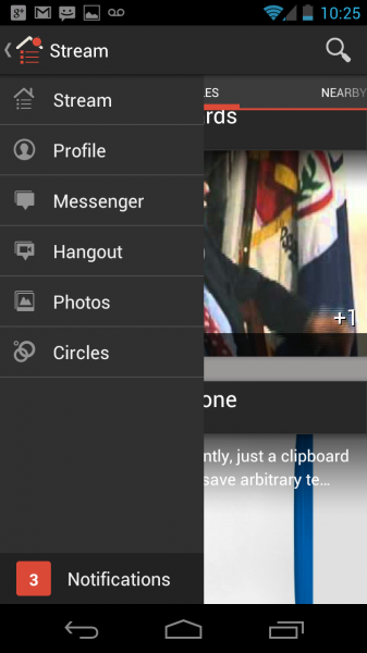
Beyond the visuals and improved discovery, two features stand out: Inline editing and integrated Hangouts. The latter, for video chatting, was one of Ice Cream Sandwich's stand-out features when launched last year. But as the cloud computing giant improved the feature as part of Google+, Hangouts grew clumsy, since users had to initiate them outside the social network. No longer.
"To get started, tap 'Hangout' in the (new) navigation ribbon, add some friends and tap 'Start'", Gundotra explains. "We'll ring their phones (if you want), and if someone misses the hangout, they can ring you back with a single tap".
 Inline editing is a "Doh?" feature that Google should have included from day one. Who wants to post while mobile if making a typing mistake he or she can't fix later on?
Search is improved, and I find it to be better than in the browser. Google+ for Android presents options for "Posts" and "People". However, my initial reaction, which might change with further use, is that Google+ for iPhone discovery is better.
In the bullet points in the section above, I noted the value of connecting additional services. Some Google+ users aren't satisfied with how far the service has come. In response to Gundotra, Phil Lott calls the new app a "huge improvement", but then requests: "Please unify Google Talk, Google+ Hangouts and Google Messenger. These services don't interoperate the way the should, although they have very much in common. I' don't understand why I can't text someone on Google Talk via Google+ Messenger etc."
The tablet experience is superior in some ways, lacking in others compared to new iPad. Clearly neither Google+ app is optimized for tablets. On new iPad, the user taps 2X, which expands the size to fill the screen with iPhone border around the app. On the Android tablet, Google+ fills the screen, offering the more visually-appealing edge-to-edge experience. However, text and photos are much sharper on new iPad, which is in part because of the higher resolution display.
Have you used either or both apps? I'm particularly interested in how you think they compare. Important: Please state what device and OS version you use.