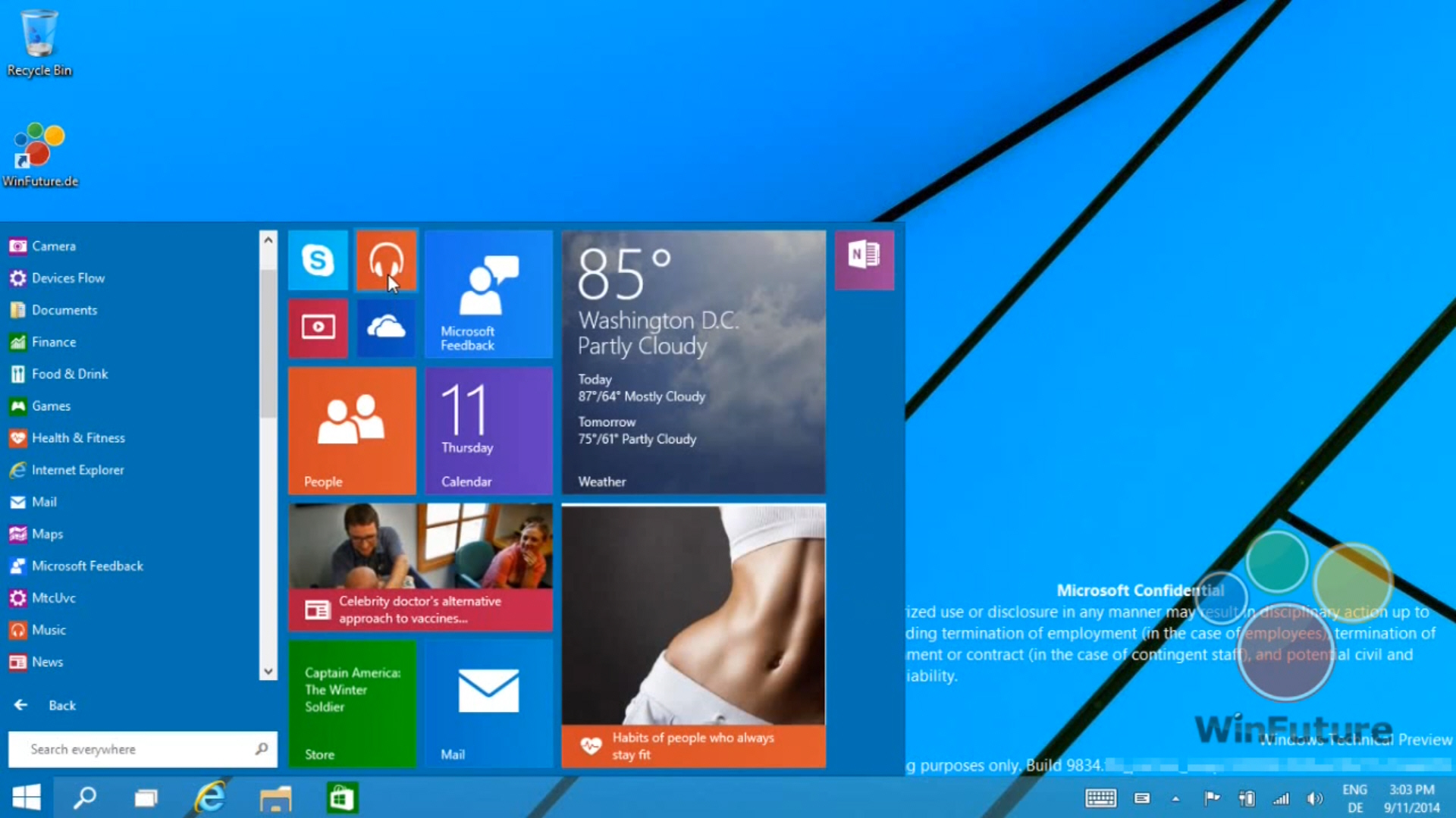
Watch a video of Windows 9 in action -- See the new Start menu and more

Want a proper look at the next version of Windows? WinFuture.de, the website behind the recent batch of leaked screenshots, has recorded a video showing Windows 9 Technical Preview (build 9834) in action.
The video focuses on the Start menu, and we get to see how well it all works. The tiled section on the right is unobtrusive, resizable, and disappears when not required. Microsoft has done a superb job of making a Start menu that functions as you’d expect, but which is modern and beautifully presented. The video also shows Modern UI apps running on the desktop, and more.
The top of the Start menu shows the user name and clicking on it will let you change your account picture, lock the computer or sign out. A power button to the right lets you put your PC to sleep, shut it down or restart. The menu uses a folder system so you can get quick access to things like individual system tools, which is great. Apps, which are accessed through an All Apps section, can be opened, uninstalled, or pinned to Start and/or the taskbar directly from the Start menu.
You can customize the tiled portion of the menu in the same way that you can customize the Start screen. Apps can be rearranged, unpinned from Start, pinned to the taskbar, uninstalled and resized.
The best thing about the menu is it resizes intelligently. So the more apps you add to Start the larger the tiled area becomes.
The video shows the Windows calculator app in use and it looks much better running windowed on the desktop (it doesn’t fill the screen), but a native desktop version still looks much better. But that's just my personal preference. Later on we see how easy it is to switch apps between full screen and windowed modes.
Interestingly, we also get a look at the Taskbar and Start Menu Properties screen in action and it turns out there’s an option there to use either the Start menu or the Start screen. So users will in fact be able to switch between the two UIs after all.
The Start screen itself looks the same as it does in Windows 8.1, although that might change in future builds.
Overall I think it looks great -- it’s exactly what I would have hoped to see. Screenshots are all well and good but they only tell part of the story. Watch the video below and let me know what you think in the comments.
[Update] Two new videos showing the Start menu and virtual desktops can also be viewed here.