Microsoft releases the Windows 10 UI you've always wanted -- and you can't have it!

Today is a frustrating day. On the positive side, Microsoft finally released the Windows 10 experience we’ve been clamoring for. It comes with all the goodness of Windows 8.1’s refined touch UI plus a familiar old friend: A Start Menu that retains the core of the previous versions but supplements it with some new-fangled Live Tile tricks.
The frustrating part is that most users can’t have it. In fact, unless they’re running one of the handful of Windows RT-based devices (e.g. Surface or Surface 2), they’ll never see this wonderful incarnation of the Windows 10 UI everyone wanted.
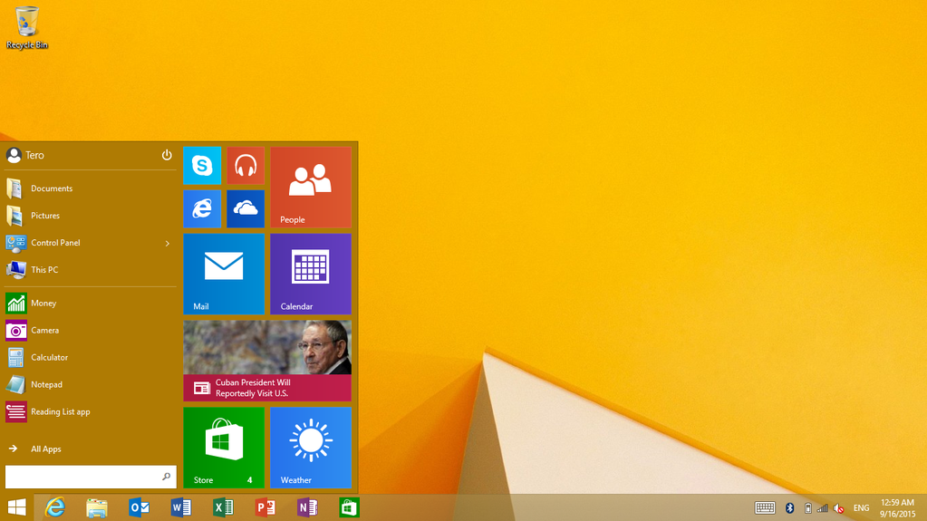
And make no mistake, this is the user interface customers really wanted. It has a Start Menu, but not the bifurcated mess that saddles Windows 10. This is a real Start Menu, with the same nested folders and quick links so familiar to Windows 7 users. Sure, there are Live Tiles sitting to the right of the menu. But these seem more like afterthoughts -- tacked-on extras that enhance, but don’t displace, the Start Menu’s core functionality.
But a fully-functioning Start Menu is not the best part of the new UI. It also retains the controversial Start Screen for when a device is being used as a tablet, and it lets you switch between the two experiences at will (simply tick a checkbox and logoff/logon).
SEE ALSO: Microsoft brings the Windows 10 Start menu to Windows 8.1 RT
Note that this is not the "blown up" Start Menu from the aforementioned (i.e. "bifurcated") Windows 10 UI, but rather the real deal. It’s essentially unchanged from the one that shipped with the Windows 8.1 RTM bits. Which is a good thing since, compared to the awkward, disconnected disaster that is Windows 10’s "Tablet Mode", the Windows 8.1 touch UI feels much more polished and forward looking. It makes navigating a tablet PC simple by placing both commonly used apps and less frequently used features and functions within easy reach (literally just a swipe or flick away).
Overall, Windows RT 8.1 Update 3 looks to have a great user experience, one that addresses the complaints of the past while preserving the core of Steven Sinofsky’s (unfairly demonized) vision for a touch-first future. All of which begs the question: Why didn’t Microsoft give users this version of the UI?
Seriously, why not stop here and call it a day? Why did Microsoft’s engineers keep tinkering like a bunch of mad scientists trying to reinvent the wheel when all they really needed to do was rebalance the tires?
Microsoft got touch right with Windows 8.1. And it got the traditional KVM interface right with the Start Menu (and every version of Windows that sports some variant of the original). The solution was to provide both experiences and let the user decide, not throw them out and start over.
"East is East, and West is West", Microsoft. Stop trying to marry two disparate UI models and instead give users the best versions of each. Hey, it worked for Apple!
Photo Credit: wavebreakmedia/Shutterstock