The Android 7.0 Nougat beta on my Samsung Galaxy S7 is a revelation

Those who have followed me over the years know that I came somewhat late to the mobile computing party. I didn’t buy my first smartphone until 2014 -- an el-cheapo Samsung Galaxy Avant running Android 4.4.2. However, after languishing in the hinterlands of abandoned devices (Samsung never bothered to updated the Avant’s OS past "KitKat"), I finally bit the bullet and this past August splurged on a Galaxy S7 (I went for the nondescript black model to discourage phone thieves).
No question, the Galaxy S7 is a wonderful "piece of kit" (as my UK friends would call it). It’s fast, has plenty of RAM (4GB), and is expandable via microSD card (unlike its immediate predecessor, the Galaxy S6). But while it runs circles around my old Avant in terms of performance, I found the phone’s TouchWiz-enhanced Android 6.0 Marshmallow UI to be uninspiring.
Frankly, I had expected more in the way of a functional improvement over my aging Avant -- though, to be fair, I had significantly modified my old phone via myriad homebrew ROMs based on the Android Open Kang Project (AOKP). So, in the end, I simply chalked my experience up to unrealistic expectations and settled in for a long relationship with my new mobile companion.
Then a funny thing happened: Samsung released a public Beta version of is upcoming Android 7.0 Nougat implementation for the Galaxy S7/Galaxy S7 edge. Up until then, most of what I’d read about the new OS was nearly as uninspiring as my initial Marshmallow observations. There was talk about virtual reality (not interested), additional UI customization options (been there, done that with AOKP), and some boot-time security stuff (boring). Basically, nothing exciting, and certainly not worth the 2GB download.
But then I heard from other Galaxy S7 users who were proclaiming what a wonderful job Samsung had done with Android 7.0. Phrases like "sleek and clean" and "complete UI overhaul" kept bouncing around the web forums. So, with my curiosity no thoroughly piqued, I bit the bullet and pulled down the massive ZIP archive. I then decompressed the four component files that make up the build and flashed them to my S7 via the Samsung Odin side-loading tool.
After a lengthy initial boot-up, I entered my SIM card PIN and began the "new phone" setup process. Much looked the same from my earlier experience setting up Android 6.0, but then the process was done and I started to poke around the UI a bit.
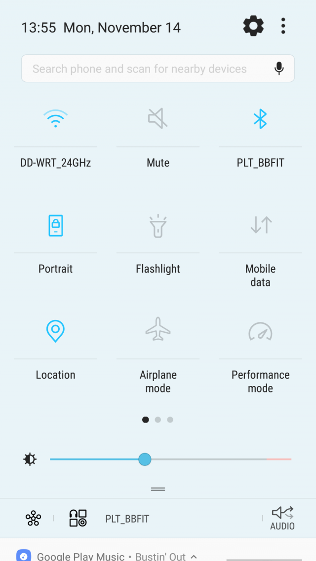
The first thing that jumped out at me was the new Quick Settings panel. Samsung has moved to a gorgeous, aqua-esque blue/gray color scheme on a near white (hint of light blue dithering) background. The icons are minimalist and the whole effect feels quite iPhone-like, especially the smoothness of the tray’s integration with the notification shade. It just "pops and snaps" in a way I hadn’t experienced before under Android.

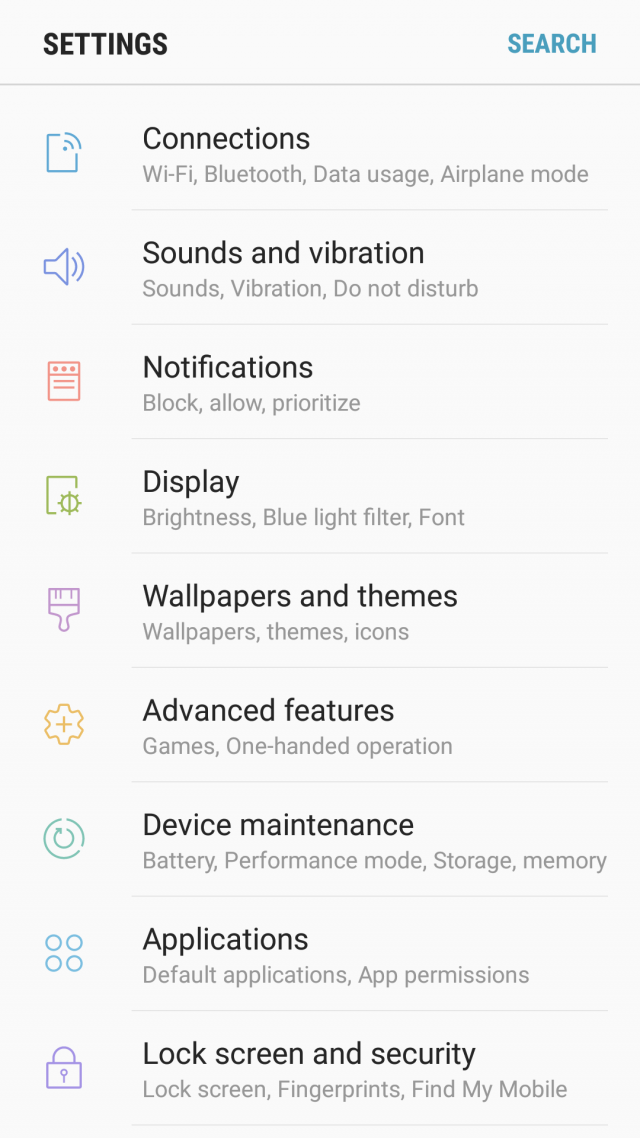
I was similarly delighted by the new Settings page. The minimalist approach from the Quick Settings panel carries over here, but this time the icons are drawn in colored outlines to make them easier to differentiate from one another. Gone is the ugly grouping of functions and generally bifurcated feeling of TouchWiz on Marshmallow. Samsung’s implementation in Android 7.0 is clean, easy to navigate/search, and a welcome departure from heavy-handed treatments in the past.

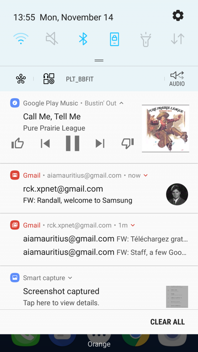
Another UI area they’ve cleaned-up is the handling of notifications. They’re now grouped by application type and presented as expandable bundles, making it easier to focus on important items (like work emails) and ignore lower-priority stuff (like Facebook/Twitter updates). Also, the ability to reply in-line to a text message has been streamlined and now appears as an integrated text-entry field (as opposed to the pop-up style I was familiar with from Android 4.4). Basically, the entire Notification shade is more interactive and, frankly, a joy to use. Animations are smooth and the whole experience has a better flow than any previous version I’ve encountered.

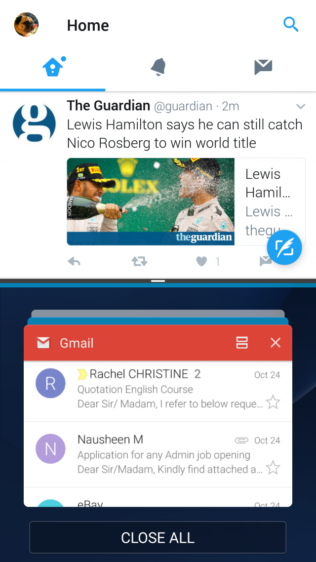
Finally, the piece de resistance: Multi-window support. Samsung has been shipping its own, proprietary multi-windowing implementation for a while now. However, with Google baking a standardized mechanism into Android 7.0, Samsung has smartly incorporated the Mountain View company’s approach as a baseline feature while preserving its clever floating windows capability via a custom swipe gesture. Together, they make task switching under Android a much more natural experience, and I’ve found that most of my favorite apps (Twitter, Gmail, Office, SoundCloud, Play Music) work seamlessly with the new split-screen view mode.

Of course, I’d be remiss if I didn’t mention the expanded functionality of Samsung’s Always On screen feature. With Android 7.0, I can now see notification icons and even the currently playing track in Google Play Music -- all without waking the phone. It’s the kind of at-a glance functionality that I’ve quickly come to appreciate and wonder how I ever lived without.
Bottom line: Android 7.0 Nougat for the Galaxy S7 is shaping up to be a solid release full of useful functional upgrades and some nice visual tweaks. I was happy with my Galaxy S7 before I installed the beta. I’m doubly happy now that I can see what a great user experience Samsung has in store for me when the final version drops next year.
Photo Credit: BigLike Images/Shutterstock