Google Calendar for the web finally gets a redesign and new enterprise features

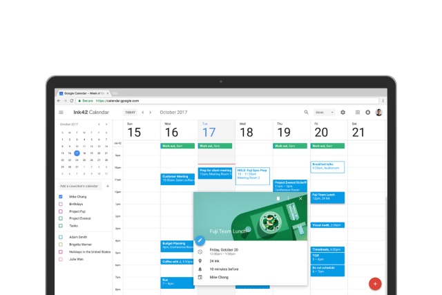
After years of little more than minor tweaks here and there, Google Calendar for the web is finally getting a long-overdue update. Inspired by the mobile app Google has developed, the revamped online version of Calendar gains a new color palette, as well as a layout rejig and a few new features.
The new look uses Google's Material Design scheme, and the update means that Calendar now intelligently resizes for different screen and browser window sizes. There are various new features for enterprise users, but there are also new views, and a focus on displaying more useful information than before.
See also:
- Google launches personalized phishing protection and updated Security Checkup tool
- Google Wifi update brings site blocking to parental controls
- Google rolls out Chrome Cleanup to help secure its web browser
If you use Google Calendar to organize meetings, you can now see not only the contact details for people who are coming, but you'll also see details about conference rooms when appropriate. Google explains: "G Suite admins can now enter detailed information about their organization's meeting rooms -- so employees know where a conference room is located, how large it is, and whether it has audio/video equipment or is wheelchair accessible. Employees can simply hover over the room name in Calendar when they want to book a space, and a hovercard will pop up with details about the conference location and resources."
Calendar invites have undergone a rich formatting makeover so you can now link to useful documents ahead of a meeting. Anyone who has struggled to juggle multiple calendars will be pleased to find that a multi-calendar view makes it possible to see them side-by-side in columns.
Google also says:
There are a number of other changes in Calendar, too. Now you can see contact information of meeting participants when you hover over their names in a Calendar invite. There’s also a new way to view and restore deleted items in one place in case you accidentally delete a meeting. Additionally, "Day," "Week," and "Month" views are now more accessible, featuring better compatibility with screen readers.
More details are available on Google's support pages.
The update is rolling out now. When you get it, you should see the option to switch to the new calendar in a notification -- just click Use new Calendar. If you change your mind and want to go back to the old look, simply select the Back to classic Calendar option in settings.
