RockMelt "social" browser: Not very special
For the last 72 hours, reviews of a new browser called RockMelt have been turning up all over my feeds, and now that the initial hype of the limited beta is dying down, I thought I'd unlock my tongue and talk about it.
Betanews readers have proven time and again to be die-hard browser connoisseurs, and after spending a day playing with the beta of Chromium-based RockMelt, I almost didn't want to write about it. The entire browser, from its concept to its code, is pretty contrived.
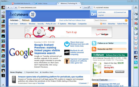
That doesn't mean it wasn't worthy of a look, though. As I just mentioned, this browser is built on the open source branch of Google's Chromium project, which means it's almost identical to Chrome 7 in appearance and behavior. It does have a large amount of new features added, but they're all tailored to folding social networks, bookmarks, and RSS feeds into the browser...something that Flock tried not long ago to do.

Your friends with Facebook chat turned on show up in a vertical list down the left hand side of RockMelt, and links to your favorite bookmarks, sites, and social networks are presented as icons down the right side. Immediately beside the address bar is a button marked "Share" which lets you share links as tweets, wall posts, or direct messages.
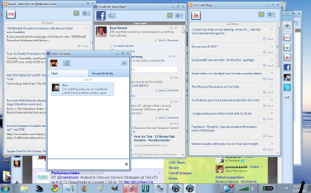
The whole point of RockMelt is that it takes your "social" data (pretty much all of it) and wraps it into the Chromium browser, making it something that you can ostensibly use for your daily browsing activities without having to ever navigate to the actual sites. All social sharing is done within the browser, and all the services you link to RockMelt can be popped out in their own window as if they were standalone apps.
But Chrome users and Facebook fans alike should beware.
Chrome's default design, color scheme, and layout are all retained, but the naked simplicity of Chrome is completely lost in favor of cramming RockMelt full of social links and sidebars. What's worse is that most of the features gumming up your browser already exist in Chrome as less obtrusive extensions.

Chrome's multi-purpose address bar/search field remains, but it's been shortened to include a search-specific field that drops down into full Google Search listings a la Google Instant, or it can be used to search your Facebook friend list. If you start typing in a name, it will suggest one of your friends, and you can click on it to open a dedicated chat window like it does with all the other items in your sidebar. Unfortunately, every window you pop out shows up as another RockMelt icon, rather than an icon related to the site or service you've popped out.
I spent all day yesterday using RockMelt while on a roving mobile broadband connection, and the sidebars spent most of the time trying to connect. And even when they were connected, the sidebar icons that are supposed to notify you when new activity happens were all 30 minutes out of sync. Even using it on a decent fixed Wi-Fi connection, the "live feed" from my facebook wall is dozens of posts behind the site, and I can't for the life of me find the settings to change the query intervals, or even a refresh button.
While this last part could simply be lumped in with the excuse that it's still a beta release, the overall lack of innovation, unsightly design, and limited access to controls aren't.