This is not a PC: Microsoft debuts Windows Phone 7 Series
Without a doubt the biggest news from Mobile World Congress thus far, Microsoft unveiled Windows Phone 7 Series today. This is the big update to Microsoft's mobile environment which presents a more social, touchable, consumer-friendly user interface with new ways to interact with mobile data.

In short, the experience in Windows Phone 7 Series is almost nothing like the Windows Mobile experience, which was designed as a complement to the desktop PC.
And to drive that point home in today's Mobile World Congress presentation, Microsoft repeated one key phrase at four different times: This is not a PC.
This is because Microsoft has turned completely against its old model in the mobile space. Instead of a system that is a truncated desktop experience, or an experience that hinges upon the device's partnership with a PC, Microsoft's new mobile platform is being sold primarily on its standalone capabilities and secondarily with its integration with Zune and Xbox Live. Integration with the PC has been moved far out of the spotlight.

"We have redesigned every step," said Andrew Lees, Senior Vice President of Mobile Communications.
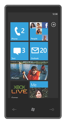
Indeed, they've even moved away from the app-based model popularized by all of the other major smartphone platforms. Windows Phone 7 Series offers an almost entirely widget-based interface with its concept of task-oriented "hubs" and "live tiles."

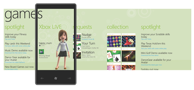
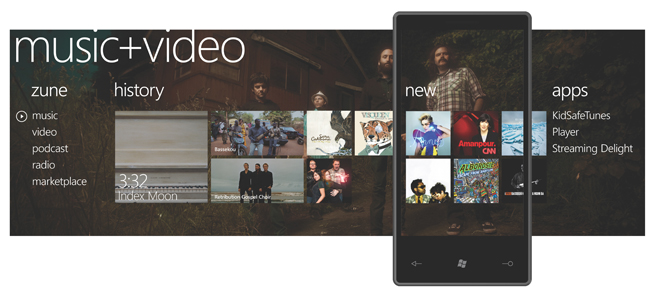
Windows Phone 7 Series has six hubs built into it: People, Pictures, Games, Music/Video, Marketplace, and Office. Each hub corresponds with an ecosystem, and rather than simply present a blank field full of app icons, it is meant to act as a central point to interact with live icons representing all of the user's related content.
"Just about a year ago we took a hard look at the state of the smartphone industry -- particularly at design," Eric Urban wrote in the Windows Mobile team blog today. "Our view is that the predominant user interface design -- screens of icons to manage and navigate -- has become a little outdated. It's a UI paradigm that was created for the PC, where it's EASY to have lots of separate apps which you navigate between, spend time with, and operate with a large screen and mouse. We said to ourselves 'a phone is not a PC...it's got a small screen, no mouse, and you want to use it not just for long periods but in short bursts -- it should work great in the tiniest of moments.' We wanted to solve for 'glanceability' -- so you could get data and information without constantly going in and out of applications. We knew that we would need to innovate further to deliver something in which each of us, and each of our customers can take delight. So here it is."
One of the immediate points of criticism, however, is that Windows Phone 7 Series was shown today on a mocked-up device, and it isn't expected to come to market until the 2010 holiday season. Given Microsoft's history with delays in the mobile space, this is a bit unnerving, and means the final experience could be quite different from what was shown today when it is run on actual consumer hardware late this year.
But regardless of the launch date, Microsoft is working toward an entirely different mobile experience, one that moves beyond the stigmatized Windows Mobile environment, and even beyond the stigmatized PC environment, into one designed especially for the devices we all use.