Google cleans up YouTube, and it looks really good!

"Modern" is not a word I would have ever used to describe how YouTube looks. The user interface remains dated, even after several refinements. But that may change, and quite dramatically. Google is in process of changing YouTube's look and feel in startling and refreshing ways. How this new experience comes to market depends in part on how users respond to it.
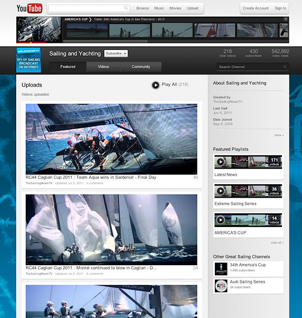
Today, as part of the ongoing TestTube project, Google opened "Cosmic Panda", which is described as "a new experimental experience for videos, playlists and channels". Hot damn, this thing is smokin'! My initial reaction is simply "Wow!"
The design is more fluid with better visual cues and much less text. It's the amount of text that in part makes official YouTube look so outdated. Among the many changes: Users choose video size by clicking on different size boxes. Videos, such as "related" or from search, are presented in 16:9 ratio boxes. Videos are now watched against a dark grey background, which makes them look better and in my brief viewing reduces eye strain. Default thumbnails for related videos are much larger, which makes scanning them easier and is more fitting with the amount of HD content available on YouTube.
Oh, take a look at the "Featured Playlists" in the screenshot below. Videos play in the thumbnails, making it easier to listen (and see) while looking for something else.
"Our team is constantly experimenting, tweaking and playing with new ways to make your experience exactly what you're looking for", write Googlers Noam Lovinsky and Alex Nicksay. "We'll be making changes to the experiment regularly, so check back to see if some of your suggestions have made it onto the site or to give us more feedback on the latest updates".
The "beta" in Betanews is there for a reason, but we don't get to write enough about testing products. Google increasingly is exception. It seems like nothing is ever finished there.
Google is part way through a major makeover of all its cloud services. Google+ kicked it off last week, along with release of two new themes for Gmail ahead of major visual changes. Google also updated Calendar last week.
In my brief experimenting with Cosmic Panda, I could see what Google developers are trying to achieve. While many blog and website owners obsess over pageviews and page ranks, time online really matters more. The more time someone spends on a site, the more ads he or she will see, particularly with video content. YouTube ranked No. 1 in May according to ComScore, with average 311 minutes per view. YouTube isn't just the most popular site based on viewers.
The new visual cues, larger and better proportioned related videos and channels -- along with the more pleasing grey background -- should keep people watching longer. It would me, if I didn't have to break from video watching to write this post. :)