Hands on with the Samsung Windows 8 slate

Microsoft is handing out 5,000 Samsung-manufactured tablets running Windows 8 Developer Preview here at BUILD, the company's developer conference. I spent some quality time with one this afternoon. While my overall impressions are good, I must say that Windows 8 demos better than using it. Perhaps I'd feel differently having used the Windows 8 slate for a longer time.
Earlier today, Steven Sinofsky, Windows & Windows Live president, and several top lieutenants gave one of the best operating system demos ever. Not even Apple CEO Steve Jobs, in younger and healthier days, could have evoked such energy and enthusiasm as Sinofsky did today. It was infectious and aspirational in all the right ways.
If Jobs had shown off Windows 8 instead, tech bloggers and journalists would have cooed like pigeons over their laptop keyboards about how Apple had done it again. Instead, one after the other -- and analysts, with them -- compared Microsoft's efforts to iPad, singing that "catching up is hard to do" song. I heard nothing more than muted enthusiasm, even among the group of reviewers who each yesterday got one of those Samsung tablets on three-day loan.
You'd Want One
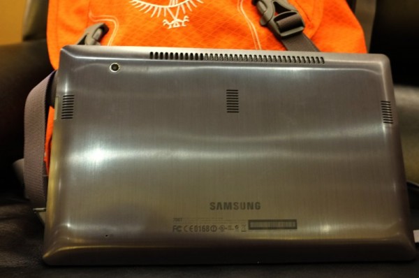
The tablet is the event's big prize. Samsung manufactures the Windows 8 slate, which bears very little resemblance to iPad, for anyone asking. Analysts Gartner and IDC classify Androids and iPad as media tablets. The Samsung slate is a PC running full Windows. From the processor to ports, this tablet is as much PC as stereotypical tablet. It will run all the apps Windows users are accustomed to using.
Core specs: 11.6-inch Super PLS display (1366 x 768 resolution); 1.6GHz Intel i5-2467M dual-core processor; 4GB of RAM, 64GB solid-state storage; Intel WDDM 1.2 integrated graphics; USB, microSD and HDMI ports; WiFi; and 3G -- 2GB/month free from AT&T for one year. Like Samsung's Galaxy Tab 10.1, the Windows 8 developer tablet is longer and narrower in landscape mode than iPad -- and thicker, more like Motorola XOOM or Asus Transformer. Windows Experience Index is 4.3, because of graphics.
The screen is overly reflective, which made taking photos uncharacteristically difficult. There is also high smudge factor -- about as bad as XOOM. Tab 10.1 smudges less easily, and iPad 2 is even more smudge resistant.

Microsoft is right to put this machine in developers' hands, so they can experience Windows 8's Metro UI, code apps for it and use new tools. Updated versions of Blend and Visual Studio are installed on the tablet. But it's the new operating system that will interest them and many other people.
Wake Me Up
Windows 8 wakes nearly instantly, and it's a hugely important feature, because:
* It makes a good impression. Slow startup contributed to Windows Vista's bad reputation. Many people will delight in instant-on capabilities.
* Time is valuable, particularly on portable devices. Pull it out, do something quick and put it away.
* Smartphones and media tablets start nearly instantly -- as does Apple's MacBook Air. These products create expectation that a computing device should start fast.
Windows 8 is smooth and responsive to touch on the Samsung slate, as it should be with a PC processor inside. Touch sensitivity is excellent. You can feel the power, because of the tablet's heft (but not overly heavy) and fluidity of Metro UI.

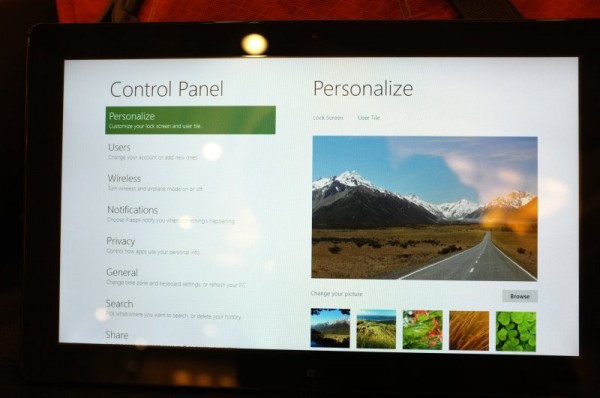
Beneath Metro is an updated version of the traditional Win32 desktop and file manager, which includes the Office Ribbon adapted for Windows. I found the older motif to be less responsive to touch. But it is beta software, after all, with the objective of introducing developers to Metro. Microsoft has plenty of time to get to fit and finish.
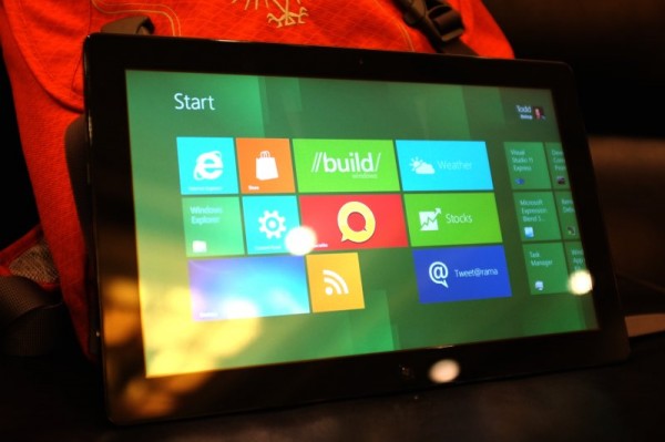
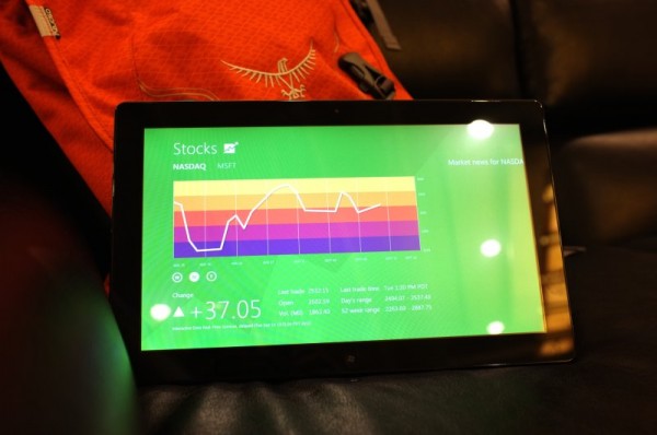
The tile motif is immediately intuitive, like no other computing interface I have ever used. Microsoft has done a remarkably good job, even at this early development juncture, putting navigational elements alongside live content. Some tiles are for tasks, while others are active.
I'm immediately reminded of Microsoft's attempts to bring live content to Windows 98 with the Active Desktop. It was a concept way ahead of its time. The strategy failed for many reasons, dial-up Internet connections being one of them. That vision is fulfilled in Windows 8's Metro UI.

Metro, like the Windows Phone UI, looks nothing like competing motifs. Apple won't be suing Microsoft, like HTC or Samsung -- or if it does will reveal willingness to litigate to innovate. The tile concept is simply refreshing and suits the use of fingers and touch like no other UI I've seen.
Little Letdown
But I found using it to be a bit of a letdown, and perhaps my reaction would have been better if not for today's BUILD keynote demos. Sinofsky and his team did things with Windows 8 that I can't. The apps aren't there, or supporting Windows Live services -- at least in the same way. He showed off stuff not available to the masses, but that's to be expected this early in the development process.
As for my peers, I don't share the sentiments of those asserting that iPad has won the tablet wars. It's still early days, and Windows 8 is much bigger than tablets. Microsoft is rightly focusing on all computing devices of many screen sizes and functions. The Windows ecosystem is larger, and Sinfosky made clear that developers and not Microsoft are in control of their destinies -- and that was an unsaid dig at Apple and the tight controls it places on iOS developers.
BUILD Day 1 started off big. How can Microsoft possibly do better tomorrow? Well, Windows 8 slate is a gift that should get better from use -- better every day. If not, we'll see hordes of them on eBay. But I think not many. Some prizes you don't part with.
