Test responsive websites at multiple resolutions with Emmet Re:view
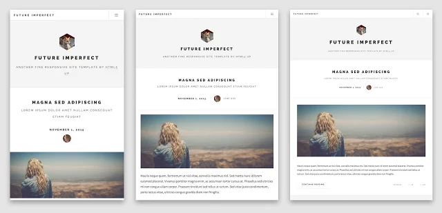
A well-designed responsive website should adapt its display to work properly on phones, tablets and desktops, but testing this on every possible device might take a while. Emmet Re:view is a free Chrome extension which displays responsive websites in various-sized views, side-by-side, enabling you to see how they work at a glance.
Visit the test website, click Emmet Re:view, and a tab opens with resizable views for each CSS media query breakpoint of your page.
(Keep in mind that if this isn’t a responsive website and there are no breakpoints, they’ll all look the same.)
Scroll through any of these viewports, move, hover and click the mouse, and Emmet Re:view keeps the other views synced.
You can additionally resize an individual viewport to see how the site behaves.
The extension also provides a Device Wall which displays multiple device-sized viewports for every <meta name="viewport"> tag of your page.
You’re then able to select various devices presets -- "Android phones", "Android tablets", "Apple phones", "Apple tablets", individual device types -- and see how the site will look at that resolution.
Emmet Re:view isn’t a substitute for full testing, and we had one or two odd problems (blank viewports), but overall it’s a simple and lightweight way to check responsive websites at different resolutions.
Emmet Re:view is a free Chrome extension.