This is the Spotify mobile experience we need
Spotify revolutionized how we consume music, and although it faces strong competition from the likes of Pandora, Apple and Amazon, it remains the number one audio streaming service by some margin, with 286 million active users a month.
That doesn’t mean it’s perfect though. Personally I’m not a lover of Spotify’s look, and I think the mobile experience could certainly be a lot better. I’m definitely not alone here.
SEE ALSO: Windows 7 returns with the stunning 2020 Edition
Serial concept creator Kamer Kaan Avdan, who has previously released videos for updated versions of Windows 95, Windows XP, Windows 7, Windows 11, Apple’s version of Windows 10, and Windows 20, today turns his attention to showing us what Spotify could look like on mobile.
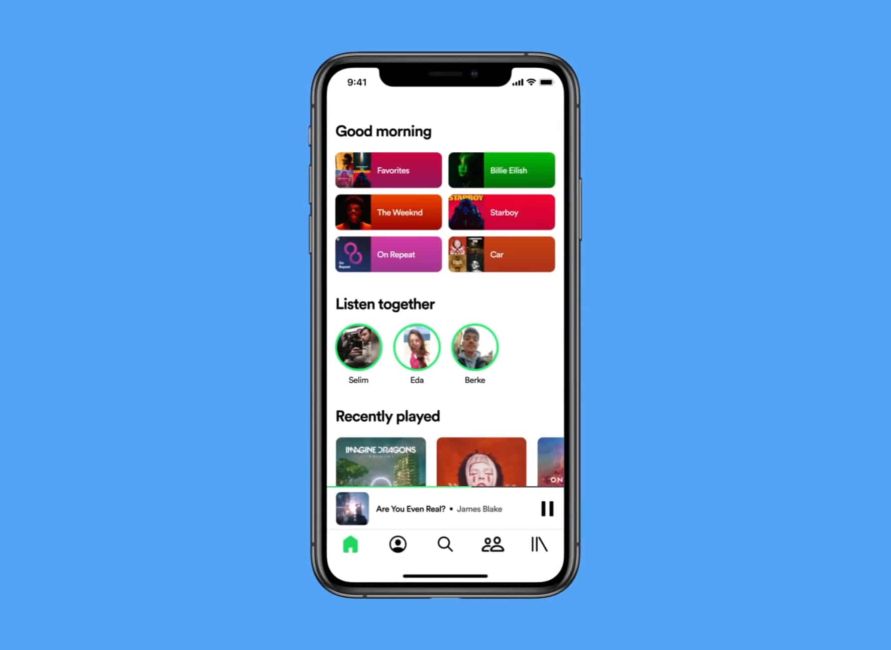
His reimagined Spotify home page is cleaner, with shortcuts to popular sections at the top, Listen Together in the center, and Recently Played below that. There’s a big focus on friend activity on mobile, making it easy to listen to music with people you know.


His concept gives us a 'You' tab that’s just for your music and the playlists made for you, and it wouldn’t be an Avdan concept without a choice of Light and Dark themes.
Personally, I’m a big fan of Avdan’s latest creation. What's your take on it?