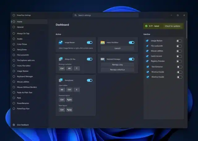
Microsoft is working on a big UI facelift for PowerToys

There can be few tech-heads out there -- particularly if they are readers of BetaNews -- that are not aware of PowerToys. This outrageously useful collection of Windows utilities has an avid following, and each new release is eagerly lapped up as new modules are added.
The latest project for the PowerToys team is to give the app a "new homepage experience". What this means in practice is an update to the app that introduces a central dashboard that provides an overview of which modules are currently enabled, also showing helpful information such as useful keyboard shortcuts for individual utilities.
See also:
- Microsoft is bringing Windows 11's new backup tool to Windows 10
- Microsoft adds a hidden System Components section to Windows 11 Settings
- All Windows 11 users should install the KB5029263 update as soon as possible
The update has been in the works for a little while already with the head of PowerToys, Clint Rutkas, having first talked about it back in mid-June. Now the team is looking for feedback that could help steer the future direction of design and development.
In the screenshot of the proposed interface (which can be seen at the top of this article and is described as "very conceptual and quick-and-dirty") there is a reference to PowerToys v0.77. The most recently released version of the utilities collection is v0.72.0, and it's hard to say whether the more recent number should be taken as an indication of when it will get a public airing.
Writing about the proposed interface update on GitHub, Rutkas says:
PowerToys is an incubation system for testing new work. Some features are on by default, others off. Most of the time, we will default them to on. This, from time to time, leads to unexpected results when someone quickly invokes find my mouse or other utilities.
My proposal is to have a more upfront system in both first time run / upgrade as well as the 1st page in settings to show crisply,
1. if a utility is on
2. Invoke shortcut
3. Shortcut to the utility's settings
When new utilities come in, this line would also be added to the top of the upgraded dialog as well.
He took to X / Twitter to ask for feedback:
The homepage is something of an extension of the PowerToys system tray icon that can be used to quickly access various modules. As well as providing a way to enable and disable modules, where appropriate, the dashboard would also serve as a launchpad for utilities and a useful source of information about how to achieve different tasks.

Pingback: Microsoft is treating Windows 10 users to more apps from Windows 11 – Techno News