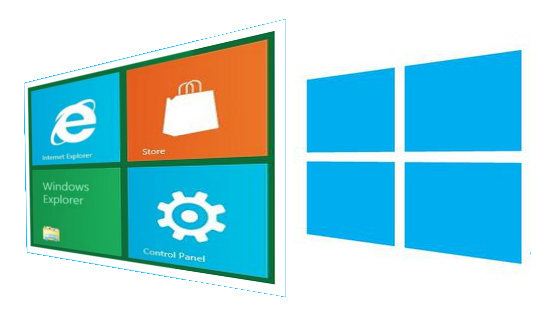
After 20 long years, Windows gets a logo that looks...like a window

A few days ago, the new Windows 8 "Metro-style" logo leaked out to blogs. Today, the Windows team has come forward to discuss the fundamental change to the iconic four-color Windows logo that has been in place since Windows 3.1 twenty years ago.
Designed by Paula Scher from the Pentagram Design Agency, whose other notable works include the Citi logo and the packaging for artificial sweetener Truvia, the new logo is a devolution of the wavy "Windows flag" we've all grown accustomed to.
"If you look back to the origins of the logo you see that it really was meant to be a window. 'Windows' really is a beautiful metaphor for computing and with the new logo we wanted to celebrate the idea of a window, in perspective. Microsoft and Windows are all about putting technology in people's hands to empower them to find their own perspectives. And that is what the new logo was meant to be," said Sam Moreau, Principal Director of User Experience for Windows. "We did less of a re-design and more to return it to its original meaning and bringing Windows back to its roots – reimagining the Windows logo as just that – a window."

The new logo is meant to mesh with the Metro design of Windows 8, which is really the most significant UI change the operating system has ever had. Moreau says it is meant to be "authentically digital," in other words, not based on industrial design. Really, tough, the new Window icon is redolent of the Metro tile interface itself, and should instantly bring it to mind for users.
And also, we did our own analysis of the text in the logo, and this is our best approximation of the new "Windows 8" text, if you're interested in mimicry:
Font Color: #00adef
Font Face: PTL Superla Book LF
We're interested in hearing what you think of the new logo. Too modern? Not modern enough? Does it do the venerable Windows brand justice?