A closer look at Android 4.2, the latest treat in the candy jar [Review]
Today, Google launches Android 4.2 Jelly Bean. Expectations run high for the latest member of the green robot family, even though it's less of a major upgrade and more of a here-and-there improvement from its predecessor. Can it live up to the excitement?
At a first glance, the second version of Jelly Bean is just that...the second version of Jelly Bean. It looks and feels very similar to its predecessor. I'm an avid Android modder, and a new operating system has to live up to pretty high expectations. So rather than write a boring review presenting some of the things that you already know, I will also assess these changes in comparison to custom distributions such as AOKP Jelly Bean Milestone 1, and CyanogenMod 10 nightly.
Why, you ask? Because a number of features introduced in Android 4.2 Jelly Bean are actually similar to what modders encounter in popular custom distributions. From that perspective, one has to consider if the switch to the stock version is worthwhile, or if sticking to something like CyanogenMod 10 is a better choice.
Revised lockscreen
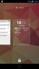
 One of the most important features introduced in Android 4.2 is the new lockscreen that supports widgets. From the get-go, users are greeted with nothing more than a clock, date and charging indicator (if plugged in that is). The lockscreen ring no longer has three targets, but rather just one which unlocks the device. Where's the camera and Google Now?
That is the first sign that Google made a big change where it shouldn't. You see now the camera is a lockscreen icon that can be triggered by swiping to the left. There is no obvious benefit in doing so other than changing a perfectly good recipe. It was simply more intuitive the way it was in previous iterations of Android.
Google Now is no longer part of the lockscreen ring either. Instead, there's a dotted circle at the bottom of the screen which can be used to swipe up to display Google Now. Again I ask, why? It's confusing and unnecessary. The only advantage that I see is the ability to unlock the device by swiping in any direction after the two lockscreen ring targets are removed.
OK, but there are widgets. Four to be exact: Calendar, Digital Clock, Gmail and Messaging can be added and moved around on a number of lockscreen pages. I installed several Google apps such as Currents and Reader on top of the included ones, hoping to find a wider selection of lockscreen widgets. There is not one at the moment.
The idea is to provide extra information that the user may want to have on the lockscreen. But there is a problem. Adding more functionality to the lockscreen is typically done to provide extra information when glancing at the display on the go. Making functionality accessible only when swiping left and right is a bit obtrusive.
AOKP and CyanogenMod 10 are better in this respect. Both offer calendar entries, weather information, battery status and even owner info on a single lockscreen page. It's a much more elegant solution that does not require swiping to find extra information and is not annoying to be honest.
Let's say that I want to use the Gmail widget. I can move it around to be on the right or the left of the default lockscreen page, and I can resize it as well. But if I add it on the right Android 4.2 will show me a small Gmail widget every time I wake up my Galaxy Nexus, while if I move it on the left it shows up as a normal, full-sized widget. I want to have a balanced number of items on the right and left of the default lockscreen page.
Another problem is that after tapping on the GMail widget to read an email it takes me to its homescreen counterpart, same goes for Calendar and Messaging. That's frustrating and not very "widgety." It is useful though when setting up alarms for instance using the respective Clock widget.
After unlocking...
 The Jelly Bean experience is mostly continued in the second iteration. That's honestly great, because the lockscreen frustration is almost too much to bear when the simplicity of CyanogenMod or AOKP are much better.
One of the first things that I noticed is the default browser is still "Browser" and not Chrome. I honestly expected Google to change it, but that's not such a bad idea when many Android users prefer Dolphin, Firefox or Opera to Chrome.
Alongside the standard analog clock widget there is a digital one, which I find far more useful. The time is clearly legible now, with a smaller but still visible date underneath. This is a welcomed improvement, but what about the notification panel?
Quick settings
It's not all unicorns and rainbows on the homescreen. Google introduced a separate notification panel that provides access to "quick settings". First of all let me explain that popular Android distributions already have a similar functionality through notification toggles. Basically a simple pull-down allows access to various Wi-Fi, cellular, GPS, brightness or sound toggles (and much, much more). So what did Google do?
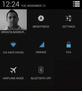
 In Android 4.2 Jelly Bean, the settings button is removed, and a square grid button takes its place. Press it and a new window pops up with what I consider almost irrelevant functionality. Yes, now I can see my face (Google+ profile picture), a simple brightness indicator with a full circle for any setting except auto when it shows an A, settings button, Wi-Fi and cellular network name and signal strength, battery status and airplane mode and Bluetooth toggles.
None of that is really impressive nor something that I consider sufficient when coming from a custom distribution. I know how I look, I can't adjust the brightness by tapping on the icon, the name of the networks might be useful but the signal strength is already displayed on the status bar. Airplane and Bluetooth toggle? No thanks, I don't use either.
However, the battery indicator is a nice feature which I appreciate and find useful at all times. I just wish Google would finally see the light and add it to the status bar where I don't have to swipe or press buttons to check it.
But as it stands, it barely adds much needed functionality and looks like a gimmick that detracts from the lack of notification toggles that other manufacturers (hint: Samsung, for instance) already have since a few Android versions ago. I see great potential in custom ROMs though, as developers will surely fiddle with the toggles and add useful functionality instead.
The new Camera app
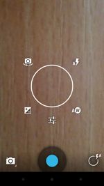
There is a new camera app that I talked about in one of my previous articles titled "Bits of Android 4.2 Jelly Bean are awesome". The truth is that while it may be slightly cooler to use (that matters too), it does not include particularly useful new features. CyanogenMod, for instance is one custom Android distribution that springs to mind which actually includes new features like burst shot mode, or JPEG quality.
There is a new 360-degree Panorama mode which lets you take... 360-degree panorama shots but that's about it. Yes, that settings circle that appears when tapping and holding on the display is useful but it's nothing more than a gimmick which looks good. The latter is important, but I expected more.
Where did Developer options go?
 As I was browsing through Settings I noticed something rather strange -- the Developer options menu was gone. But how to get it back? Apparently Google chose to hide it from prying eyes, but I'm not quite sure why.
In order to get the Developer options menu back one has to tap a number of times on Build number from About phone. Afterwards it returns back to its rightful place after congratulating the user for being a developer. Tapping after restoring Developer options Android 4.2 says: "No need, you are already a developer." If only...
Hiding such an important functionality seems like the wrong call to make. Stock Android does not necessarily target the common inexperienced user. The Nexus lineup is addressed to developers as well as enthusiasts for instance, and I'm fairly certain that both types would not prefer the change.
Swype-like keyboard
In all fairness, there is already a keyboard that uses swiping to type words. It's called Swype, and unlike Google's implementation it has more than a few dictionaries available.
One of the problems that I have with the stock keyboard is that while it looks good and is perfectly adequate for a number of people it does not include more international dictionaries. Writing texts is a pain because the keyboard does not recognize Romanian words, and I have to type all of them without error because auto-correction does not work. So for someone who doesn't have appropriate dictionary coverage, SwiftKey or Swype is generally going to be better.
I have fairly big thumbs so swiping does not really work well for me. It requires rather precise input which I find tiresome when I'm really in a hurry. From past experience using Swype the Android 4.2 keyboard is less accurate at predicting words, nor as fast to use as SwiftKey. In order to insert a comma I have to press another button to find it, while the latter does not go down the same route.
I do have to point out that I'm rather picky about keyboards, but as it stands the default one is still unusable for me. It works better for typing English, French or Italian words, for instance, but it doesn't work for me most of the time when I actually need it.
The other bits
Android 4.2 eventually caught up with custom distributions in the Clock app department. Finally the latest operating system developed by Google has a countdown timer and stopwatch functionality. That wasn't so hard was it?
Unlike custom distributions though the Clock app is beautiful. All the three tabs are neatly integrated and there is a sense of unified design and seamless transition which is nice. Stopwatch times can be shared with various apps such as Gmail, Messaging or Twitter, and we are likely going to read about who finished first or last.
To some, benchmarks scores are not important, but I have noticed a change nonetheless. Using 4.1 Jelly Bean, I got less than 5000 points in Antutu, whereas with the latest version of Android I now get more than 6300. That's a welcomed improvement in my book and almost just as good as the custom kernel I used with AOKP and CyanogenMod (Francisco Franco kernel).
SunSpider tells a similar story with the stock browser managing 1,475ms with 4.2 Jelly Bean, again better or just as good than before (the number was roughly similar) using a custom distribution. Chrome is less impressive at 1,798ms but still on par with previous results.
The interface is very responsive and has a certain fluidity that is slightly improved from its predecessor, but I noticed some lag when activating the Recents panel. It happens occasionally, it is nothing major and should not detract from the overall experience.
There is an interesting feature in Wi-Fi settings. Named "Wi-Fi optimization" it allegedly minimizes battery usage when Wi-Fi is on. My question is how? There is no obvious explanation as to how it achieves that and I can only assume that it relies on magic. That or it just powers down the searching cellular radio. Performance is not affected by the setting, and I can get 25Mbps download with it on, and just as much when it's off.
The dock setting (yes, just one) is now moved in Sound, and considering its location it only allows to select or deselect the dock insert sound.
One of the new features for Android 4.2 that I have not seen anywhere else (except in old phones) is Daydream. It basically acts like a configurable screensaver which can be started when docked, charging the phone or either of the two. It can be triggered manually to test out the setup as well.
One of the most interesting things that Daydream can do is to show items from Google Currents. Extremely useful in terms of screensaver functionality, but a gimmick nonetheless. I mostly charge my phone at night when I don't need a lit up display to grab my attention. But besides showing the time or pictures on top of Currents there is not much else noteworthy.
Android 4.2 lacks a Reboot options in the Power menu, which is amusing to say the least after coming from a custom distribution. It's not a major oversight but it's not difficult to implement either. Let me put it this way: I mostly never shut down my Galaxy Nexus, but I do want to reboot it.
It's good though
As with all new operating systems from Google, it will take some time until developers can work their magic. The reality is that it will be a fine upgrade for most people from the stock Android 4.1, but not as amazing as I expected a few days ago.
There are some issues that can be attributed to its infancy, such as the weird lockscreen widgets, but that will likely get sorted out over time once developers start releasing apps that can take advantage of the new features.
But is the upgrade going to appease modders like me?
No, certainly not. Google still has a lot of work to do in order to reach a point where "going custom" is no longer necessary. The upside is that it can be rooted, and that's enough to get me hooked for a few days.